

This Specialization covers how to write syntactically correct HTML5 and CSS3, and how to create interactive web experiences with JavaScript. Mastering this range of technologies will allow you to develop high quality web sites which work seamlessly on mobile, tablet, and large screen browsers accessible.
During the capstone you will develop a professional-quality web portfolio demonstrating your growth as a web developer and your knowledge of accessible web design. This will include your ability to design and implement a responsive site that utilizes tools to create a site that is accessible to a wide audience, including those with visual, audial, physical, and cognitive impairments.
Welcome to Advanced Styling with Responsive Design, taught by Colleen van Lent!
This course is an introduction to the theory and practice of creating responsive websites.
What is a responsive site? The easiest answer may be to describe sites that aren't responsive. Have you ever visited a site on your phone and the content just seems crammed in? You maybe get the idea that the site was designed for a large screen and simply shrunk down for the phone. Or even worse, it wasn't shrunk at all and you have to do a lot of side-to-side scrolling? Or maybe you have been on a website on your tablet, but a bunch of key components are locked and you are forced to go back when you have access to a laptop or desktop?
The following are examples of sites that do not use responsive design;
This course is meant for people who are comfortable using HTML and CSS, but want to take the first steps to creating a single site that can display a different layout (or "look") on different platforms.
There are three common approaches to responsive design.
Throughout the entire course there will be an emphasis on the importance of good habits and examples of potential pitfalls. All of the example code is provided to you as a starting place. For some learners, this will be sufficient to get a decent base on how responsive design works. For other learners however, there is nothing better than when they decide they can write better versions of the code.
All of the reading material you will need to pass this course is contained within Coursera. Additional resources may be added as optional material, but everything will be online and free.
For the coding content you may want to access my CodePEN account. CodePEN is a website that allows you to modify copies of my code. In real time you can see how your changes affect the website we are working on. The one issue that some students have with CodePEN is that it doesn't require you to link your files together. So, if you want to write the code right on your machine, you will need to know how to link the code. Don't worry, I do cover that in class.
Here are links to collections of code for each week/module of this course:
Module/Week 1: Responsive Design - Week One
Module/Week 2: Responsive Design - Week Two
Module/Week 3: Responsive Design - Week Three
Module/Week 4: Responsive Design - Week Four
When you read the modules, you can check the resources section to find a link to any code that is used in the lectures.
At the end of many modules, there is HTML & sometimes CSS code. Use this code in CodePEN as referenced in that particular week/module. Oftentimes you will see two files, a "starter" file and a "complete" file. This way you can start at the same place as me, but still have access to the final product.
The best way to get help is to utilize the discussion boards. I know that this may be new to many of you so let me explain how the discussion boards work. We always have one friendly "where are you from? /introduce" yourself board where people tend to be social. Other than that, we encourage people to use the discussion section that goes with the week/module you are on. Notice that I said "use" not "post." We really want to encourage you to read before you post. You will often find your question already there. If you don't find your question, make sure to post. There are no "stupid" questions. Ever. (Sometimes you may just have found a mistake on my part that I will need to fix.)
The slides for all of the lectures are now posted. You can find a BIG zip file of PDF and Powerpoint files at the Introduction to Web Development with Responsive Design website.
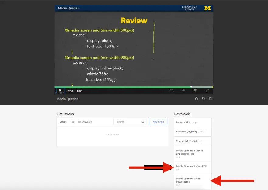
I have also attached the pdf and powerpoint slide for each week/module directly in the week/module text themselves. Just look in the Downloads section to view them.
It used to be the case that everyone viewed webpages on about the same size screen. But with the explosion of the use of smartphones to access the Internet, the landscape of design has completely changed. People viewing your site will now expect that it will perform regardless of the platform (smartphone, tablet, laptop, or desktop computer). This ability to respond to any platform is called responsive design.
This course will expand upon the basic knowledge of CSS3 to include topics such as wireframes, fluid design, media queries, and the use of existing styling paradigms such as Bootstrap.
After the course, learners will be able to:
This is the fourth course in the Web Design for Everybody specialization. A basic understanding of HTML and CSS is expected when you enroll in this class. Additional courses focus on adding interactivity with the JavaScript Programming Language and completing a capstone project.
@media (min-width:320px) { /* smartphones, iPhone, portrait 480x320 phones */ }
@media (min-width:481px) { /* portrait e-readers (Nook/Kindle),600 or 640px smaller tablets @ 600 or @ 640 wide. */ }
@media (min-width:641px) { /* portrait tablets, portrait iPad, landscape e-readers, landscape 800x480 or 854x480 phones */ }
@media (min-width:961px) { /* tablet, landscape iPad, lo-res laptops and desktops */ }
@media (min-width:1025px) { /* big landscape tablets, laptops, and desktops */ }
@media (min-width:1281px) { /* hi-res laptops and desktops */ }
What does it mean to have responsive design for your site? How can you tell if your existing site is responsive? This lesson we will begin with the theories behind the "mobile-first paradigm" - the idea that your mobile site should provide everything needed, not a pared-down version of a good page. We end the week by taking the first concrete step of using fluid measurements in your CSS.
In this module/week (2) you will get a chance to put the theories into practice using media queries in your CSS. These queries can automatically detect the size of the browser being used to view the page so that you can decide what type of look you want to achieve. There will also be a discussion on common practices for designing your different views at various screen sizes ("viewports").
After every good programmer has put in time creating sites from scratch, it is common to utilize existing tools out there. After all, why recreate the wheel? The work you have done up to this point will give you the knowledge needed to craft your own unique sites from these frameworks. In this lesson (3) we will work with Bootstrap, a framework that uses HTML5, CSS, and JavaScript (but don't worry if you have never used JavaScript yourself).
This lesson is dedicated to solving those little issues that pop up when you move from theory to practice. We look at more advanced framework options and also hear from people who are using the techniques covered in this course.
Note: In the third column you can enter numbers and have the conversion calculated for you.
This CodePen by Chris Coyier will let you use sliders to dynamically change the font size on a page.
This CSS Tricks demo goes with one of the readings on Fluid Measurements, but I am including it here again just in case you missed the code. You can read about REMS to EMS here if you want to know how to use the tool.
Someone provided me with a link that helped them better understand the meaning of "relative"
and "absolute" as they relate to CSS.
Here is the link for more.
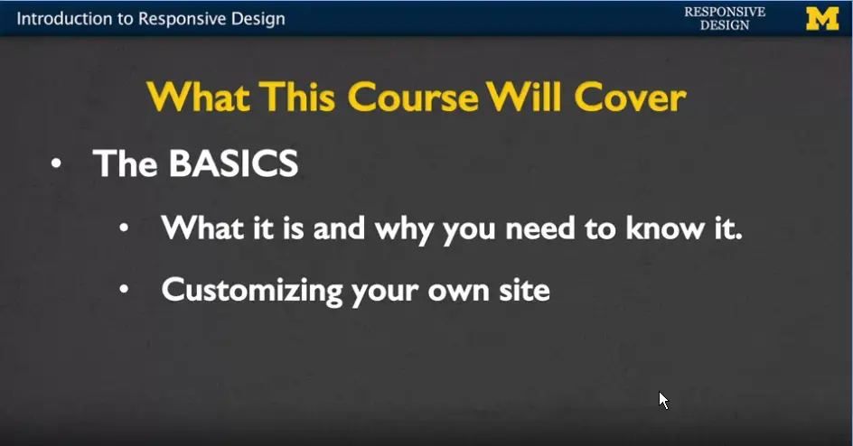
Welcome to introduction to responsive design. In this course, we're going to talk about different ways that you can make your website look the best it can possibly look. No matter if someone's viewing it on a phone, a laptop or a tablet.
We're really going to cover the basics in this course and help you develop a general understanding of what responsive design is and why you need to know it. We're going to talk about ways that you can customize your own site without using any special software to give it a really special look and feel.
However, we also want to talk about using frameworks. Because if other people are using software or different code to make their site look great, why not take advantage of it and learn how to use it yourself.
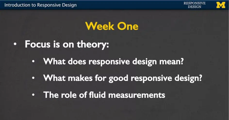
In week one, we're really going to focus on the theory.
The idea of what is responsive design. What do people mean when they use that term? Those of us in technology are pretty guilty of throwing out terms and using them even when we don't really know what they mean.
We're going to talk about what makes for good responsive design. If you don't know what to aim for, it's really hard to know how to get started.
Finally, we're going to end the week talking about something very concrete and that's the role of what we call fluid measurements; these different type of measurements that can change as the screen size changes.
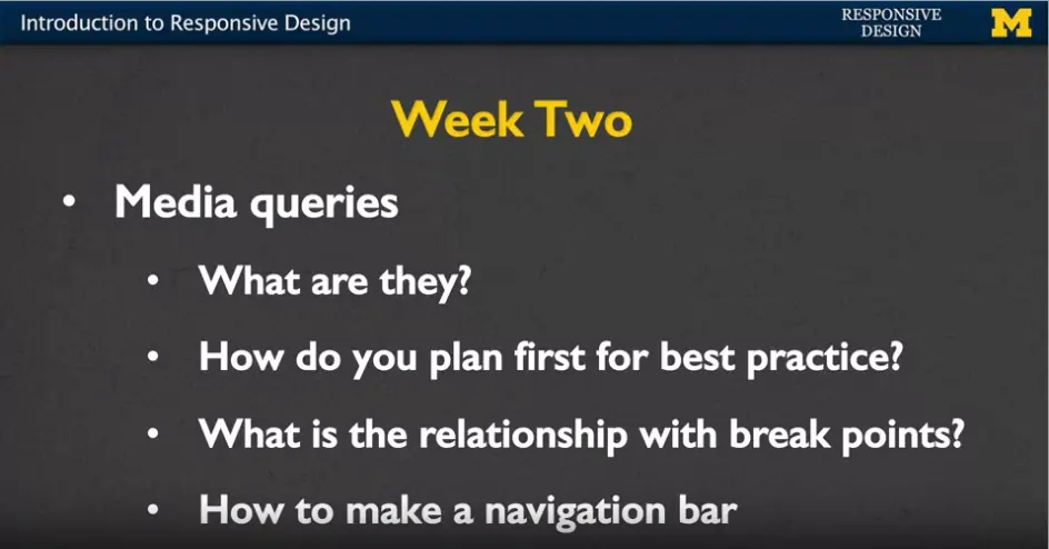
In week two we're going to tackle media queries.
This is the first time you're really going to get your hands dirty with some code, and get things to work. We're going to talk about what they are. And how do you plan, before you even start to code, for the best practice? It doesn't really do you any good to sit down and code without having a plan.
In week two, we're going to talk about break points, how you can decide what different screen sizes are the ones you really want to focus on.
And finally, I am going to do an example where you and I are going to code together to make a navigation bar. By the end of week two, you're going to be ready and feel like you can really tackle this.
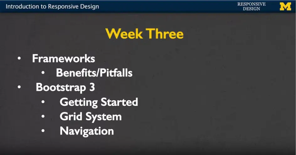
In week three, we're going to shift a little bit and instead of writing our own code, we're going to start using different frameworks. In particular, we're going to talk about the different benefits and pitfalls of using other people's code. Sometimes, it's easier and great to be able to use these different software options. But sometimes it comes at the cost of good practice and accessibility. In particular we're going to talk about the Bootstrap 3 framework. I've picked this one because it's one of the most popular frameworks out there.
Now for those of you who may be familiar with responsive design, you'll know that Bootstrap 4 is out. I'm going to focus on those elements of Bootstrap 3 that you're going to be able to use over and over again. The simple things such as getting started, the grid system, and also, a navigation bar. Because these are the keys to getting your site to have that responsive feel.
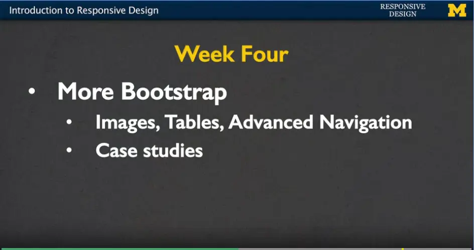
Finally, in week four, we're going to continue with more bootstrap, but we're going to talk about things such as images, tables, and some advanced navigation techniques. These are things that are cool and kind of fun, but I don't think are core to understanding what responsive design is.
So, we leave them at the end to make them something more we can play around with. At the end we'll get to some case studies. We're going to talk to people about how they approached designing the responsiveness in their real-life sites.
We will do this with the culmination of a final project. When you're done with this course, you are going to have one or more pages that you have written yourself. With the help of a framework that can respond to different screen sizes.
Who is this class designed for? It's really someone who's new to responsive design. Someone who'd like to get started and possibly carry on these ideas once their done with the course.
You will need a general knowledge of HTML and CSS in order to get the most out of this course. If you don't understand those two concepts, I recommend you go back and get a grasp of them and then come back to us in the responsive class. Again, as with any coding class at all. This is a class with people with persistence. You're going to run into problems.
This isn't a course where you're going to read something, take a quiz and you're done. Instead, we're going to be coding, probably failing a little bit, coding, failing some more, then and then hopefully success.
Who am I? Well, if you're new to one of my courses, I have a PHD in computer science. I've been teaching for about two decades, sticking mostly with introductory programming, web design, and artificial intelligence. What I really love to do is help students debug. Help them to get those general basic ideas down so they can go off and really master some of the more advanced concepts. And I understand that it's not always about conveying content. It's about helping you recognize those places where you might run into trouble. If I can let you know early, it might help you get up over some of those humps.
In this course, we're going to have a pretty consistent workload. Every week, you'll have multiple modules to read. Some of them will be of traditional lecture format. However, there will be other modules which I tend to call, “Code with Me”. These are lectures where I hope you'll sit down and type along with me and make sure you can replicate what I'm doing.
There will be a few weekly readings but there'll always be online articles. I like to find things that are very pertinent to what's going on in web design right now.
So how do you succeed in this class?
I will always say that the best way to code is with a friend but that's not always possible, so I hope that you'll use the message boards not only to ask your questions but to answer the questions of others.
Never spend more than 20 minutes on something that doesn't work. I'm not kidding. I want you to just move on. When things are working it's great, you can whip out a whole bunch of code. But when it's not it's rarely the case that staring at it is going to make it any better.
Make sure that you feel comfortable looking things up on your own. This is the internet; you can stick your question into a search engine and you will probably find the answer. You'll find three or four wrong answers, but eventually, the answer will be there.
Finally, make sure that you practice, practice, practice. The only way to really learn how to code is to make sure you're getting as much experience as you can.
Welcome to introduction to responsive web design. I hope that you'll learn a lot. Thanks.
Hi, everybody, so you're here and I'm here, and we're here to talk about responsive design. But one of the first questions should be, what is responsive web design? And what it is, is it's designing your web site with the idea that people will be viewing it from multiple screen sizes and different resolutions as well. We want to make sure that our side is going to, what we call work, under any platform, any browser size or any orientation. And by orientation, I mean whether you turn your phone up or to the side. And same for the tablet.
The most important lesson is that you want to make sure that the user has the power. Don't dictate to them what they can and can't do. Let me give you an example. A lot of times when you're looking at a site on a smaller screen such as your phone you get a lot less content. And while it's true their smaller space it's not that there should be less things you can do everything should just be laid out a little bit more intelligently. You have to remember that people are doing more and more things on their phone that they've never done before.
We often think now about watching videos, but we also have to think about filling out applications, or coding. There's going to be a lot of things that we don't even know yet that exist, so we want to be as flexible as possible. The most important thing is, never assume that the user won't need access to specific functionality. I think we've all been there when we're looking at a website on a smaller device and we just can't find the thing that we're looking for. Or even worse, there's these pictures or buttons or different things we can't even move them out of the way with our fingers because the site just won't work for us.
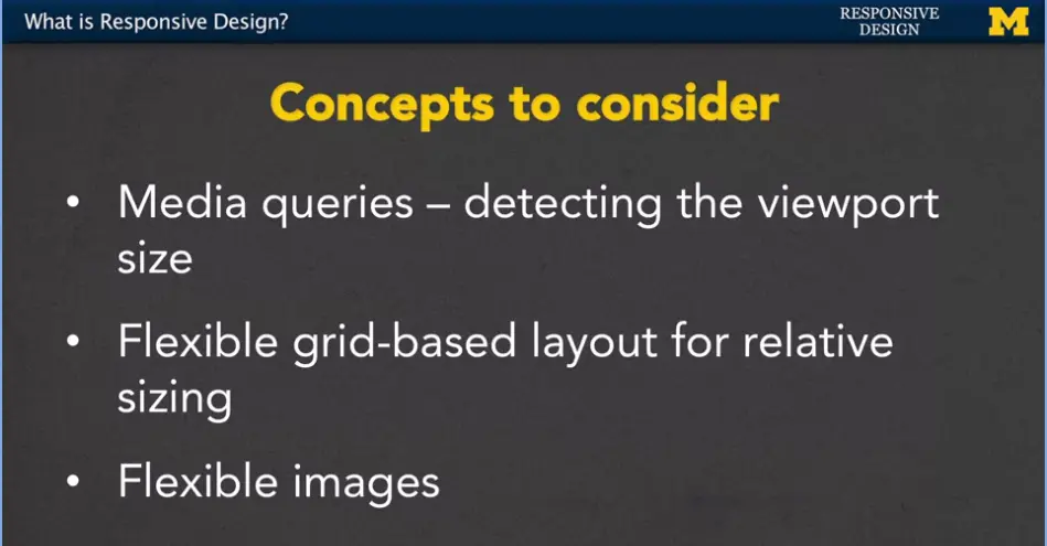
Here are some of the concepts that we're going to be considering throughout this entire course.

Three concepts that I want you to keep in the back of your mind. And I'm hoping at the end of this course you'll be able to say, yeah, I think I've got that, and the first one is called media queries, and what media queries do is that they can detect the view port size and other information about the device that the browser is on.
The next thing that we're going to want to talk about is this idea of flexible grid-based layout for relative sizing. And relative means, depending on how large the screen is, that's how big your grid is going to be as well. And, finally we want to think about flexible images.
All these things add up, so that when you go to the page, the user doesn't need to waste their time scrolling back and forth or trying to resize things to be able to see everything. We want it to happen really automatically.
Let's take a look at some examples that have great responsive design. The first place I'm going to take you is a website called mediaqueri.es.
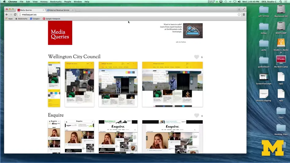
This site has a really nice collection of different sites that it's found that really kind of find that key to responsive design. Let's go ahead and take a look at, I'll scroll down a few.
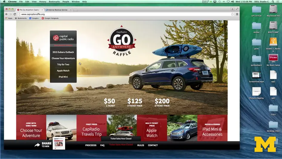
How about this one right here? CapRadio, go anyplace. This site right now, when I'm looking at the large screen, you can see that there's a definite look to the layout.
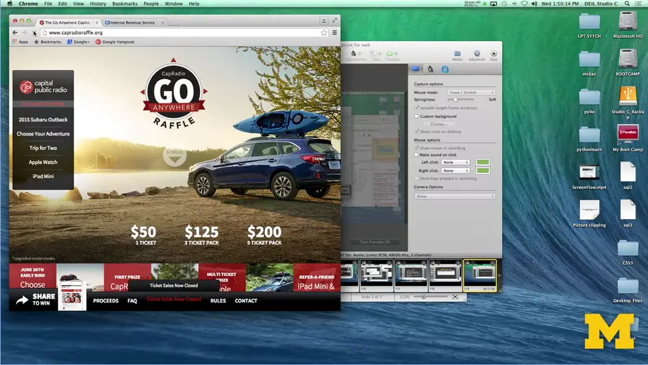
As I resize the screen, as if I'm looking perhaps on a tablet, and I reload it you can see that things have moved over.
The navigation bar is now over to the left when it wasn't there before.
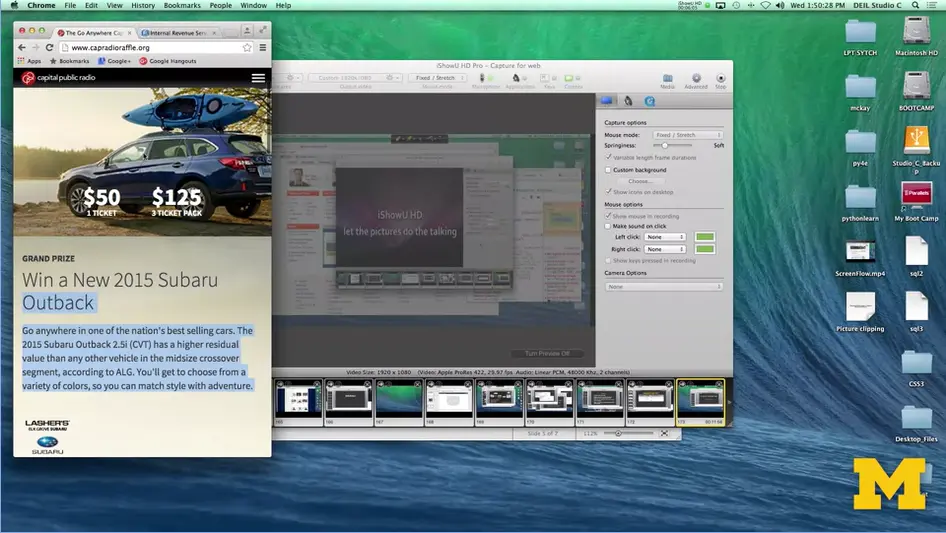
I'm going to go ahead and make it smaller still. I don't even need to refresh. And now you might see something that looks much closer.
To that look and feel of something you would see on the phone. The navigation bar has completely disappeared, and there's this little pop up and down.
These different sites just don't make everything smaller, let me make it bigger, they actually think about the best way to lay out the content, so that you can still find everything that's there without having to look too much.
Now, you can use that site to see examples of great responsive design, but what if I also wanted to show you an example of kind of bad responsible design.
Unfortunately, when you Google that out, or you look for that on your search engine, nobody really wants to advertise the fact that they're really bad at web design so I found one for you.
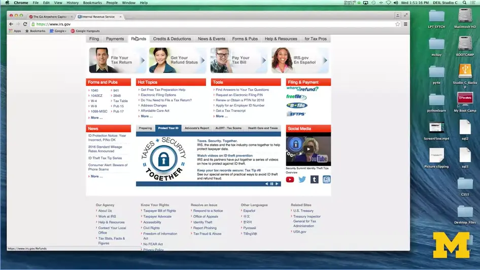
It's the Internal Revenue Service. And what we have here is a site that not only looks the same, but is laid out the same no matter what type of screen you're looking at.
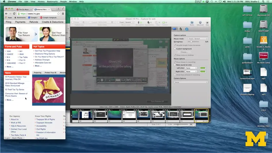
It looks okay right here, but when I make the screen much smaller, you can see that it didn't really do anything. Now I actually have to physically scroll back and forth to see things. The navigation bar hasn't changed. You have the same size pictures.
This is just an example of really bad responsive design.
Let's work together over the next few weeks to make sure that you are avoiding those same types of traps, and we're going to get started coding right away.
Hi, everybody. One of the things that you're going to want to do is test your site to see how it's doing across multiple devices and multiple view ports.
But unless you happen to just be flux with money, you may not have access to all these different types of platforms.
What can you do? Well, one option if you're using a desktop or a laptop, that you can resize your window and refresh the site.
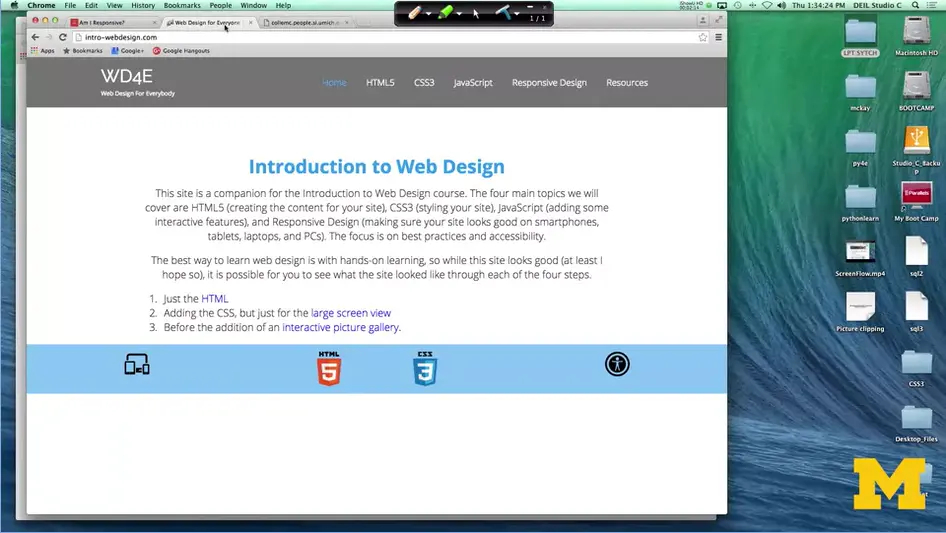
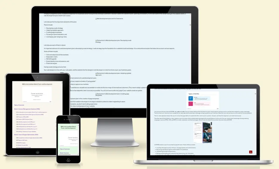
If I go here; <https://ui.dev/amiresponsive?url=https://ibm-web-dev.bauska.org>. The Introduction to Wed Design for everybody, of course. I can just use my mouse and resize it, take a look and see how things are going to change.
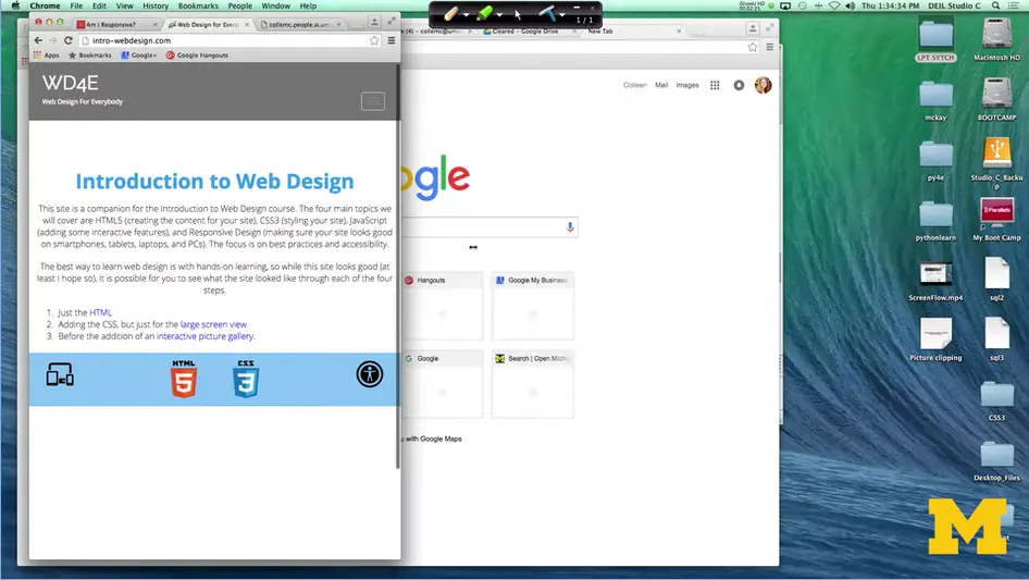
Here, large view, tablet and mobile view. I can see that I have three different break points that all work. That works great if you're on a laptop or some sort of desktop, but what if you're on a mobile device?
It isn't simple or even often possible to resize that window, so we need to come up with another solution that will help you out.
What you can do is look for online tools to help you check for your responsiveness. One that you may want to look at is called ami.responsivedesign.is. https://ui.dev/amiresponsive?url=https://ibm-web-dev.bauska.org.
I'm going to go through and I'm going to show you three different sites and how we can use this website to test the responsiveness of these webpages. Here we go.
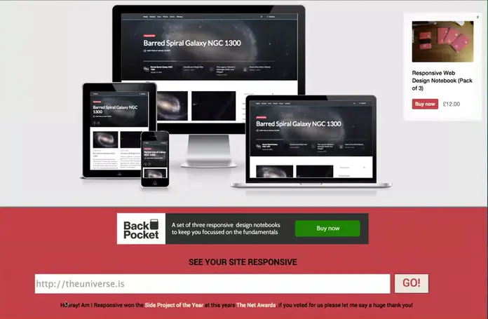
Here's a website that you can go to. Down at the bottom of the screen, you can fill in the URL of the site you want to look at.
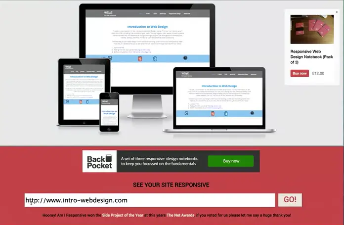
Just so you know, this is made with an HTML tag that makes it so that you have to put in a URL. It's always going to be looking for at least that www. Let's look at that Intro to Web Design website again.
There we go. Now if you look up at the top of the screen you can see that my website is now displayed on four different platforms. I have the desktop, the laptop, a tablet view and a mobile view, and you can see that each one is a little bit different depending upon the platform I'm using.
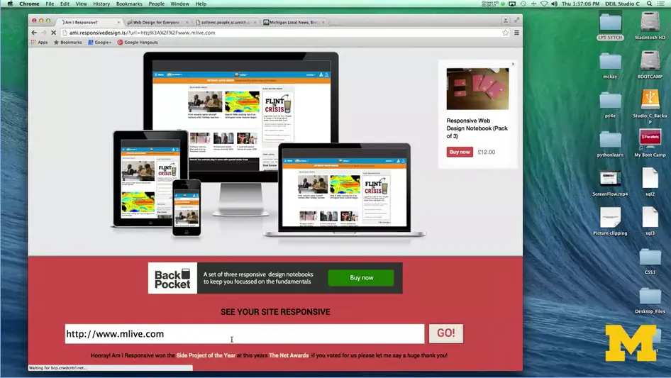
Let's check out another site.
In this case, again we can see that this is a responsive setup. Now, even though the pages may look very similar, you can see that on the mobile view that weather map isn't there (2 images back), that kind of brightly colored map.
In addition, the laptop and desktop view are very similar. But you can see that in the tablet view, we've really broken it down and they use more of a two-column grid system rather than having quite as much content.
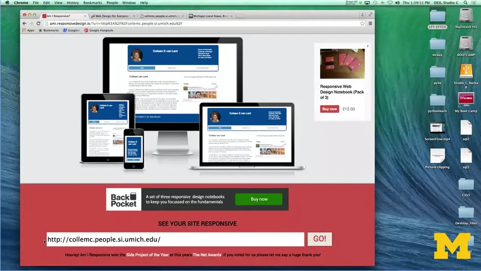
The next site I'm going to check is one that I've made from my umich site. Going here, paste in that URL, and we can take a look. What I've tried to do here is to have a little bit more distinct look, so that you can see that I've tried to develop my site for really what the people might want to be using.
In my larger view I've got my picture, because you know, everybody wants to see me. I've got my name and then my contact information. On the laptop view it's very similar. In the tablet, I've kind of just reduced the space. That information is still important, but I don't need so much space in between them. In my phone viewer, mobile view though, I've gotten rid of the picture and I've started to stack the information to make it easier for people to see. I'm able to look at all four of these views on a single website, and this makes it much easier than trying to go back and forth and resize my window.
However, there is the caveat that this site doesn't always work for every different website. It may be the case that people aren't using traditional responsive web design. On this site, the pages all look the same. But if you were actually viewing them on a browser, they would look different.
The next option you can try is to use tools on your Chrome or Firefox, or whatever browser you're using. It's often the case that your browser is going to have special tools that let you simulate looking at things from different viewpoints.
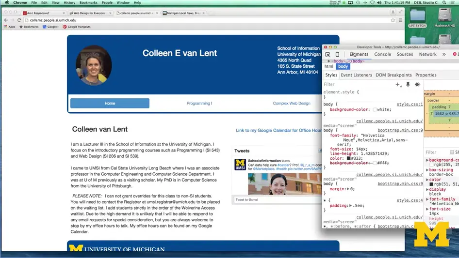
With Chrome, you can use inspect element to see the different viewpoints in real-time. Let's take a look. I've gone here to my website looking at it in chrome and pretty much enlarge screen view. I'm going to drag it out a little bit here. You can see I've got my large screen I've got a lot of spacing in it. I'm going to go in and do inspect element by right clicking Click over here.
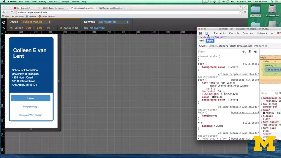
And what I can do now is up in the upper left-hand corner, there's something that looks like a small little mobile phone. It says Toggle device mode. I'm going to click on that. And when I do, I am now viewing my site as if I'm viewing it on a small mobile phone.
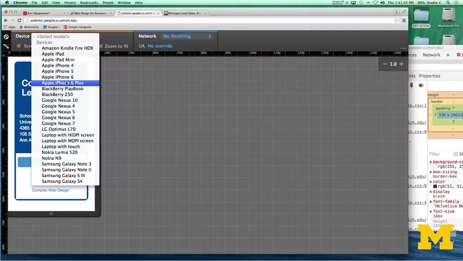
Depending upon your operating system in the browser of the addition that you have, you can go up to the device in the upper left-hand corner select mode, or model actually. And say what would it look like on an iPhone 6? It is a little bit bigger, what if I look at it on a google nexus seven. Same thing. You can pick a number of different options to kind of see what the site would look like.
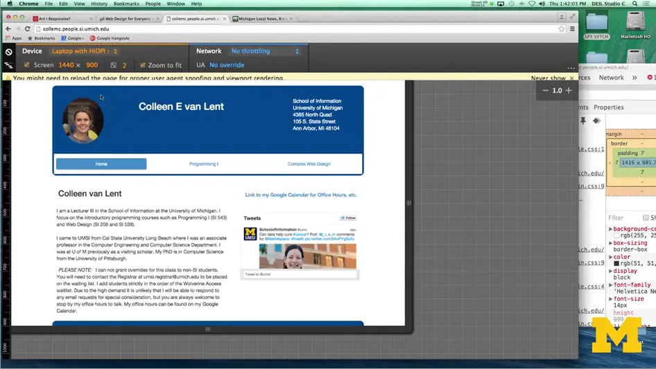
Let's see, do one last one, a laptop. Depending on which type of platform people are using.
Now that you know some quick and easy ways to review the responsiveness of existing sites, it's a good idea for you to go out and get that feel for what you think looks really good, or sometimes even more importantly, what you think you want to avoid on your site. Go ahead and have some fun and mock your friends if their sites aren't responsive. Don't worry, yours will be.
Hi everybody. Today, let's talk about some of the benefits of responsive design.
First thing we need to realize is that responsive design means different things to different people. We're going to talk about three different options that people often use, and why the responsive web design that we're going to adopt has its true benefits.
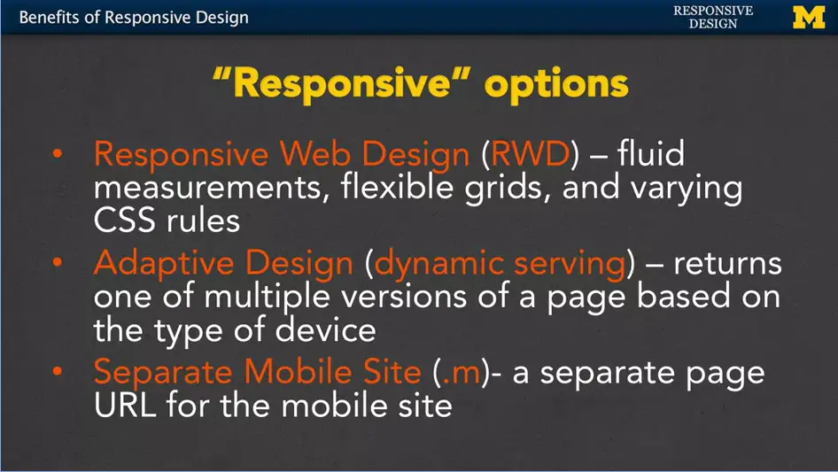
The first option, responsive web design or RWD, is really dealing with fluid measurements, flexible grids, and varying CSS rules.
We also have adaptive design, or what's sometimes called dynamic serving. What happens here is that you can end up returning different versions of a page based on the type of device being used.
The third type is the separate mobile site, or .m. This is when you create a completely separate page URL for the mobile site.
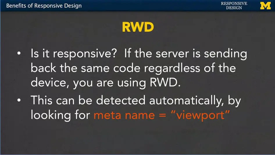
First, let's talk about responsive web design. With the definition that we're using, the test really is, are you getting back the same code regardless of the device that you're using?
You know that I'm a big fan of inspect element and viewing the source code, so my question is, are you going to get the same source code no matter what platform you're looking at?
Now, as humans we can do that by viewing the source code or other little tricks. But sometimes when you're thinking about things such as source engine optimization and getting really high rankings on your page.
A bot can also tell if you're using responsive web design by looking for certain meta tag named viewport. It can be detected automatically and would really, kind of help boost your search engine score, is what many people think.
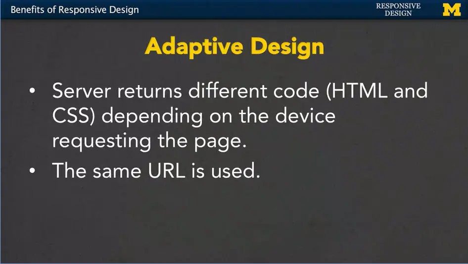
The second type, adaptive design, means that the server figures out what kind of device you're running on and then returns specific HTML and CSS for that page. You can get completely different code depending upon what device you're using.
With responsive web design, it's the same code, just different styling. Here, you're getting different content, the important thing you realize is that no matter where you're doing it from, you're using the same URL. Now, there's a few issues with this, in that the server might return the wrong code if the wrong device type is detected.
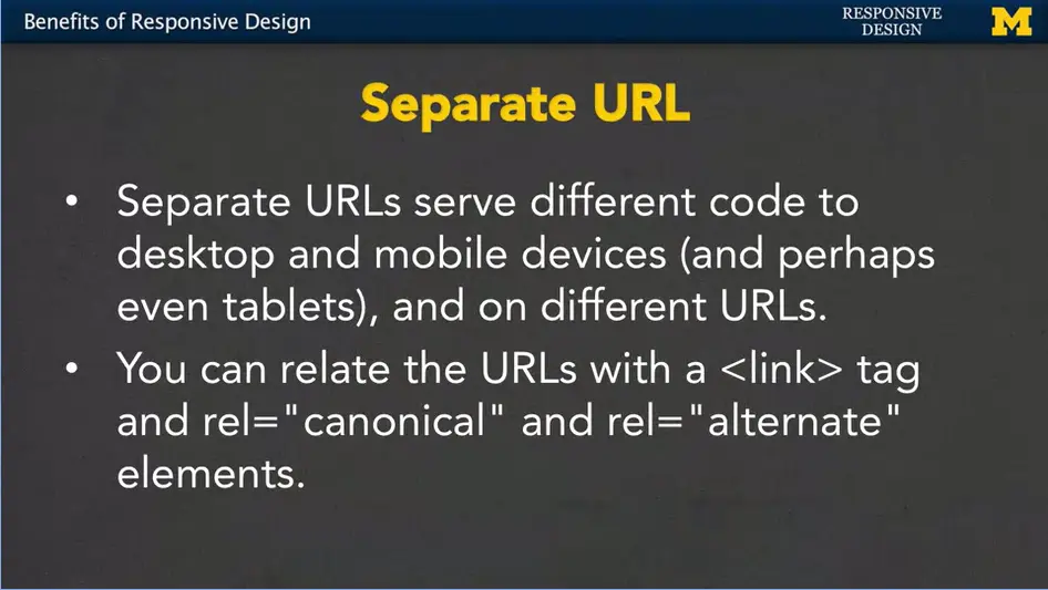
That third option of having a dedicated mobile site, or a .m URL, means that you're going to get a different page completely on a completely different URL when you're using this approach. It's incredibly popular and you're going to see it very often.
When you're on a site, check and see if you have .m in front of your normal URL, or sometimes even a little bit different URL depending upon your device. It's possible if you're going to take this design step to link the fact that pages are related by including a link tag and using the relationships canonical and alternate. Which means, you know what? This is my main page but I do have some alternate URLs out there. Why would you bother doing this? Again, it's for search engine optimization. It really helps if the search engines can know that this is the same type of information just on different URLs.
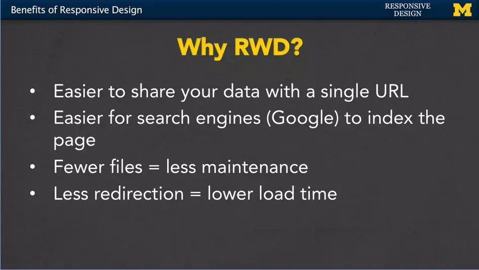
So why am I stressing responsive web design?
Redirection is when you go to a site, and you see that the URL is being changed as the server tries to figure out what type of device you're using and what kind of page or URL you should be redirected to. Lower load time is always great.
Hopefully you see why responsive design is really important. It may even be obvious to you because you're really into this topic. However, if you're ever working a project, you may need to convince someone that they need to pay you for that extra time to make sure their site is responsive. And in that case, hopefully, you've learned some facts here that can help convince other people how important responsive web design really is.
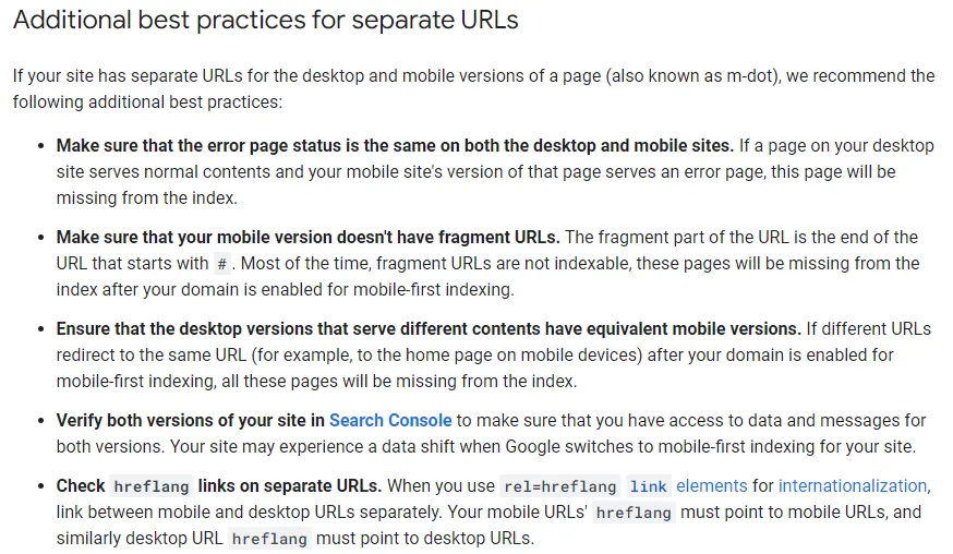
In-Depth discussion of using separate URLs;
Additional best practices for separate URLs;
I like to include additional resources that align with my lectures and I will be putting these ideas into practice in the next two modules. In this case, I have found four really good articles that relate to my next lecture on Fluid Measurements.
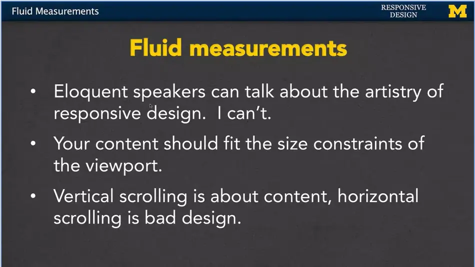
Hi, everybody. Today we're going to talk about fluid measurements. They're really important to responsive design. I've seen some really beautifully written and spoken presentations on how important it is to have these fluid measurements. And how the artistry of responsive design can make things just incredibly good. Just the fact that I use the word good explains that I am not that eloquent. I'm going to do my best to show you the technical reasons why you want to use fluid measurements.
The most important thing is that you really want to understand that your content, it needs to fit in the size constraints of the viewport. Don't try to make people use a certain size, it's your job to conform to them. If you go to a page and you have a lot of vertical scrolling where you have to go up and down, that's really about content, it's not something that we're going to concern ourselves with. If you have a lot of content, people are going to need to scroll. What's bad, what you really don't want is I hate when people have to do horizontal scrolling.
When you're on a page and everything doesn't fit in the screen so you've got to kind of look for it. We want to avoid that whenever possible.
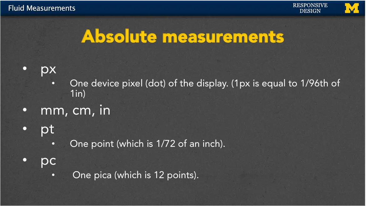
First, let's talk about absolute measurements. For many people, these may be the only type of measurements they've used when doing web design. And they do have their place, so let's talk about how we use them.
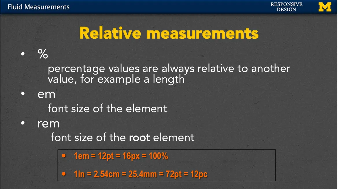
Let's start with percent. Percentage values are always relative to some other value, for example, a length. If you say you want something to be 75%, it's going to check the container it's in and make it 75% of that. The measurement came up with its name because it wanted to be the font size of the letter M element. It seems a little bit odd, because when you first think about it, it's going to be the same size by default. If you use one it's going to be that same size. 1.1 will make it a little bit bigger, 10% bigger. 0.9 will make it smaller than the default size.
Another thing that you can use is rem. rem is very similar to but it helps avoid that problem of something getting smaller and smaller and smaller. Let me show you an example.
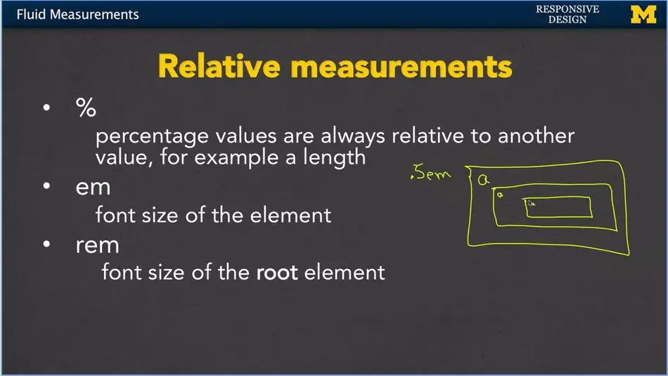
Let's assume we're going to set something up to be 0.5em and it's going to be inside this element in here. I'm going to make up a size and I'm going to say, it's this big. Okay, well, the problem is, if I have another element inside here, the a is going to be only half as big as that a. And if I have another a in here, it's going to be even smaller. So, when you use and you have things that are nested inside each other, the font can actually get smaller and smaller and smaller. And that might not be how you really want it to go.
If you use rem instead, 0.5rem. Instead, it's always going to be half the size based on the parent or the root element. This a is going to be the exact same size and the exact size in here. rem really helped people out when they were doing these kinds of complex sites where you had a lot of things embedded inside the other.

Now, the problem with teaching and learning about relative measurements, is that it's very abstract. I tried to include a little thing here to help you make it a little clearer. 1em is basically the equivalent of 12 points, or 16 pixels, or 100%. If you don't style your code in any way, you can assume that some of these defaults will fall in. I've tried to include this little chart here to make it a little bit more clear. In general, 1em is the equivalent of 12 points, which is the same as 16 pixels, which is the same 100%. So, you could use any one of these four. Now, the difference is, if you were to resize your screen and make it bigger or smaller, only the em and percent would adjust to the size of the screen. If you used point or pixel, as the screen gets bigger, the font stays the exact same size. Same if the screen gets smaller.
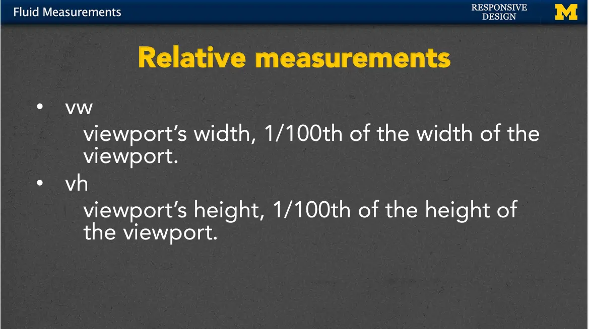
Two of the newer relative measurements are based on the viewport. vw stands for viewport width, so if you were to use one vw, you're saying, I want to use up 1/100th of the width of the viewport. It used to be the case that you needed to use Javascript to go off, find that width of the browser, return it, and do some math there. Now, we can just use it with vw. In the same way, you can use vh for viewport height.
The viewport's height is 1/100th of the height of the viewport. So, if you're on a screen, you'll know exactly how much real estate you have if you want something to show up exactly in the middle. This comes in really handy when you're trying to set headers and footers in specific positions.
Now, there are times that you're going to want to hardcode values with those absolute measurements. But, whenever possible, when you're coming up with your design, figure out, are you going to need that font, or that image, or that section to resize depending upon the viewport? Then, you want to use these fluid and relative measurements.
And I can't stress enough that you're not really going to understand how they work until you take some time, play with the code and just kind of see what you can make it do. For that reason, our next module/week (1-06) is going to be an example of me moving from absolute to relative measurements.
One of the things we always talk about is that there's a real difference between sitting and listening to me talk about something, and getting in there and coding it yourself, or at least following along with me while I code it.
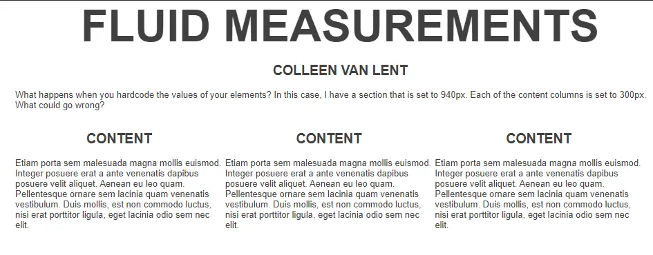
So, let's do an example as we go from static or absolute measurements to something that's more fluid. So, what I have here is a site where I've used absolute measurements to lay everything out. I have a large screen, and I have three columns. I'll check out the HTML quickly just so we can all follow along.
I've got my header, right here. Not much in it other than H1 and H2 element. I have a nice little paragraph over here where I basically say, I've hard-coded these measurements, what's going to happen when I resize the screen? And then, the last thing I have is really just a little bit of craziness. I'm going to pull it down here. It's just three divs, each of which has an H2 header and a paragraph. They all say the same thing, it's just some Latin filler, because I don't really care about the actual content itself. More importantly, let's look over here at the CSS.
In that main section, the main content of my page I've gone in and I've hard- coded the value to 980 pixels, the margin 0 auto, just means hey, make sure you center me, if I'm on a bigger browser. For each column, because I'm going to have three, I set the width to 300. Now 300, 300, 300 that's only 900 pixels. But, because I leave some margin in-between each column, it's important we add a little bit of extra padding there. Everything else is fairly straightforward. I have rules for the body and the H1 and H2. The only other real measurements I use are the fact that I set my font size to 13 pixels, and down here for the H1. I've set my font size to 64 pixels.
All right, let's take a look at this page when I really bring the content up, so it's something we can see. Here we go. I have it. I have a fairly large sized screen, in fact, if I maximize it, I can usually see how big it is. And it looks okay, but as I make the screen smaller, you're going to see that what happens is the content is hidden. If I scroll, I can't even scroll up and down. I'm trying. The only way for me to see more content is to scroll horizontally. And we all know that I absolutely hate that. In addition, this H1, the fluid measurement, the font is so big that it kind of overshadows the rest of the content.
So, I'm going to make this big again, and let's think about what we want to do. One of the keys to responsive design typically is mapping out what you want your page to look like before you code it, and we're going to talk about that in week two. But right here, for week one, let's just wing it a little bit.
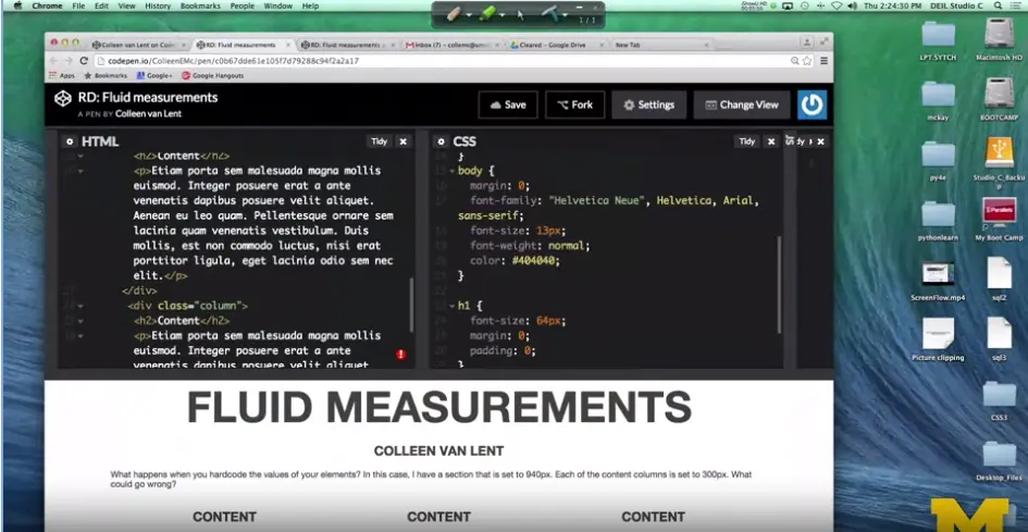
I'm going to make it so I can see my code. And the first thing I'm going to do is I'm going to go to the first place I hard coded a value, which is the width of this main part. Saying that I always want it to be 980 pixels, it's just a mistake.
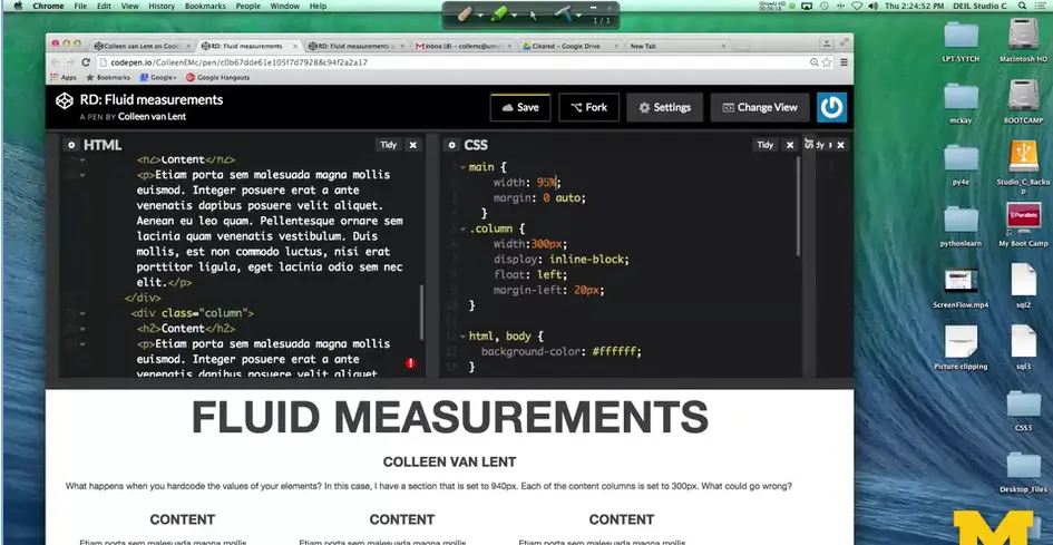
Instead, let's use percent here, and say I want this to take up, let's say somewhere between 95 and I'll pick 95% of my page. Already, you could see that things happened in there. Not everything we wanted to happen, but a little. I'll resize it again.
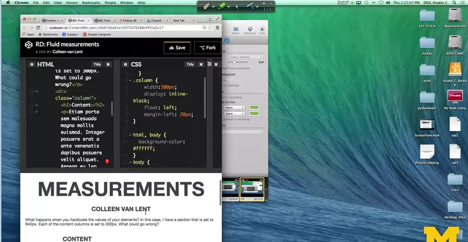
You can see that my paragraph down here still fits, but the columns just look at little bit awkward. Particularly, if I'm somewhere in that awkward range of two columns fit, but not the third. So, while the main page is responsive, let's work on those columns.
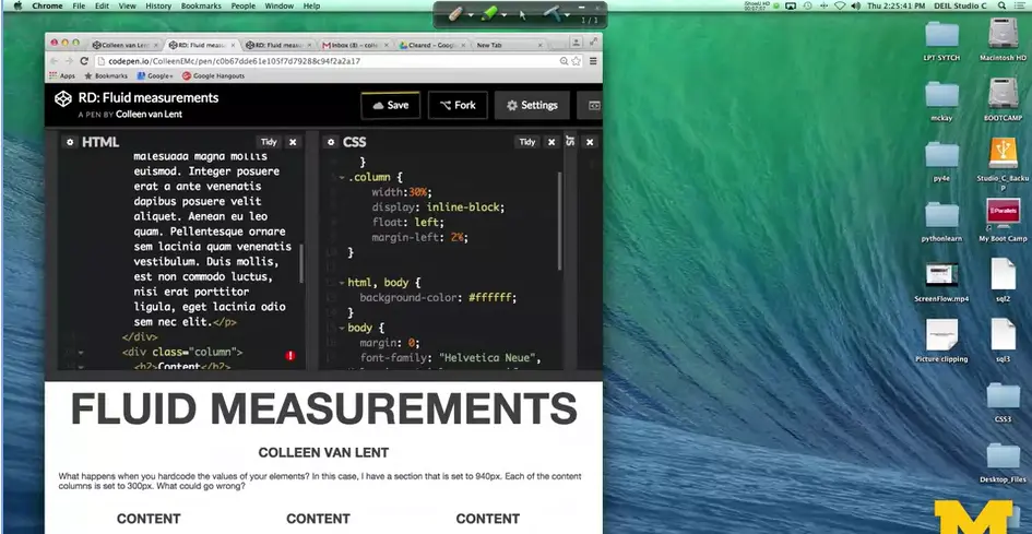
Here, I've set them to 300 pixels. Let's change that. Since I have three columns, again, I can set it to 33, 33, 33, but I'm probably going to end up with some overlap. So, I'm going to make these 30%, and I'm going to set the margin left to, we'll use 2%. Now you can already see this is a huge difference in our page. Whether I make it big, there's not a lot of wasted white space along the side. And if I make it small, the columns are still together. This is really good.
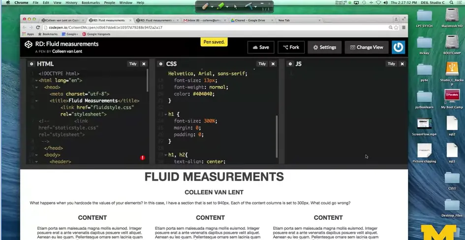
The last thing I'm going to change, I'm going to go ahead and change my H1, so I'm using the percent instead. I'll make it 300%. That'll be big. Okay, I'm going to save this, I'm going to resize, and when you go in, it will no longer be quite as dramatic over the entire page.
All right, so this is a fairly straightforward example of how we can take absolute measurements and change them do something that's relative or responsive to make our page a little bit better. This is just the first step, but it's an important step and it's something I want you to play with. So, you can feel like you're beginning to understand percents, ems, and other things like that. Good luck.
<!DOCTYPE html>
<html lang="en">
<head>
<meta charset="utf-8">
<title>Fluid Measurements</title>
<link href="fluidstyle.css" rel="stylesheet">
<!-- <link href="staticstyle.css" rel="stylesheet">
-->
</head>
<body>
<header>
<h1>Fluid Measurements</h1>
<h2>Colleen van Lent</h2>
</header>
<main>
<!-- Content -->
<p>What happens when you hardcode the values of your elements?
In this case, I have a section that is set to 940px. Each of the content
columns is set to 300px. What could go wrong?</p>
<div class="column">
<h2>Content</h2>
<p>Etiam porta sem malesuada magna mollis euismod. Integer
posuere erat a ante venenatis dapibus posuere velit aliquet. Aenean eu
leo quam. Pellentesque ornare sem lacinia quam venenatis vestibulum.
Duis mollis, est non commodo luctus, nisi erat porttitor ligula, eget
lacinia odio sem nec elit.</p>
</div>
<div class="column">
<h2>Content</h2>
<p>Etiam porta sem malesuada magna mollis euismod. Integer
posuere erat a ante venenatis dapibus posuere velit aliquet. Aenean eu
leo quam. Pellentesque ornare sem lacinia quam venenatis vestibulum.
Duis mollis, est non commodo luctus, nisi erat porttitor ligula, eget
lacinia odio sem nec elit.</p>
</div>
<div class="column">
<h2>Content</h2>
<p>Etiam porta sem malesuada magna mollis euismod. Integer
posuere erat a ante venenatis dapibus posuere velit aliquet. Aenean eu
leo quam. Pellentesque ornare sem lacinia quam venenatis vestibulum.
Duis mollis, est non commodo luctus, nisi erat porttitor ligula, eget
lacinia odio sem nec elit.</p>
</div>
</main><!-- .row -->
</body>
</html>
main {
  width: 95%;
  margin: 0 auto;
}
.column {
  width:30%;
  display: inline-block;
  float: left;
  margin-left: 2%;
}
html, body {
  background-color: #ffffff;
}
body {
  margin: 0;
  font-family: "Helvetica Neue", Helvetica, Arial, sans-serif;
  font-size: 13px;
  font-weight: normal;
  color: #404040;
}
h1 {
  font-size: 300%;
  margin: 0;
  padding: 0;
}
h1, h2{
  text-align: center;
  text-transform: uppercase;
}
Hi everybody. Today we are going to talk about Media queries.
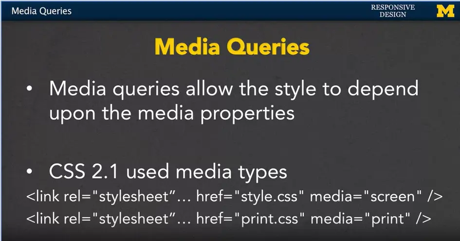
Media queries are going to allow us to adjust the style of out webpages, depending upon, the properties of the media we're looking at. We can look at the browser size, width, and other things to decide the best way to lay out our content. This all started with CSS 2.1. It allowed us to use different media types.
Inside your HTML you could have multiple links to different style sheets. But it wouldn't apply all the style sheets just some of them so here's an example;
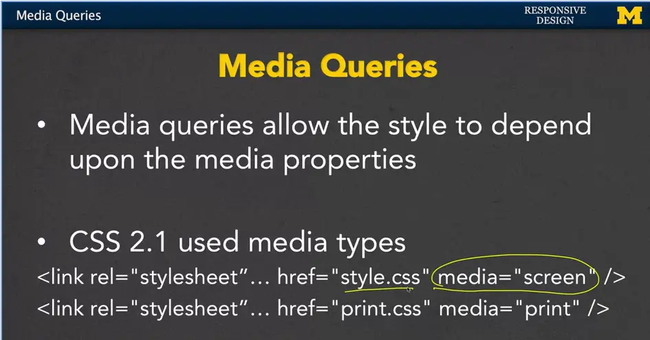
Right here the style sheet style is only going to apply when the content is being displayed on a screen. And for many of you, that's the only way you know of content being displayed. But for those of us who are older or just plain old we remember a time when on your computer you might want to print out directions someplace and so when you printed out the directions you had the option to turn on or off the pictures and other things like that.
For us when it came time to actually print out the directions, the computer would recognize that we're trying to print them out, and use a completely different style sheet. And this was a big step forward for us, because it allowed us to, again, have different content and style depending upon the platform.
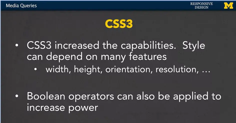
With CSS3, we have even more capabilities because the style can depend upon many more features. We can look at the width, the height, the orientation and even the screen resolution. In addition, we can add the Boolean operators to increase the power. And what Boolean operators are just simple “ands” and “ors”. So, you might want to say something along the line of, if it’s a screen and fill in some other properties there.
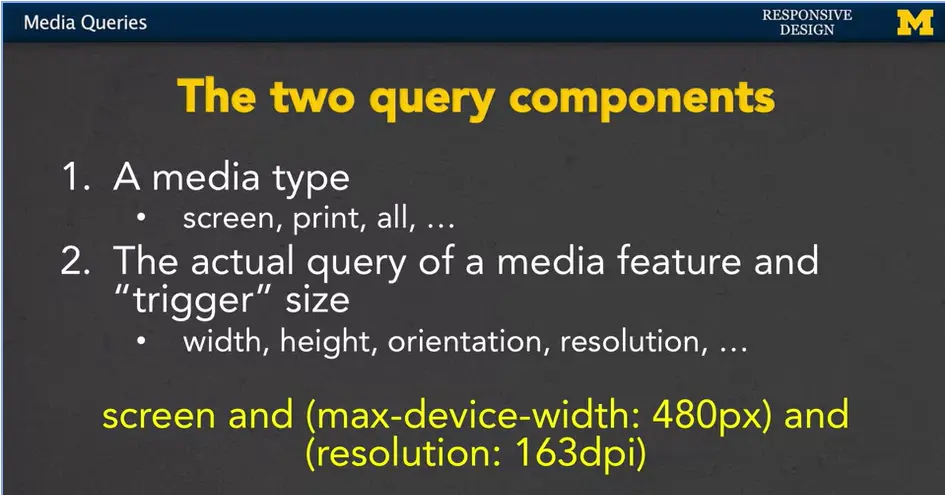
Let's look at some examples. Every media query has two components. The first is the media type. We often think of this as something along the lines of, will this be a screen? Is it a print out? You might even think about braille or if it's going out to a TV. We can also use the word all to trigger every possible media type that could possibly come up.
The second component is the actual query of the media feature and the trigger size that we want to be looking for. For example, we might be looking for very specific width, height, orientation or resolution.

Here's an example for you (see above).
The media type that I want to talk about is screen, the CSS will only apply if we're looking at a screen, but in addition, we also want to make sure that that screen has a maximum width of four hundred and eighty (480) pixels. And, a resolution, of one hundred and sixty-three (163), DPI. So, that's a lot of circling, and that's a lot of new words. But that's what we're going to talk about, for the next few slides, to help you really get this idea, of how every query has a media type and then some sort of trigger size and media feature.
There are three ways to implement media queries.
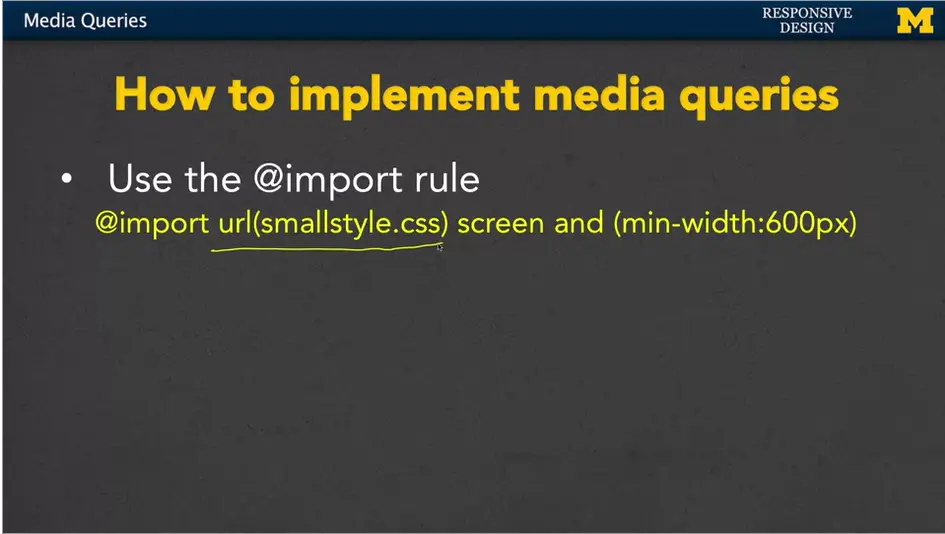
The first is to use the import rule. Inside your CSS, you would use import, you'd include the URL for the style sheet that you want to import, as well as the different size and conditions on when you want to import it. In this case if my screen has a minimum width of 600 pixels, we would want to use smallstyle.css.
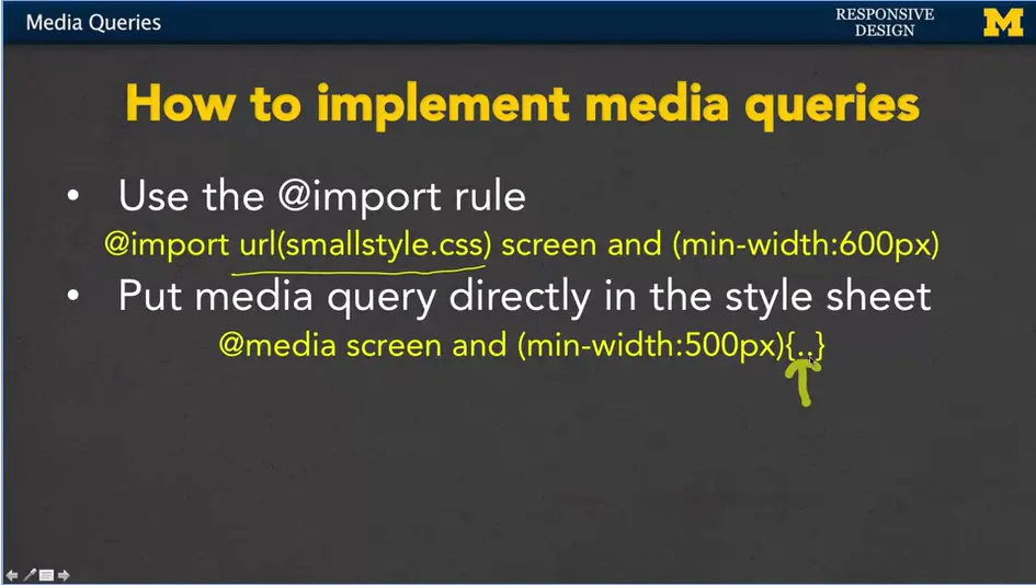
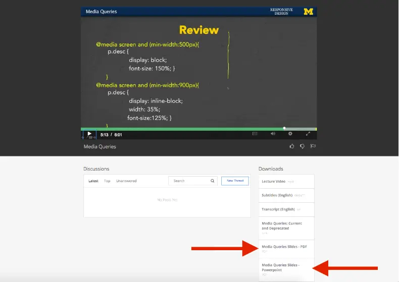
The second approach is to put the media query directly in the style sheet itself. We would have before any of our rules, we'd have the @media screen and (min-width:500px). And then inside here, we would put all of our usual CSS rules for the color, or the font, the size, different things like that. So, it's all contained inside a single file.
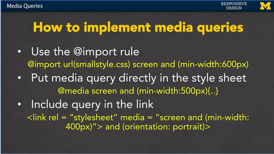
The third approach is to include the query in the actual link in the header of your HTML. So here, instead of just saying link this style sheet, we've included the trigger and the different rules right inside our HTML link tag.
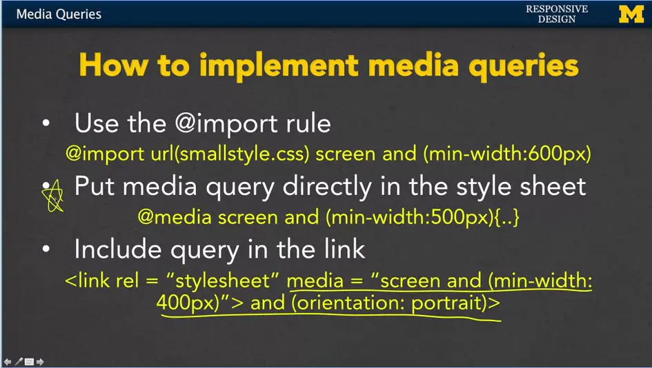
In general, I'm going to always stick to the second approach; Put media query directly in the style sheet. This is the one that I personally use for doing my responsive design, but that doesn't mean you shouldn't feel free to play with all three of these different approaches.
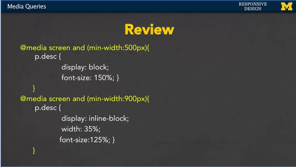
Let's review for just a second to make sure that we're on the same page with how we implement media queries.
In this case I've put my media queries directly into my CSS file. And what's going to happen is as always CSS start from the top and works its way down.
We're going to hit that first rule right here that's going to check and say, hey, I need to see if my display is an actual screen, not a printout or something like that. If it is, and the screen width is at least 500 pixels. Then I want to apply these specific rules right here. But I don't stop. Because this is the CSS, it'll continue to work its way down and check and say hey am I at least 900 pixels? If I am, I'm going to apply these rules too. So, it gets tricky at first when you're first learning how to do responsive design. We're going to do one together to get your hands wet and have you coding, just make sure that you start small and we'll go ahead and we'll do something together. Good luck.
Hey everybody, welcome back. Let's go look at some code together.
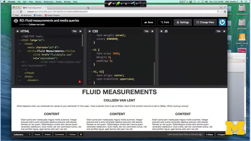
What we're looking at here is an example from when we first learned about fluid measurements. We went in and we switched our absolute measurements of pixels and started using percents. And it works out really well, unless you take it and you look at a small screen. Right now, the three columns are fine.
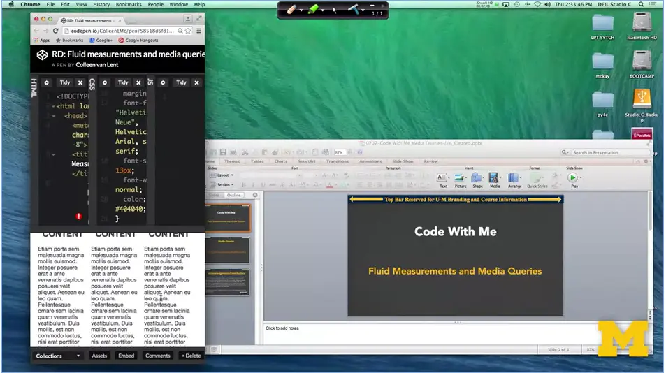
But when we get smaller, right here, it really doesn't make sense to try to shove three columns worth of content into such a small screen. This is where the idea of mobile first really comes in. What I think would be a much better look is to have each column stacked on top of each other and only go to three columns when you're on a large screen. So, let's take a look at how we can make that change together.
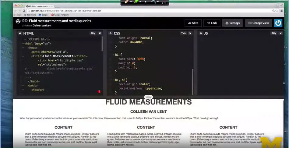
The first thing that we need to look at is what these columns are. And what we have is we have dibs each of type class equals column. The nice thing about divs is that by default, they're block. If we don't do anything at all they're going to be stacked just the way we want them to be. So, let's find our code. Right here. You can see that I went in and I said I only want them to be 30% and in line block. I floated them and all that great stuff there. The truth is, when we think mobile first, we shouldn't be changing anything at all in the column.
I'm going to take this code and I'm going to delete it. All right, I've done it, their block, and on the large screen, it looks really silly. But on the smaller screen we have success I was looking for. Now the question is, how do we go from a single column to three columns as we get bigger? And the answer is to use media queries.
So, I'm going to scroll down to the bottom of my CSS. And I need to add some code. How do we make a media query? Don't forget, it's all about putting in that type and that break point.
@media screen and (min-width:778px)
{
.column {
  width:30%;
  display: inline-block;
  float: left;
  margin-left: 2%;
  }
}
I'm going to put in at media screen. And, min-width, let's go ahead and pick a number. I'm going to say 778. All right, make this a little bigger so you can see it. What I'm saying is, hey browser, if you are this size or bigger, I want you to run some special code. And what code is it? It's that code that says, never mind, I don't want to be a single column, I want to be three columns. So, I'm going to put that back in there. Save it. And boom, it happened already.
It goes in, the browser figures out your size, and then goes in and makes any changes. This is hopefully pretty straight forward to you, although you might want to look at the code for a little bit, change the numbers. I'm going to change this to 1,200, right away it goes back. You can play with these break points, these are the break points that we talked about earlier, to find that perfect look for your page. As we make more and more complicated media queries, I really want you to go back and make sure you understand these simple ones first. Good luck.
<!DOCTYPE html>
<html lang="en">
<head>
<meta charset="utf-8">
<title>Fluid Measurements</title>
<link href="fluidstyle.css" rel="stylesheet">
<!-- <link href="staticstyle.css" rel="stylesheet">
-->
</head>
<body>
<header>
<h1>Fluid Measurements</h1>
<h2>Colleen van Lent</h2>
</header>
<main>
<!-- Content -->
<p>What happens when you hardcode the values of your elements?
In this case, I have a section that is set to 940px. Each of the content
columns is set to 300px. What could go wrong?</p>
<div class="column">
<h2>Content</h2>
<p>Etiam porta sem malesuada magna mollis euismod. Integer
posuere erat a ante venenatis dapibus posuere velit aliquet. Aenean eu
leo quam. Pellentesque ornare sem lacinia quam venenatis vestibulum.
Duis mollis, est non commodo luctus, nisi erat porttitor ligula, eget
lacinia odio sem nec elit.</p>
</div>
</main><!-- .row -->
</body>
</html>
main {
  width: 95%;
  margin: 0 auto;
}
html, body {
  background-color: #ffffff;
}
body {
  margin: 0;
  font-family: "Helvetica Neue", Helvetica, Arial, sans-serif;
  font-size: 13px;
  font-weight: normal;
  color: #404040;
}
h1 {
  font-size: 300%;
  margin: 0;
  padding: 0;
}
h1, h2{
  text-align: center;
  text-transform: uppercase;
}
@media screen and (min-width:1200px)
{
.column {
  width:30%;
  display: inline-block;
  float: left;
  margin-left: 2%;
}
}
Hi. Today, we're going to talk about wireframes and as we talk about them, I have to admit the way in which I teach web design doesn't really mimic the way you should really do it in the real world, in that I tend to talk about the coding aspects first. The things you can do to create something real right away. But this lecture should have really come earlier in the course, because your layout is one of the first things you should think about.
If you're going off to be a web designer, you're going to need to realize that coding comes after your design. And wireframes provide a visual representation of your layout. This is what you're going to use when you decide it's time to start coding.
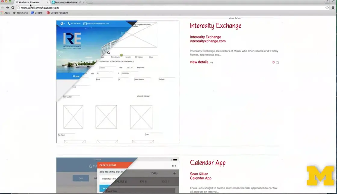
What do I mean by a wireframe? Let me show you a few examples. Right here, I'm at a site called wireframeshowcase.com.
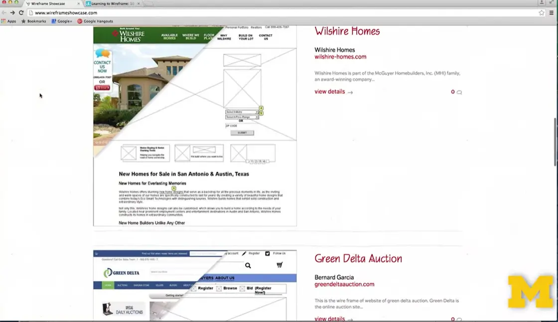
And If you scroll through the page, kind of up and down, you can see that you see a little bit of a few different pages. Real pages but also you see some graphical sketches underneath them.
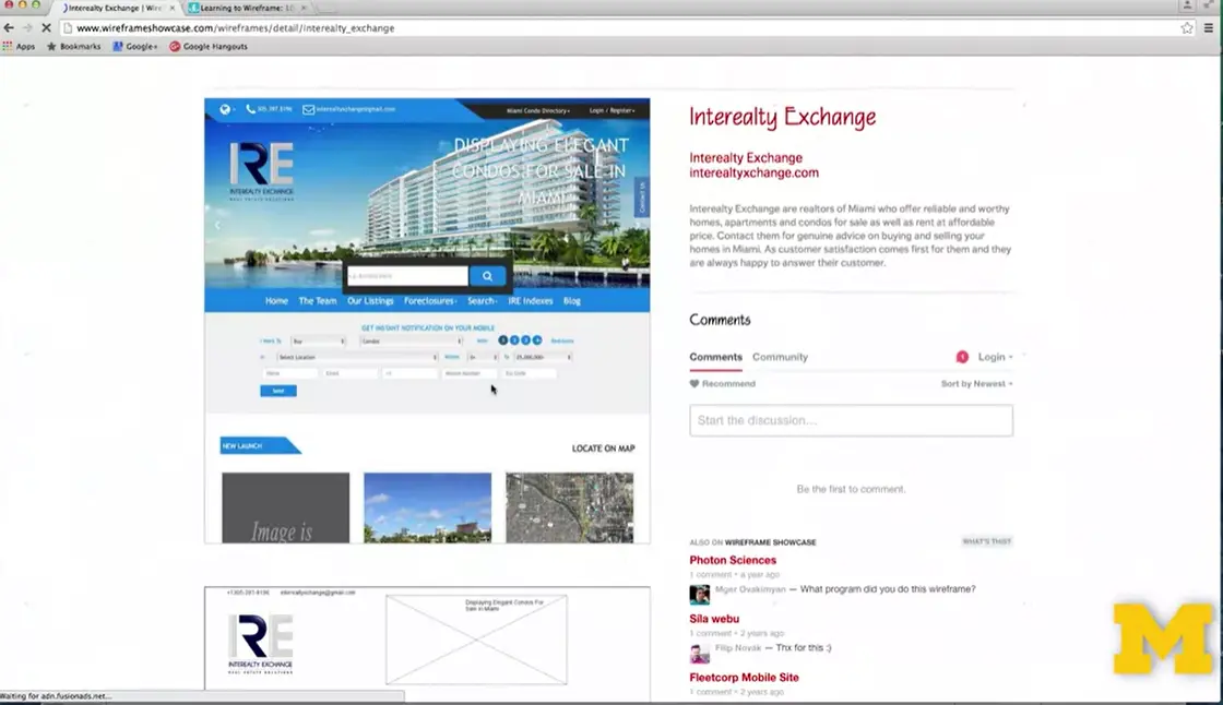
Let's go back up to the first one. Up here I'm going to go ahead and go in and kind of show you what it means when we click on the view details. When I hover over the page you can see what the site's going to look like when it's set out on the screen.

But when I've come off just a little bit, you can see that all those visual representations are actually based on very plain, very unstyled little documents. That's what we're going to talk about today.
So, before you can start drawing, you need to decide what you need to have on your page. This includes both text and graphics. If it really needs to be there, you need to know at the beginning. What is going to be the best layout for this material? Once you know what you need to have, you can start thinking about different things such as, on a mobile view, we might want a different type of navigation bar. We want all the same material just a different layout.
When we're on a laptop view you might decide you want to add a little bit of extras but first you need to figure out how you're going to lay out those necessities.
Again, as always, I'm going to remind you that the mobile view is the most important view in web design. If you don't think about the mobile view first, it's very simple for you to start coming up with a clear idea, and then as you shrink it down, throwing things out. No. At the beginning you decided this was important. So, if it is important, make sure you design it for that mobile view.
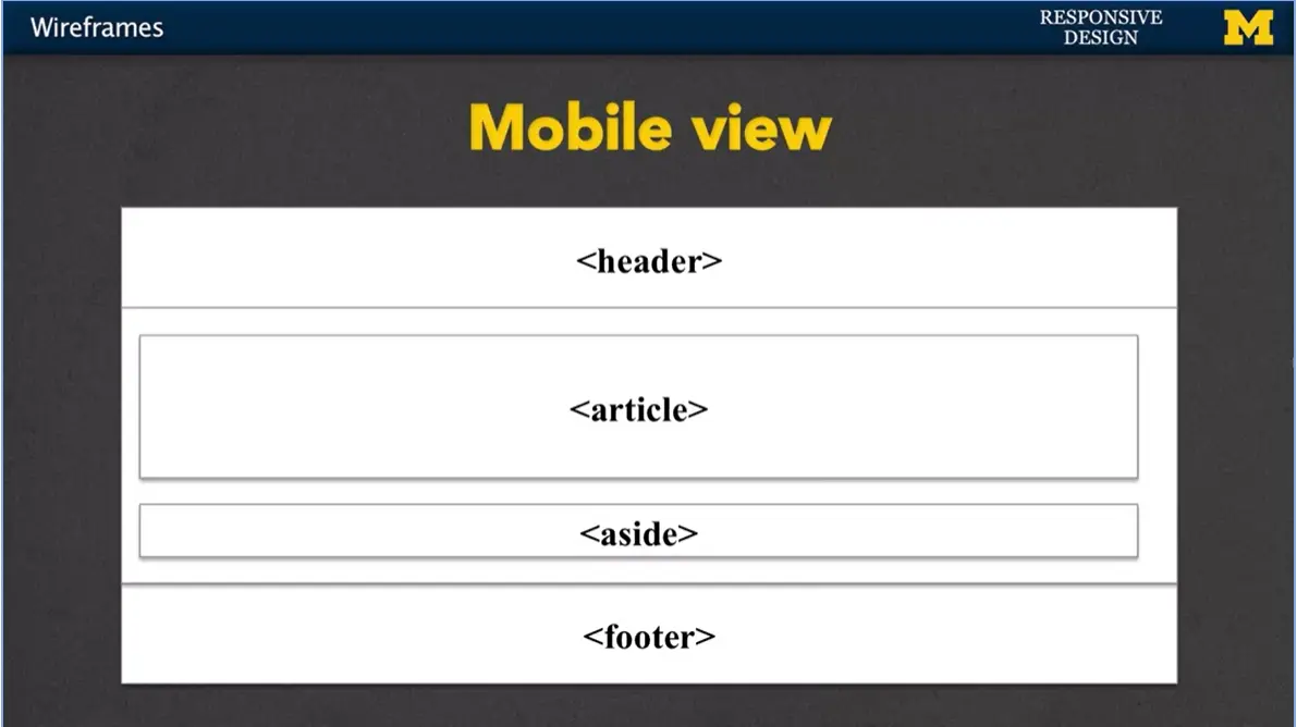
Let’s give an example. You might know that you want to have header, a section, inside that section you're going to have an article and maybe an aside, and you're also going to have a footer. Because you're on a mobile view, things tend to go right from the top down to the bottom and very few things side to side. We just don't have the space.
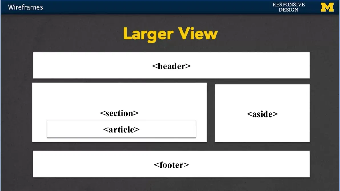
Once you've decided on that mobile view and you've sketched it out, you can go on to what you might want it to look like on the larger view. In this case the header and the footer are the same but we have more flexibility with where we want to put that other content.
You also want to think about functionality when you're doing your wireframes. The design should be about more than just the layout. You can use these wireframes to test out the interaction that your page might go through as well. Navigation, form inputs, different things like that. If you don't think about that at the beginning, you run into a lot more problems when it's time to code.
Did you want it to be a drop-down menu, a hover actions, we need to think about this functionality from the beginning.
Many people refer to sketches and wireframes and kind of wonder what the difference is. I always recommend starting with a sketch. With this idea with a sketch, is that you're just kind of drawing with your hand and it's very free-form. One of the reasons to do this is that I know when someone hands me a very nicely typed paper, or some nice computer printout, I'm more hesitant to give back feedback. Well, if you give me a nice kind of hand drawn piece of paper, you can really dive into it and say, no, what if you do this. You don't mind marking up their stuff as much.
When you do a sketch, when you do it by hand, you get less, I would say, attached to it. You're more likely to be willing to make changes because you didn't spend five hours getting the perfect border or putting things in just the right spot.
So, let's take a look at another place where I'm not going to cover myself, but there are places where you can figure out these kind of best design practices as you start sketching out your page and eventually moving on.
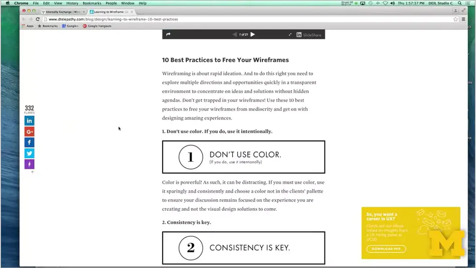
One of the reasons I like this site is well because I agree with many of the things they're talking about and they agree with me. But as you look around, you're going to see that most articles talk about best practices. These aren't rules, these are just ideas and suggestions for you to think about. So, for instance, one suggestion is don't use color.
Again, this goes back to the idea that wireframes and sketches are about content. It's about figuring out how you want to lay it out and use it. Once you start throwing in color, things start taking on more meaning when maybe they weren't supposed to. You want to be very consistent when you're doing your side. Don't worry about other things such as padding and spacing and certain little elements that might be different on a single page. Think about your over line sketch. The next one is always a problem for people because when you're designing you actually tend to get really into it. It's important that you use actual content in your page because when you do this it really helps you visually look at the page and realize, this part's getting lost or this section is really too big. Maybe I should be breaking it up in to more sections.
http://www.dtelepathy.com/blog/design/learning-to-wireframe-10-best-practices
Hi everybody. Every once in a while, I like to step back and think about some of the terms I use in this class and make sure I've actually defined them for you so we're all in agreement or understand what the general meaning is.
One of those terms is breakpoint. People hear it talk about it all the time when they're talking about responsive design, but what are they?
Breakpoints are sizes or positions that define a change in your site layout or content. So, you might say, I'm going to set a breakpoint at 500 pixels, 800 pixels and 1,000 pixels. And depending on those sizes you're expecting to see some sort of change.
We use these breakpoints to provide the best possible experience for users based on the device information we have. Now, there's more to it than just breakpoints.
You might also want to talk about resolution, whether using print, but breakpoints are really a key element that you want to understand. The other phrase I use quite a bit in conjunctions with breakpoints is this idea that they trigger something, breakpoints trigger changes. And to be honest, it may not be the best phrase to use. That's because most people don't actually resize their window when they're on it. You open up your screen and there it is.
As developers I encourage you to open up your browser, make it big, make it small, kind of resize it all the time. But most people aren't going to do that when they're viewing your page.
So, when we talk about triggering these changes, we often mean triggering rules in your style sheet instead. That's why I'm going to use breakpoints to refer to which rules I apply in different situations. So how do you determine what those breakpoints should be? While I'm teaching, I'm kind of notorious for just randomly picking numbers and throwing them out there, because I'm just trying to do things on the fly.
In the real world, people tend to set their breakpoints based on one of two things. The first is devices. They'll think ahead and think of all the different devices out there, and try to figure out which breakpoints correspond to the different machines. Other people feel strongly that you shouldn't think at all about the different devices that are out there. Because they change all the time. There's always a new phone, a new tablet, and you can't keep up with that. Instead, you should base your breakpoints based on the content of your page. You figure out what it is you want there and decide when will it really look good next to each other versus not. Let's talk about using devices as a breakpoint.
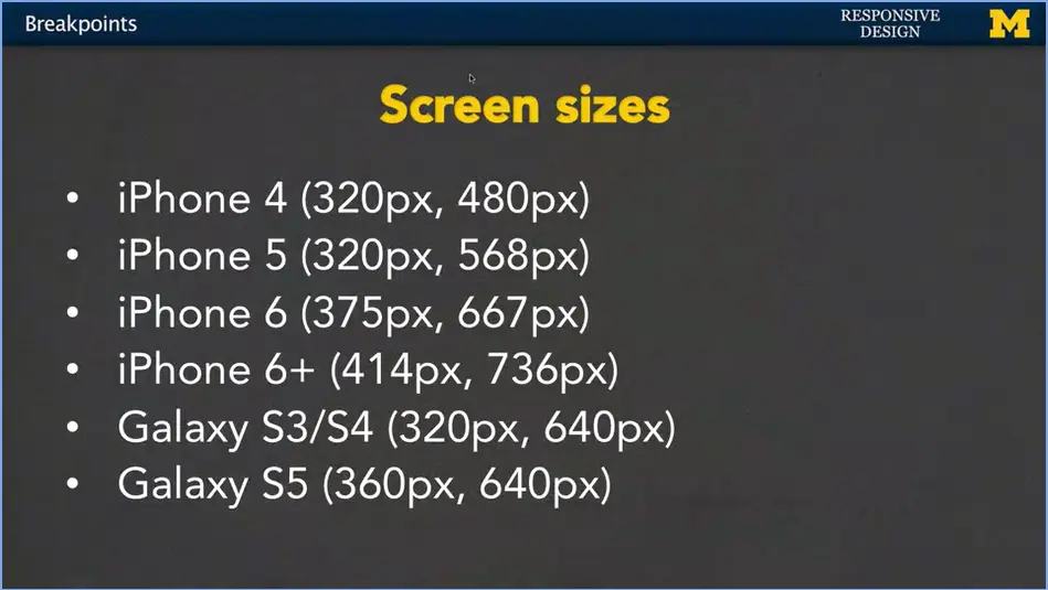
What I have here is just a quick little shot of some of the most common devices and their screen sizes.
I think this is how most people come up with their breakpoints. They'll look at the screen sizes, find some that are similar or find the lowest possible number for the smallest screens and maybe the biggest possible number for the larger screens and just build around those.
In most cases, your content's going to fill in just fine. And it would be impossible for you to go in and try to have a different view for each one of these sizes. And of course, when we talk about breakpoints, we want to talk about mobile first.
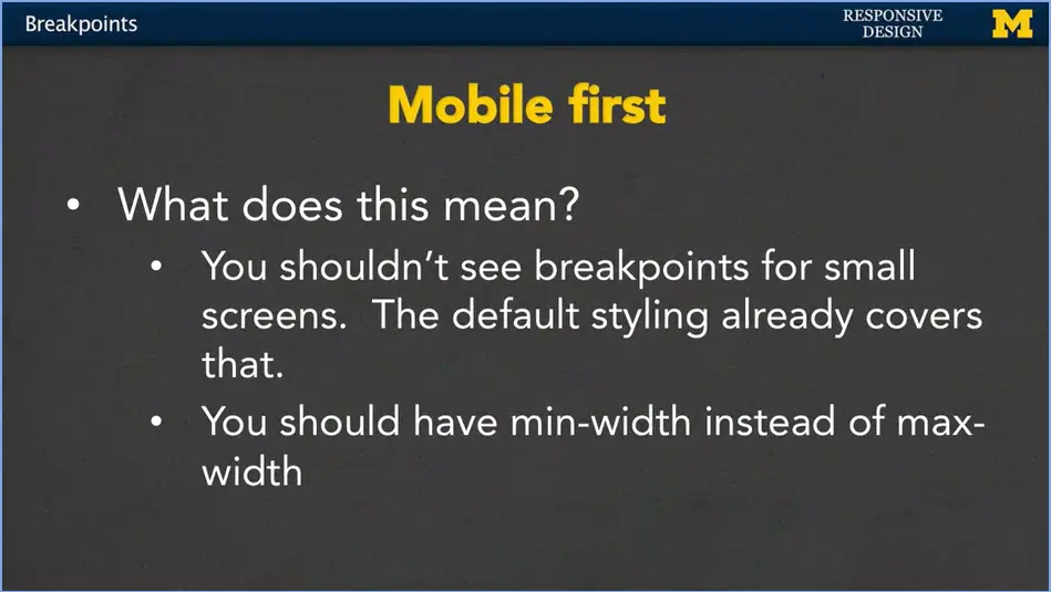
In a lot of paradigms, you're never going to see a breakpoint of 320 pixels or even 360 pixels. You're not going to see that because they're already designing as if the default style sheet covers the smallest possible screen. The good thing about this or the great thing about this means that your page is going to work successfully and show all of your content even on much bigger screens, because you don't have any breakpoints that you may or may not miss. So that's a really great thing about designing mobile first. That also means though, that if you're going to be using code that isn't yours, maybe you have someone else's style sheet.
If you see them using max-width instead of min-width in their rules, that means they did not design for mobile first and you might need to move things around. But as I mentioned at the beginning of this lecture, today, I really just wanted to talk about these key words. Breakpoints, triggering, mobile first. You won't really get a good feel for them until you've had the time to write some code yourself. So don't worry if you’re not familiar with them at first. But make sure you’re constantly thinking back, hey, what does a breakpoint mean again, is this an example of triggering, and I really hope you'll really understand mobile first by the time that we're done with this course.
Today's lecture is about media queries. And yes, I've already given you a lecture on media queries but I really want to give you another one. Because media queries are something that it's much easier watching me do it than doing it yourself. So today, three simple steps that I want you to try at your best to follow and then, we'll look at an example.
The key to understanding media queries is to actually use them in responsive design. This lecture is going to describe that process in three steps, but you won't necessarily need to use all of them.
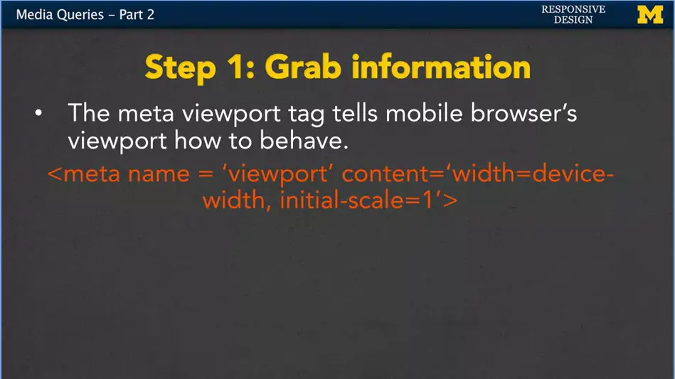
So, the best I can do is give you guidelines. Step one, this is something that will cause your page to work or not work many times on mobile phones. It's a simple bit of code that you want to include in the head of your HTML. What we have here is a meta tag. And what it's going to do is it's going to convey this information to your browser. We're going to be using different view ports. And it wants a browser to let your style sheets know, hey, how big you are? You're always going to leave the code exactly like this. You're simply saying, I want to know the view port, I want to know the content width, this initial-scale equals one that basely just kind of set what your size is going to be. Now, if you ever been to a site where things are really small and you want to make it bigger so you can read it a little better. And it just won't let you do that.
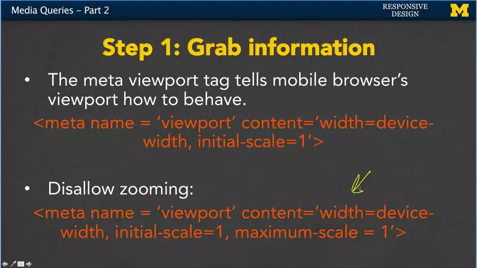
That is because somebody has put this very horrible, horrible piece of code into their HTML. Instead of saying just initial-scale equals one, it also has maximum-scale equals one. I mention this not because I want you to put it into your site, but because it's pretty common practice when you're first coding to use other people's code. So if you see this happening, you want to take it out. It's just a really bad experience for many people trying to use your page if they can't make things bigger or smaller. So that's step one. It's not only going to help your browser know that you're going to be doing responsive design. It may actually help your search engine optimization as well.
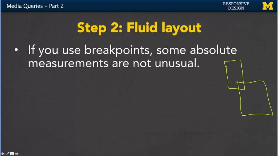
In step two, I really want to encourage you to use fluid layouts. It's very often the case that when people use breakpoints, they then use absolute measurements. The reason for that is if you think about it, they know pretty much how big the screen's going to be. They know that's going to be somewhere between here, That size and that size. Based on the fact that they know how many pixels wide the screen is going to be, they can hard code the width of some of their elements. You're going to see this in Bootstrap all the time. But, just because somebody else does it, doesn't mean the you should.
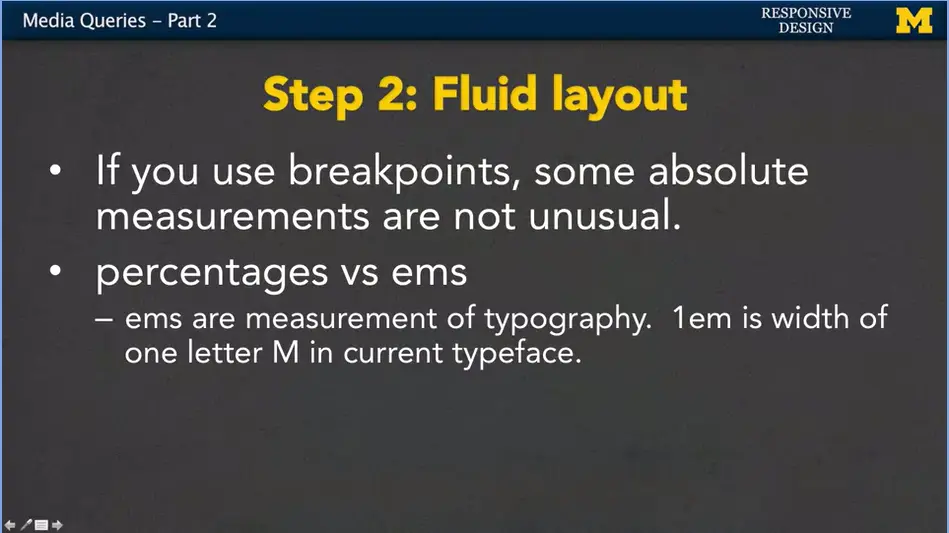
I want you to use those other things such as percentages, and ems. These are really great fluid measurements. Percentages you tend to use more on element such as images and dibs. Ems are a measurement of typography. So 1em is the width of one letter M. If you're not sure, you don't remember that, don't forget to go back and look at some of the fluid measurement modules. I also hear that Bootstrap 4, one of the platforms we're going to use is going switch over to ems and rems, too.
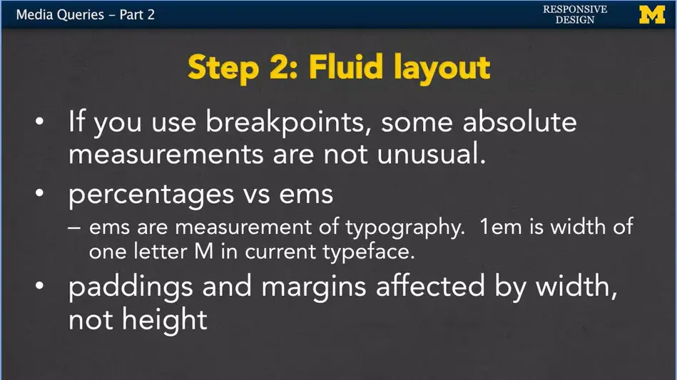
The last thing I just like to remind people is that when you use these fluid measurements for things like padding and margin, the percents are affected by the width not the height of your page. What does that mean? It means if you're page is this big, let's switch to the pen there. The padding is affected by how wide it is. So, 50% padding would pretty much give you something like this. If you make the page wider then you would get more padding. However, if you make the page the same but you make it taller, the height doesn't affect it at all. So, it doesn't seem like a big deal until you're stuck trying to code it. Just remember paddings and margins, when you use percent, they're affected by the width of the page, not the height.
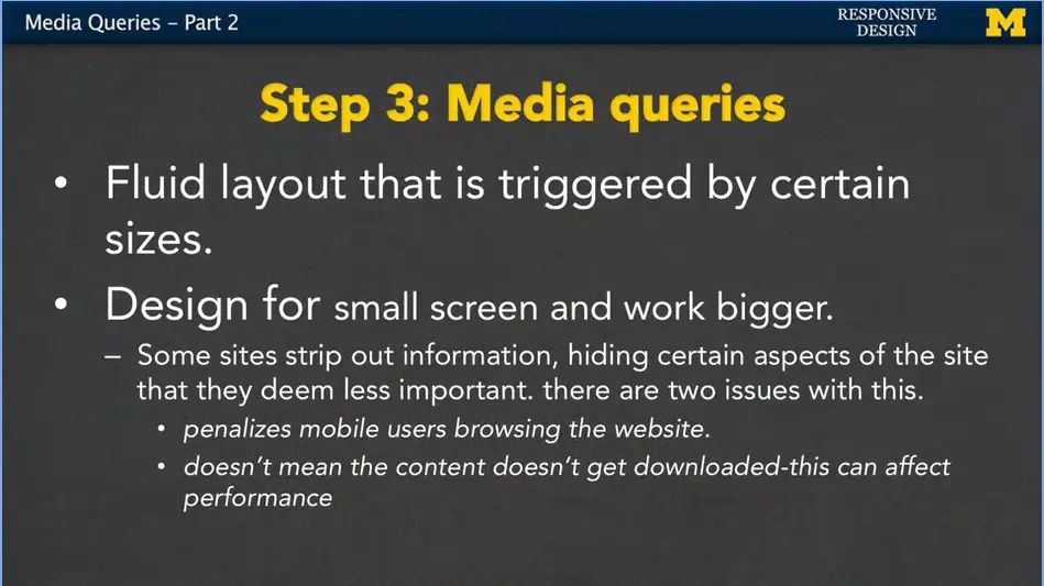
That third step is really the biggest step. And that is including those media queries. The fluid layout is triggered by these certain break points that you want to use. Design for that smaller screen and work bigger. Some sites like to strip out information, or even just set it to display none when the site is small, because they think, that's not really important information. Well, that's kind of you deciding for other people what they might want to see. It drives me crazy when I go to a site and I have to click on a link to go to large size view. Or when it just won't let me access information at all. You don't want to penalize your mobile users. You also need to realize that just because you set something to hidden or display none, the content might still be downloaded. And this can affect performance. They're still downloading big things like pictures. And you're eating up their data. So think small screen and grow bigger.
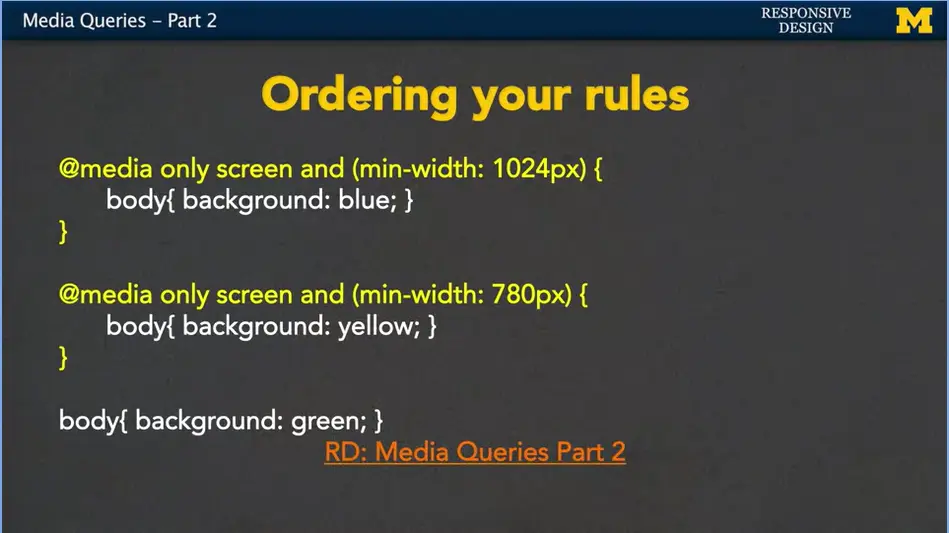
When you put in these media queries, it's common to have a few different sets of rules. You might have your large screen, and then a medium screen.
And then, here's my default mobile view. I want you to look at this and if you need to, I want you to pause the video and I want you to see if you can figure out why this is bad code. All right. Did you see it? Let's see. I added one additional rule here. I just added in some size. But if you notice, as I resize this window, nothing happens. Nothing is getting triggered. Why is that? Well, it’s because I haven't ordered things correctly. Style sheets always start from the top and work their way down. All right, so the first thing it’s going to do is it’s going to check and say, do I have a minimum width of 1,024 pixels? If you do, great. It's going to apply the background blue and the width of 25%.
But here's the problem. If you have a minimum width of 1,024 pixels right there, that means you also have a minimum width of 780. If it's going to happen when it's big, it's going to happen when it's smaller. So, this rule overwrites the one above it. And then down here, this one, it's not even inside a rule. You're basically saying always apply this styling.
Our rules are syntactically correct. This is a valid piece of code. It's the logic that we need to fix. Let's start by doing this. I'm going to take that default rule, and I'm going to move it up to the top. And as soon as I do that, let's see what happens. Well, one, you can see that it's now yellow, so we know that it's at least 780 pixels. But when I look at it, you can usually see it's actually 1,800 pixels, so I would expect it to be blue. But it is working on the small view, so that's good. So, we have two out of the three views. Well, that problem still exists that the order isn't correct. When you're triggering on minimum width, you want to make sure you're always testing for your smallest sizes first. Save this and now we have, I'm hoping it'll go from green to yellow, to blue. As you can see, I still added fluid measurements because as the size of the screen grows so does my H1, because I set it to 25%. These are the type of things that it's really simple to nod along, say yep, yep, I got it. And it isn't until you write your own code that you're going to accidentally make these mistakes and not know what's going on.
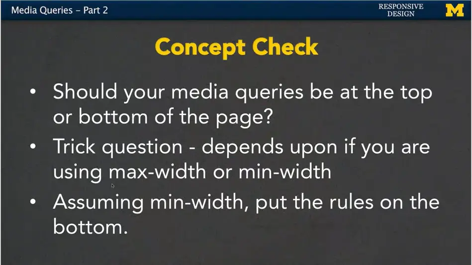
My advice to you is to always add one media query at a time, and make it something simple. Put in that media query, add a rule, test it, build from there. Add a new media query, add a rule, test it. It's the best way to make sure that your code's going to be clean. And with that, I'm pretty much going to leave you with a concept check here.
The question I'm going to ask is, should your media queries be at the top or the bottom of that page? Where you have your little at media. The example I just showed you is that, well, they should go closer to the bottom. Have all your default styling first, and then trigger media questions.
But in all honesty, it’s a bit of a trick question.
If you're assuming min-width, if you're doing mobile first, put the rules on the bottom. If you're using somebody else's code and they didn't use that mobile first paradigm, and they're searching for max width, then it’s completely the opposite you want to put those rules at the top. It can be tricky, and that's why I encourage you, to get into good habits at the beginning, and continue them as you get better and better at coding responsive design.
<h1>Media Queries Part Two</h1>
  <main>
  <p></p>
    This page should be Green on Small screen<br>
    This page should be Yellow on Medium screen<br>
    This page should be Blue on Large screen<br>
  </p>
</main>
/* Do these need to be reordered? */
@media only screen and (min-width: 1024px) {
  body {
    background: #0000FF;
    width:25%;
  }
}
@media only screen and (min-width: 780px) {
  body{
    background: #FFFF00;
    width:50%;
  }
}
body{
  width:100%;
  background: #008800;
  font-size:150%;
  }
Hi everybody, today, with this lecture I'm hoping you'll sit with me and write up some code where we use media queries to produce responsive navigation. In particular we want to make one page where the navigation bar is at the top on a small screen and off to the side on larger screens.
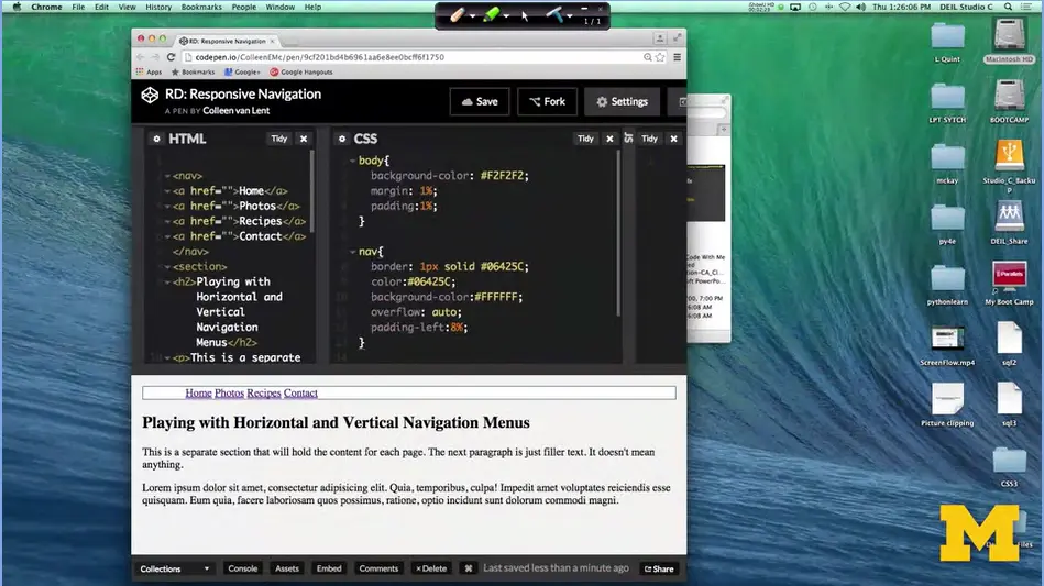
So, let's look at some code. What I have here is some HTML that doesn't have any styling on the navigation bar. What you have is a nice horizontal line of links right up here at the top of your page.
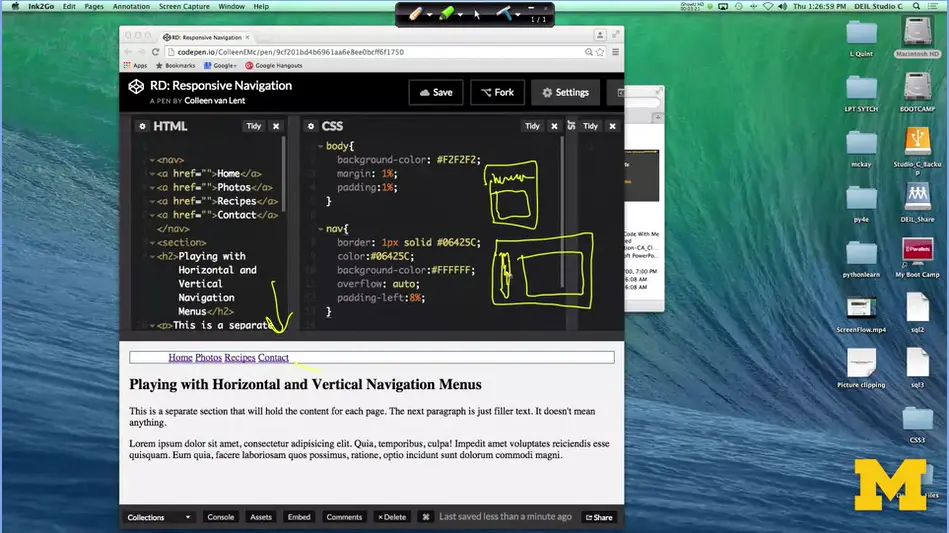
What I would like to do is design my page, so that on small screens, the navigation bar is still on the top. But instead, when I'm on larger screens, we have more room to play with. I want to put that navigation bar, off to the side. Let me draw you a little picture here. Small screen, I want the bar to be along the top here and then you'd have all the content. But on a larger screen, it can be this big, then I want my navigation bar to be along the side and we can put all the content right off to the right.
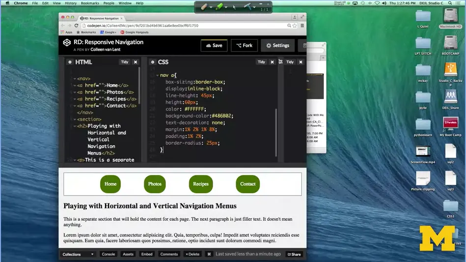
Let's take a look at how we're going to do that. Because we want to do mobile first, that means by default we already have it set up where the navigation bar is where we want it, but let's go ahead and add a little bit of styling. I'm going to cheat and copy and paste this in here for just a second.
What I've done, is I've just added a little bit of styling to not only the navigation, but now, we also have it so that the links themselves are also styled. I've put in some border radius, to make them nice and circular. I've added the margin and the padding. And, just in case you look at it, and kind of wonder what's going on, I've done a little trick that I do, in order to center text inside these little.
I've gone ahead and set the line height to 45 pixels. What this does is it gives this kind of little extra padding on the top and the bottom to help fill up the size. You should play with this, and see if you like it. Well even though we have it looking great, the way we want it on a small screen, let's see what happens when we make the screen larger. Well at the moment, nothing happens when we make the screen larger. And that makes sense because we didn't put in any media queries. We do have a slight bit of responsive design simply because I've used fluid measurements.
That margin and that padding, it's going to adjust as I resize the screen. But I don't just want things to adjust. I want a completely new layout, so let's get started. The first thing that I'm going to do is add in my media query. @media all and (min-width) I'm just going to go ahead and set this to 900 pixels. It's a nice big size, and it'll give us a really clear break point as to where we want things to change. So, I've done that, and now I can start adding new rules.
Some people love to jump right in, and start doing a whole bunch of coding. It would make sense that sense we're doing navigation bars that we would want to start adjusting the different navigation. I'm not going to do that thought. What I always recommend is somebody write a very simple, clear rule. The reason is, it's really easy for you to figure out whether or not your rules are triggering.
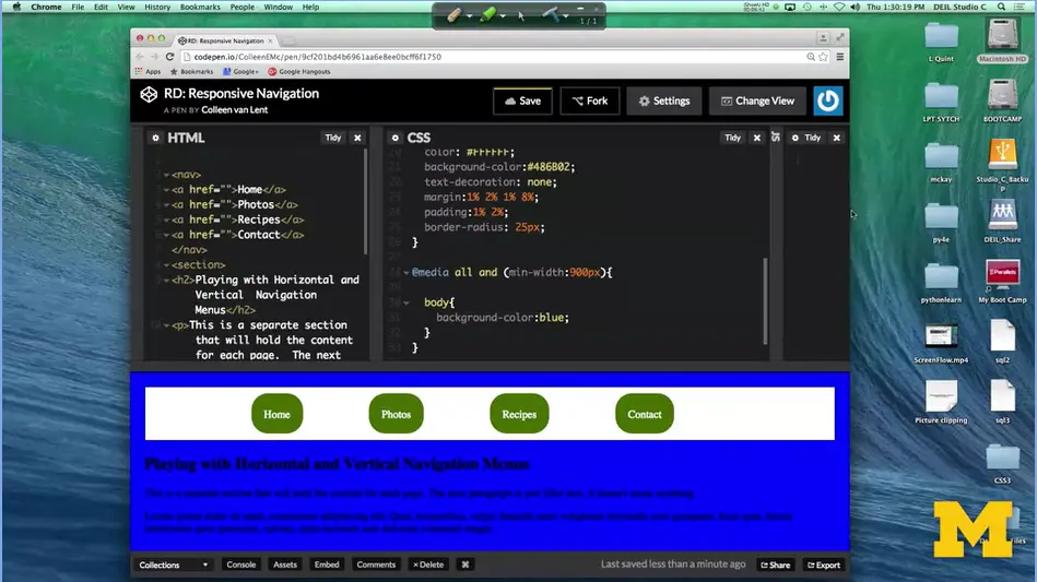
Let's go ahead and just change the entire color of the body of this page. Put in body, curly bracket, background, color, I'll just make it blue. All right it worked. If for some reason you typed that in and it didn't change anything on your screen, You want to stop. Don't start doing new complicated things if you can't even get this little one to get going. See if I can get away with grey. There we go.
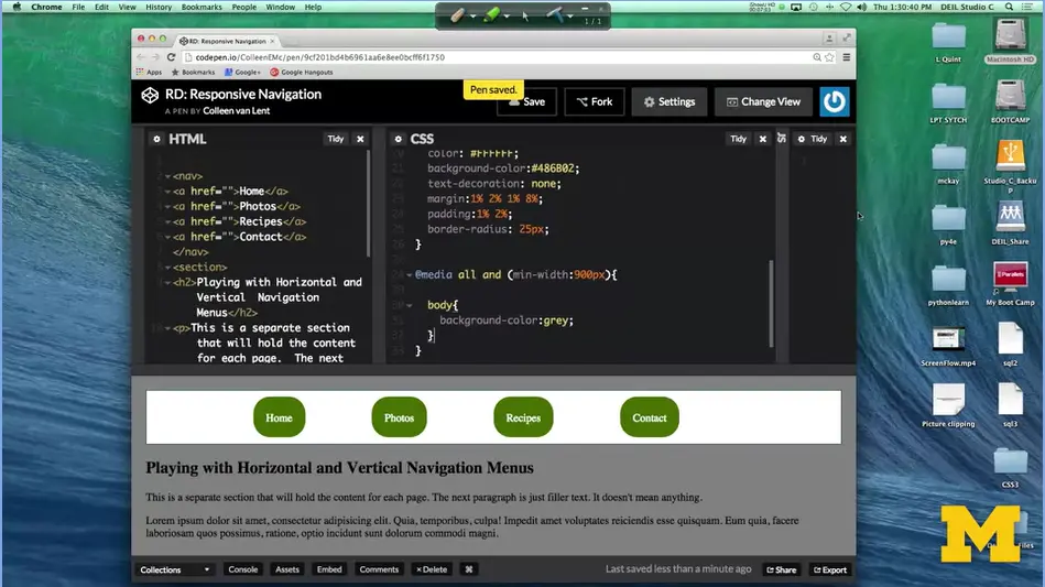
You can still see everything. If you run into problems, the parts you want to check are go in did you remember to have minimum width? If you do maximum width, then as you make it larger, it might trigger on and off. Make sure you've added the pixels at the end so it knows what it's looking for. Make sure you have two sets of curly brackets. Notice I have one set that starts my media query. And then a second one that goes with the body selector.
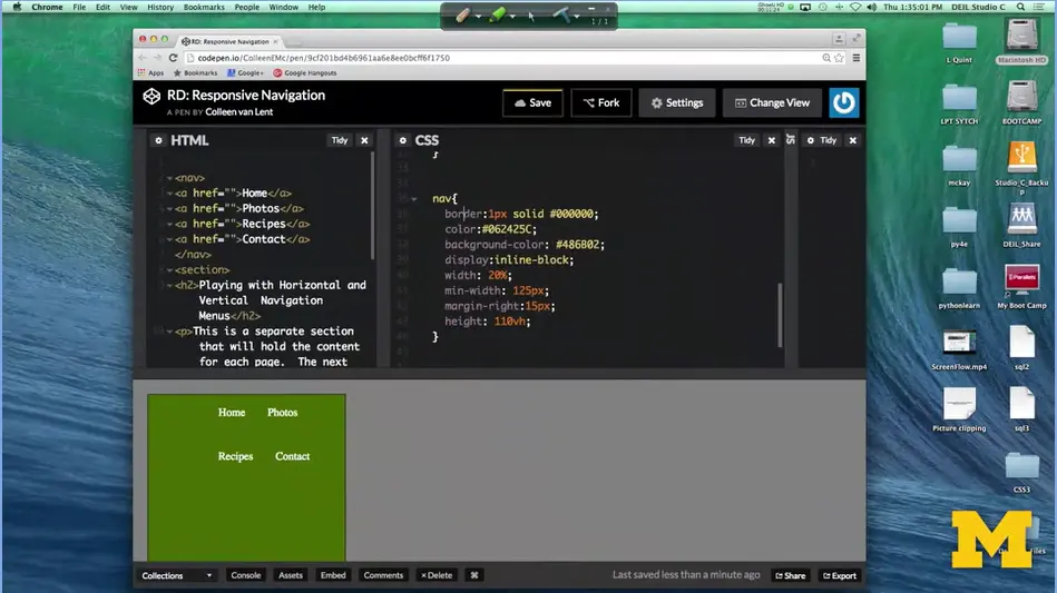
If that's going, let's go ahead and move on to how we would change that navigation bar to be off to the side instead of on the top. One of the first steps we're going to want to take is changing the styling for the nav tag. I have it for you, right here. The most important thing is that I want this to be off to the side, now. By default, nav is block, so it takes up the entire width. Now, I only want it to take up a small bit along the side. In fact, I said that I want it to take up 20%. As the screen gets larger, it will still take up 20% of the screen. I also have a min-width of 125 pixels because I just don't want it to get too small. This now has placed the nav bar off to the side, but it still doesn't look quite right. What I need, is I need to style those individual links as well. That they go right underneath each other. Let's do that next code. How do I do that?
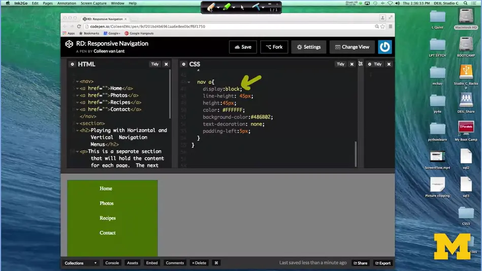
How do I get the links to go underneath each other? Well, that's not too hard if you remember some of the more advanced CSS you've learned earlier. The most important thing is that I want to make it display block, right here. Once you do that, well, now they have to go underneath each other. I played a little bit with the text decoration and the padding, but other than that, everything is just a little bit of extra styling.
The important thing for the layout was to make everything display block. Let's take a look at what we have for a second. We have our navigation bar and it's off to the side as we were hoping. And it only takes up some of the space. But we really wanted the content to be next to it. We wanted it to be over here to the side. And instead, it ended up underneath.
What do we need to do? If we were in class, in real life, I would sit there and stare at you, until someone finally raised their hand and made a guess. But, you're lucky, we're not there together.
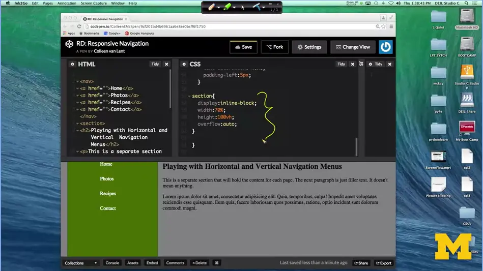
I'm just going to tell you. The problem isn't with our navigation, it's actually with the section that comes underneath it. I'm going to go down here. If you think about it, every section by default is block, so it's a simple enough trick to get these things to be next to each other. I'm going to add the code right now.
In order to get this to work I've added a little bit more code. I went in and I said, you know what, this section can't be block, it needs to be inline block. And since I made the navigation bar about 20% I went ahead and made this 70% because I'm not feeling like I want to do the math of the margins and the padding right now. I also set the height to 100 viewport height to take up the whole screen. I did have to go back and change one thing up in my nav as well.
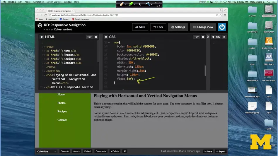
I had to add a float left, right down here if you look. And this is what lets these two things be next to each other off to the side. So let's take a look at what we've got.
On the big screen, we've got the vertical navigation bar. On the small screen, we jump back to the horizontal navigation bar. Neither one of these things had a lot of tricky CSS to it. But the important part was remembering to put in that media query, that's what triggers everything.
If you didn't code along with me right now, I hope you'll stop, write some code on your own and see if you can't get things to move around. Try to do it in such a way that you can see it really making sense. Where you know that on small screen phones they really do their navigation differently than if you're on a laptop. Good luck, and make sure to post questions if you run into trouble.
The following is a link to good examples of responsive design:
50 Examples of Responsive Web Designs.
<!DOCTYPE html>
  <html lang="en">
  <head>
    <meta charset="UTF-8">
    <title>Styled Navigation</title>
    <link rel="stylesheet" href="css/navigation.css">
  </head>
  <body>
    <nav>
      <a href="">Home</a>
      <a href="">Photos</a>
      <a href="">Recipes</a>
      <a href="">Contact</a>
    </nav>
    <section>
      <h2>Playing with Vertical Navigation Bars</h2>
      <p>This is a separate section that will hold the content for
        each page. The next paragraph is just filler text. It doesn't mean
        anything.</p>
      <p>Lorem ipsum dolor sit amet, consectetur adipisicing elit.
        Quia, temporibus, culpa! Impedit amet voluptates reiciendis esse
        quisquam. Eum quia, facere laboriosam quos possimus, ratione, optio
        incidunt sunt dolorum commodi magni.</p>
    </section>
  </body>
</html>
body {
  background-color: #F2F2F2;
  margin: 1%;
  padding:1%;
}
nav {
  border: 1px solid #06425C;
  color:#06425C;
  background-color:#FFFFFF;
  overflow: auto;
  padding-left:8%;
}
<nav>
  <a href="">Home</a>
  <a href="">Photos</a>
  <a href="">Recipes</a>
  <a href="">Contact</a>
</nav>
<section>
  <h2>Playing with Horizontal and Vertical Navigation
    Menus</h2>
  <p>This is a separate section that will hold the content for
    each page. The next paragraph is just filler text. It doesn't mean
    anything.</p>
  <p>Lorem ipsum dolor sit amet, consectetur adipisicing elit.
    Quia, temporibus, culpa! Impedit amet voluptates reiciendis esse
    quisquam. Eum quia, facere laboriosam quos possimus, ratione, optio
    incidunt sunt dolorum commodi magni.</p>
</section>
body {
  background-color: #F2F2F2;
  margin: 1%;
  padding:1%;
}
nav {
  border: 1px solid #06425C;
  color:#06425C;
  background-color:#FFFFFF;
  overflow: auto;
  padding-left:8%;
}
nav a {
  box-sizing:border-box;
  display:inline-block;
  line-height: 45px;
  height:60px;
  color: #FFFFFF;
  background-color:#486B02;
  text-decoration: none;
  margin:1% 2% 1% 8%;
  padding:1% 2%;
  border-radius: 25px;
}

@media all and (min-width:900px) {
  body {
    background-color:grey;
  }
  nav {
    border:1px solid #000000;
    color:#06425C;
    background-color: #486B02;
    display:inline-block;
    width: 20%;
    min-width: 125px;
    margin-right:15px;
    height: 100vh;
    float:left;
  }
  nav a {
    display:block;
    line-height: 45px;
    height:45px;
    color: #FFFFFF;
    background-color:#486B02;
    text-decoration: none;
    padding-left:5px;
  }
  section {
    display:inline-block;
    width:70%;
    height:100vh;
    overflow:auto;
  }
}
Hi, everybody. Frameworks is one of those words or terms that people really love to throw out there. The term framework can really mean different things depending upon who you ask and what they do.
The general agreement though, is that frameworks are meant to make your job easier by providing code and structure. Once you learn how to use a framework, you're able to develop your sites quickly and easily without changing too much code. So again, when we talk about framework, we want to think about what does framework mean here in this class.
For front-end developers, frameworks provide tools for CSS, JavaScript, and jQuery. They're these little bits of code that you can use to get an instant look that you're looking for. And sometimes an instant behavior that you're looking for as well with the JavaScript and the jQuery.
If you're a back-end developer, this is something completely different as far as frameworks go. Now you're looking at code that's going to help you do routing, resources, templates and security. This is something completely different. When we're done talking about frameworks, you might find that you don't necessarily understand some of the terms that other people are using. Just make sure that you realize that we're doing front-end development, not back-end development. In saying that, I think it's important that you know at least a handful of frameworks that people are using today.
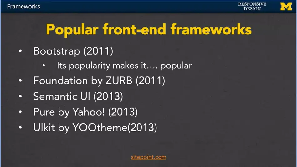
Templates are really interesting. Some people build their sites directly from the template. They grab some HTML code, they change it around, and they're done. They only provide the content and they still get a great looking site.
Other people develop their code on their own, but they'll go in and they'll use some frameworks to add little functionality that they don't want to code themselves, or they're unable to code themselves.
Now there are things such as pure coders, particularly computer scientists and the really, you know, us really geeky types, who sometimes think, nope, I'm going to write everything from scratch. I'm not going to use other people's code. I disagree with that. I think that if you want to learn web design, it's important that you get to know at least one popular framework. That way, you'll be able to communicate with others who are doing web design, and if need be, jump in quickly.
As we start to learn more about Bootstrap, I want you to understand that it's a tool, and it's supposed to be making your life easier. If it isn't, that's okay, you can go back to coding on your own, but you still want to know a little bit about it.
One key challenge of popular frameworks is how to make them work efficiently in the browser. When a user loads a web page, the browser needs to download all the HTML, CSS, and JavaScript, and then parse and render the page. If you have a lot of JavaScript code that needs to be executed before the page is fully interactive, the user might have to wait a long time before they can use the application.
This is where hydration comes in. Hydration is the process of taking the static HTML that was generated by the server and attaching JavaScript functionality to it on the client side. This allows the user to interact with the page right away, while the JavaScript code is still loading and running.
Image credit: Reddit
So, let's say you have a React application. When a user first loads the page, the server generates some HTML that includes the basic structure of the application. Then, when the browser loads the page, the React framework "hydrates" the HTML by attaching the appropriate JavaScript code to each HTML element, so that they can respond to user events and update the UI as needed.
The benefit of hydration is that it allows you to create complex, interactive web applications that run smoothly and efficiently in the browser. By separating the initial HTML rendering from the JavaScript functionality, you can optimize all aspects of the page/app loading speed.
Over the past decade, SPAs have become increasingly popular due to their ability to create dynamic and responsive user interfaces.
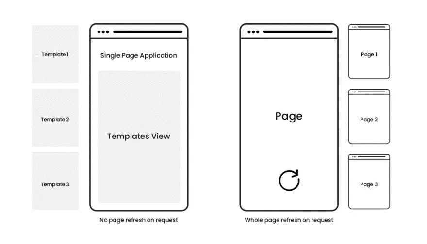
In fact, many of the most successful modern web applications, such as Gmail, Google Maps, and Facebook, are built using SPAs. This is because SPAs enable a seamless and smooth user experience by eliminating the need for page reloads and minimizing the amount of data sent to the server.
Another reason why SPAs are popular is that they allow for a cleaner separation between the front-end and back-end of an application.
With SPAs, the front-end is responsible for rendering the UI and handling user interactions, while the back-end is responsible for providing data and API endpoints. This separation of concerns makes it easier to develop and maintain large-scale applications.
JAMstack is a unique concept for building static web pages. Rather than implementing a back-end solution for content generation, an API is used instead. The end result is that the website is both faster, but also simpler to manage from the developers' perspective.
The definition for JAMstack:
As for stack, it's the combination of tools you're using. JAMstack can be used with any framework and service combination, so as long as it follows the JAM structure.
Learn more: Jamstack.org / WTF is Jamstack?
To use a JavaScript library in your app, add <script> to the <head> element using the src attribute that references the library source path or the URL.
Read the JavaScript library’s documentation you intend to use for more information and follow the steps provided there.
As we’ve said, JavaScript libraries are used to perform specific functions. There are around 83 of them, each created to serve some purpose, and we are going to cover some of their usability in this section.
You can use JavaScript libraries for:
And those are just the most common use cases. Other uses of JavaScript libraries include:
The following segment of this article is dedicated entirely to the frameworks themselves. The list goes down in accordance with the rankings we saw earlier. I have provided a general overview of each of the frameworks, as well as links to GitHub and the framework's website.


React.js (also known as ReactJS or React) is an open-source, front-end JavaScript library. It was created in 2013 by Jordan Walke, who works at Facebook as a software engineer.
React continues to dominate the front-end space. The framework stands out with its own virtual DOM, ensuring persistent app performance at scale. Likewise, the component-based structure means that development is more accessible across teams.
While the learning curve for React is moderately forgiving, the accessibility of tooling makes the process manageable. Namely, create-react-app automates the build process for an application boilerplate. And then there are React DevTools, providing an accessible debugging experience from the browser.
Thanks to the mass adoption of React, front-end developers can enjoy getting their hands on many open-source projects. For example, more than a dozen full-scale design systems are built for React. The number of hours this saves from the development process can be enormous.
Next.js is a React framework for building full-stack web applications. You use React Components to build user interfaces, and Next.js for additional features and optimizations.
Under the hood, Next.js also abstracts and automatically configures tooling needed for React, like bundling, compiling, and more. This allows you to focus on building your application instead of spending time with configuration.
Whether you're an individual developer or part of a larger team, Next.js can help you build interactive, dynamic, and fast React applications.
This feature enables you to maintain a similarity of appearance and functions in your project throughout. The layout is like that of multiple sheets of paper, giving it depth and order.
The Kit also includes several basic elements like sliders and buttons, badges, pagination, bars for navigation, menu, pills, and tabs among others. With the help of this React component library, you can customize the style, size, and color of most elements.
The JavaScript elements have modals, date-time pickers, tooltips, popovers, and carousels. You can not only use the Kit to start a new project but also restyle any old Bootstrap project. What’s more, the Material Kit React Pro version comes equipped with several other components, sections, and example pages.
It is more like an open-source tool that is used for building UI components in isolation for React and several other platforms and technologies.
What’s unique about Storybook? It enables you to work on a single component at a given time, making the development process a lot faster.
As one of the best UI frameworks for React, Storybook enables you to document components for reuse. It also allows you to automatically test your components visually in order to prevent bugs. Last but not least, an ecosystem of add-ons allows you to fine-tune responsive layouts, verify accessibility, and much more.
A significant feature of React Bootstrap CSS is compatibility, i.e., Bootstrap core compatibility and the world’s largest UI ecosystem compatibility. The framework has great compatibility with the hundreds of Bootstrap themes used by developers around the world.
The React Bootstrap eliminates the need for Bootstrap.js and jQuery dependencies in the code. React developers can even import individual components from the library. This feature results in faster development, shorter time to code, less code, better stability, and efficient code management.
This UI framework allows you to build your projects on the backend and then finally prototype them on the front end. And so, React Bootstrap can be a great pick for developers working on multiple aspects of apps. However, backend developers may not like the layout of the interface. This is because the use of reducers and actions replicates a front-end environment. And so, developers will need to alter their code or refer to the UI’s documentation to get used to it.
React Admin is great for creating business-to-business i.e., B2B admin applications on top of REST/GraphQL APIs. This framework is customizable by design.
This React UI framework is made up of several popular projects along with React: Material UI, Redux, React Router, as well as React Final Form. The latter is a well-known form of state management solution.
React Admin also offers an enterprise solution apart from their free version and components. This solution offers pro support from Marmelab along with access to private modules. React Admin has an active community and is hence pretty well-maintained.
React Toolbox is a React UI components library. This library can be used to implement Google’s Material Design principles in projects. React Toolbox uses CSS modules for this implementation. Although you can utilize any module bundler, React Toolbox integrates with webpack workflow seamlessly. What’s more, the React Toolbox team provides an in-browser editor where developers can play with components in real time.
You can import components in raw components or bundles while working with this library. The main difference is that for the latter, the components come with all required dependencies and themes injected for you.
In other words, the CSS for each dependency will be available in your final CSS automatically and raw components don’t include any CSS. This means that you will need to provide a theme via properties to the component for it to be properly styled.
If you are working on an application that is data-heavy in the front end, React Virtualized should be your choice. Virtualized has a set of reusable, lightweight components that can render large datasets efficiently.
One of the most useful features of React Virtualized is that it uses windowing and virtualization techniques to optimize the rendering of large lists, tables, and grids. It is great for the performance of your application as it only renders the elements that are visible on the screen instead of all the elements at once.
Another benefit of React Virtualized is that it provides a set of helper functions and utilities to assist with common UI patterns, such as infinite scrolling, dynamic row and column sizing, and responsive design. It supports both fixed and variable row heights, and it provides a flexible API for customizing the behavior and appearance of its components.
React Router is a popular compact library for React. It allows developers to build single-page applications with dynamic, client-side routing. React Router is designed to work seamlessly with React, and it allows developers to declaratively define the routes of their applications using JSX. This makes it easy to create complex and hierarchical navigational structures within a single-page application.
One of the key benefits of using React Router is its ability to perform code splitting, which allows developers to load only the necessary components for a given route, reducing the initial loading time of the application and improving performance.
Another benefit of React Router is its support for managing the browser’s history, which enables users to navigate through the application using the browser’s back and forward buttons.
Semantic UI integrates with React to offer a customized library of user interface components. Semantic UI does not have the virtual DOM, as it is independent of jQuery methods. The Semantic UI React library offers several customizable elements for front-end development.
Semantic UI is an open-source project on GitHub that is useful for designing CSS style sheets with React framework. The Semantic UI framework features augmentation for building responsive web pages with unique component functionalities. The subcomponents offer better control over accessing and editing markup, and an auto-controlled state enables better utilization of components.
Material UI (MUI) includes pre-built material components and themes for designing user interface elements with React. Material UI has tools for navigation, sliders and drop-down menus, and a lot more customizable component. The MUI elements adhere to the Google Material Design standards that improve the application speed.
The Material UI offers many tools and APIs for assisting native mobile app development. MUI features automatic color changes and interoperability between styling components and CSS-based modules.
Also, read: How to Successfully Find and Hire the Best React Native Developer in 2023
A large community of active front-end developers prefers MUI over other frameworks. The framework aids software developers to deal with the documentation and clear out their concerns and doubts.
React Redux is a predictable component library with a simple interface and solid code-testing capabilities. When developers enter the values for the components, the interface fetches, updates, and apprises the values automatically. Redux has several DevTools to spot application state changes, maintain logs as well as send error reports.
Redux is one of the most popular React libraries, with more than 21,000 GitHub stars. Redux works great with Angular, React, and many more JavaScript frameworks. Developers can connect React code to several components, write consistent code, and edit it while the app runs with Redux.
Yet another popular mention in this list of best React frameworks is Blueprint UI. This is a well- known CSS-based React framework for the front-end development of computer apps.
Blueprint UI is best suited for designing UIs for complex and data-intensive web pages. Blueprint UI has a CSS library of 30 components with options for minimal scripting and coding.
Blueprint UI boasts of a multi-touch interface that’s easy to use, intuitive, and great for developing websites and applications efficiently. This React framework also includes core components with distinct components for selection, date-time, tables, icons, and more. Blueprint UI has dark and light-themed modes and customizable design elements like classes, typography, and color scheme.
HPE developed Grommet as a CSS framework for React with component packages for building responsive and intuitive mobile websites. Grommet offers a dynamic and vibrant layout, great accessibility, catchy themes, modularity, as well as simplicity. Grommet can be integrated into existing projects or used to create new ones with advanced themes.
Grommet has an icon component with a massive bank of SVG icons to aid front-end development. The Grommet library also offers components for customizing UIs with utilities, media options, input visualization, layouts, and colors, as well as controls.
This list of the best React frameworks would be incomplete without Ant Design. Ant Design is a CSS framework for React that developers extensively use to create appealing UI components. Ant Design offers an expansive design library for front-end development and a GUI design for client development. The framework’s design elements are simple to integrate, and its components can be directly used with React.
Ant Design has many customizable themes, design elements, and development tools.
The Ant Design library has more than 50 components and helps design UIs for enterprise-grade applications. More than 100 companies use Ant Design for their projects, thanks to its flexible design and features.
Next up on our React JS framework list is Chakra, a React component library that requires less time for writing code. The Chakra UI enables faster development and offers accessible, modular, and flexible UI components for building applications.
Chakra UI enables React developers to create newer components efficiently. In Chakra UI, the components are customizable, reusable, and adhere to the WAI-ARIA standards.
With dark and light UI options, themes, and 49+ components, Chakra UI includes various inputs, accordions, tips, and icons. Though the Chakra UI library is new, the community is active in resolving doubts.
The Microsoft team developed the Fabric React UI library (so you know it’s a real piece of dog shit), and later it was renamed Fluent UI. The components and graphics resemble MS Office products and share compatibility with OneNote, Azure DevOps, Office 365, and more. The default settings of Fluent UI are suitable for most projects.
Fluent UI contains pre-built components like inputs, notifications, menus, and more for developing applications.
In Fluent UI, the components are customizable and offer a straightforward approach to web development. The Fluent UI library also offers cross-platform compatibility, supporting desktop, Android, and iOS devices.
Segment developed the Evergreen React UI framework with 30+ components. The components are built on top of the primitive React UI, with commonly usable patterns. The default and classic themes combined with the Evergreen Figma library make it easy to create components in CSS.
As a CSS library for React, Evergreen contains a collection of React modules with React Primitive. Also, Evergreen v6 hosts an updated theme API for better customization and accessibility. The Evergreen library is easy to edit, contributor-friendly, and offers flexibility for creating UIs.
Which UI is best for ReactJS?
UI frameworks like MUI (Material UI), React Bootstrap, React Redux, and Semantic UI are some of the best UIs for ReactJS. Ant Design, Chakra UI, Fluent UI, and Evergreen are also popular UIs.

jQuery is a classic JavaScript library that’s fast, light-weight, and feature-rich. It was built in 2006 by John Resig at BarCamp NYC.
jQuery is a fast, small, and feature-rich JavaScript library. It makes things like HTML document traversal and manipulation, event handling, animation, and Ajax much simpler with an easy-to-use API that works across a multitude of browsers. If you're new to jQuery, we recommend that you check out the jQuery Learning Center.
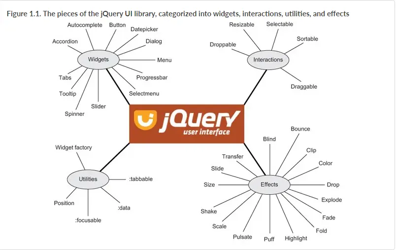
Interactions add basic mouse-based behaviors to any element. You can create sortable lists, resizable elements, drag & drop behaviors and more with just a few lines of code. Interactions also make great building blocks for more complex widgets and applications.
Widgets are full-featured UI controls that bring the richness of desktop applications to the Web. All widgets provide a solid core with plenty of extension points for customizing behavior, as well as full theming support.
Effects add support for animating colors and class transitions, as well as providing several additional easings. In addition, a full suite of custom effects are available for use when showing and hiding elements or just to add some visual appeal.
Utilities used by jQuery UI to build interactions and widgets.
jQuery UI offers a combination of interaction, effects, widgets, utilities, and themes designed to work well together or on their own. Play with the demos, view the source, build a theme, read the API documentation and start using jQuery.
Also, jQuery UI is a curated set of user interface interactions, effects, widgets, and themes built on top of the jQuery JavaScript Library. Whether you're building highly interactive web applications or you just need to add a date picker to a form control, jQuery UI is the perfect choice.
jQuery UI is built for designers and developers alike. We've designed all of our plugins to get you up and running quickly while being flexible enough to evolve with your needs and solve a plethora of use cases. If you're new to jQuery UI, check out our getting started guide and other tutorials. Play around with the demos and read through the API documentation to get an idea of what's possible.
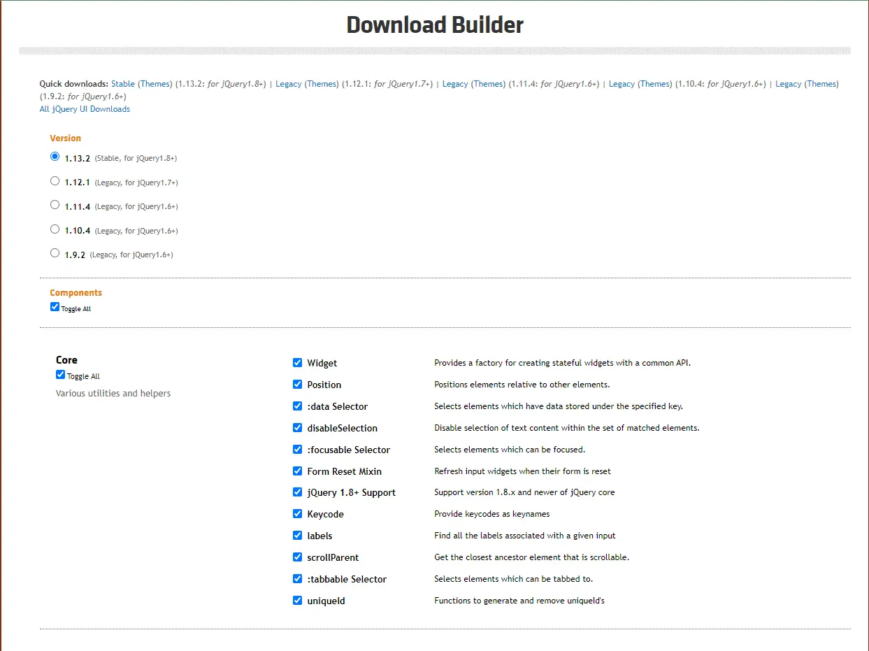
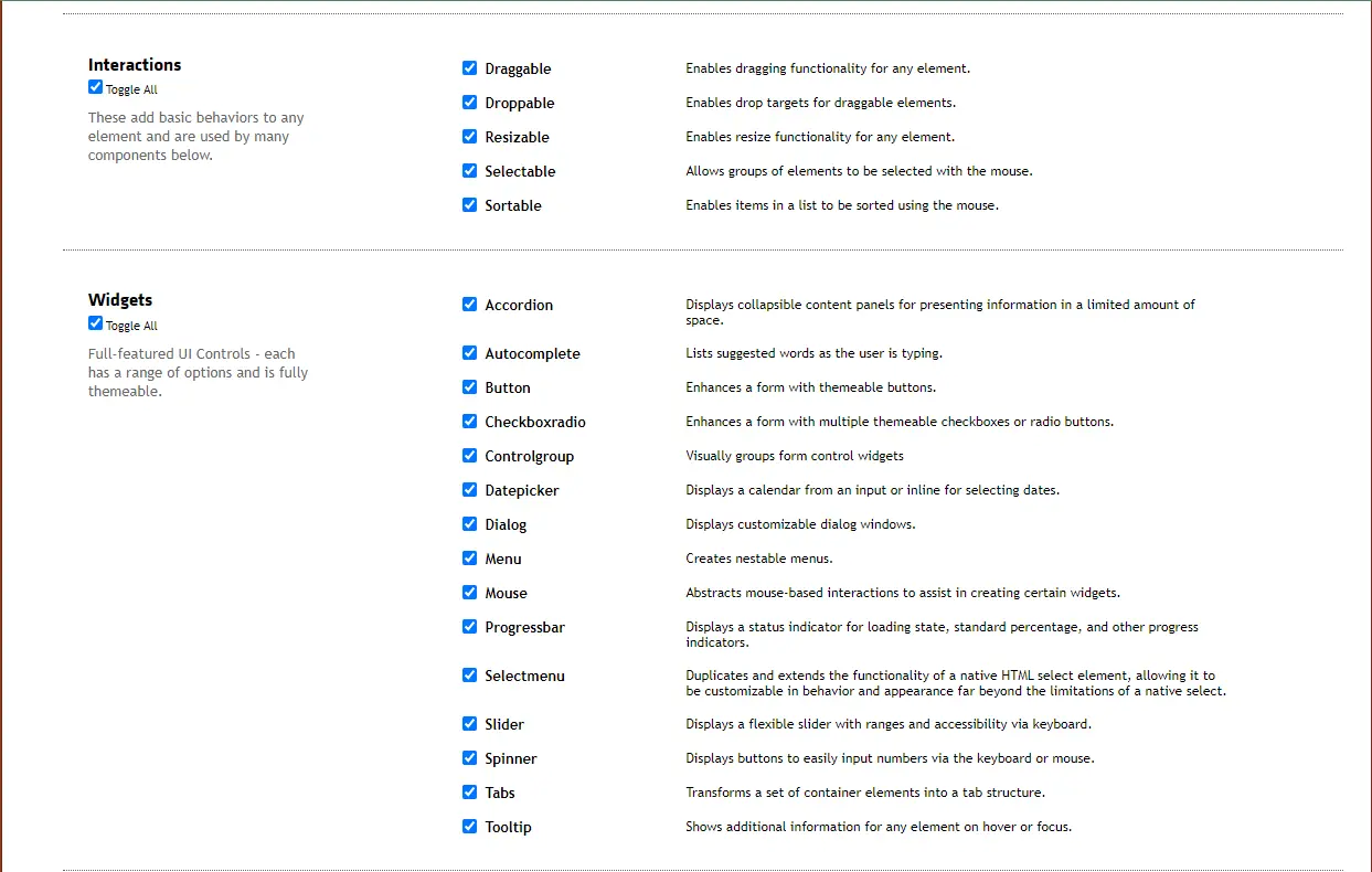
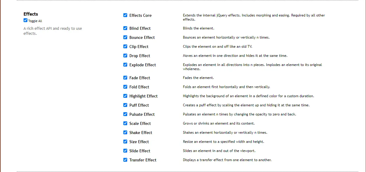
Next, open up index.html from the downloaded zip in a text editor. You'll see that it references your theme, jQuery, and jQuery UI.
Generally, you'll need to include these three files on any page to use the jQuery UI widgets and interactions:
<link rel="stylesheet" href="jquery-ui.min.css">
<script src="external/jquery/jquery.js"></script>
<script src="jquery-ui.min.js"></script>
https://cdnjs.cloudflare.com/ajax/libs/jqueryui/1.12.1/jquery-ui.min.js
Once you've included the necessary files, you can add some jQuery widgets to your page. For example, to make a datepicker widget, you'll add a text input element to your page and then call .datepicker() on it. Like this:
<input type="text" name="date" id="date">
$( "#date" ).datepicker();
Bootstrap is a powerful, feature-packed frontend toolkit. Build anything—from prototype to production—in minutes.
Include Bootstrap’s CSS and JS. Place the <link> tag in the <head> for our CSS, and the <script> tag for our JavaScript bundle (including Popper for positioning dropdowns, poppers, and tooltips) before the closing </body>. Learn more about our CDN links.
<!doctype html>
<html lang="en">
  <head>
    <meta charset="utf-8">
    <meta name="viewport" content="width=device-width, initial-scale=1">
    <title>Bootstrap demo</title>
    <link href="https://cdn.jsdelivr.net/npm/[email protected]/dist/css/bootstrap.min.css"
      rel="stylesheet"
      integrity="sha384-rbsA2VBKQhggwzxH7pPCaAqO46MgnOM80zW1RWuH61DGLwZJEdK2Kadq2F9CUG65"
      crossorigin="anonymous">
  </head>
  <body>
    <h1>Hello, world!</h1>
    <script
      src="https://cdn.jsdelivr.net/npm/[email protected]/dist/js/bootstrap.bundle.min.js"
        integrity="sha384-kenU1KFdBIe4zVF0s0G1M5b4hcpxyD9F7jL+jjXkk+Q2h455rYXK/7HAuoJl+0I4"
        crossorigin="anonymous"></script>
  </body>
</html>
<script src="https://cdn.jsdelivr.net/npm/@popperjs/[email protected]/dist/umd/popper.min.js" integrity="sha384-oBqDVmMz9ATKxIep9tiCxS/Z9fNfEXiDAYTujMAeBAsjFuCZSmKbSSUnQlmh/jp3" crossorigin="anonymous"></script>
<script src="https://cdn.jsdelivr.net/npm/[email protected]/dist/js/bootstrap.min.js" integrity="sha384-cuYeSxntonz0PPNlHhBs68uyIAVpIIOZZ5JqeqvYYIcEL727kskC66kF92t6Xl2V" crossorigin="anonymous"></script>


Data-Driven Documents (D3) or D3.js is another famous JS library that developers use to document manipulation based on data. It was released in 2011.

If you want to add animations to your site or application, Anime.js is one of the best JavaScript libraries you can find. It was released in 2019 and is lightweight with a powerful yet simple API.
If you’re looking for a powerful and easy to use JavaScript library for animating your web projects, look no further than anime.js. This popular library makes it simple to create complex animations using just a few lines of code.
And because it’s built on top of jQuery, you can take advantage of all the features that jQuery offers, such as event handling and AJAX support.


Do you need to present a lot of statistics?
Chart.js is an excellent JavaScript library to use.
Chart.js is a flexible and simple library for designers and developers who can add beautiful charts and graphs to their projects in no time.
Chart.js is a powerful and flexible open-source charting library for JavaScript. It allows developers to create line, bar, pie, and other types of charts with ease.
The library is also lightweight, making it ideal for mobile development. Chart.js is also compatible with jQuery, making it a popular choice among developers who are already familiar with the library.
There are many reasons to consider using chart.js when looking for a javascript library. First, chart.js is very lightweight compared to some of the other options out there.
It doesn’t require jQuery, which can be a plus if you’re trying to keep your codebase lean. It allows developers to create line, bar, pie, and other types of charts with ease.
The library is also lightweight, making it ideal for mobile development. Chart.js is also compatible with jQuery, making it a popular choice among developers who are already familiar with the library.
Additionally, chart.js has a wide range of features that can be helpful in creating charts and visualizations.


Lodash is a JavaScript library that provides utility functions for common programming tasks. It is similar to jQuery in that it offers a chainable API for manipulating data.
lodash is more lightweight and provides more features than jQuery. Lodash can be used for tasks such as creating custom iterators, working with arrays, objects, and strings, and manipulating data.
Lodash can be used for things like creating, manipulating, and traversing arrays and objects and it is similar to jQuery in that it offers a chainable API for manipulating data.
However, lodash is more functional in nature and provides more features than jQuery.

Bideo.js is a free and open source HTML5 video player library that creates a unified look and feel for all your video content. It makes super easy to embed video in websites and manage the playback experience across devices.
The jQuery plugin supports a wide range of video formats, including MP4, WebM, Ogg, and more. You can also use Bideo.js to create custom controls and plugins.
The library is used by companies like Brightcove, Netflix, and Microsoft. Video.js is open source and free to use.
Bideo.js can be used to create custom controls for a video, or to add features like playback speed control and full screen mode.


While Angular retains a rather large usage percentage, the interest in the framework is at an all-time low. Who knows, maybe the loyal following is because Angular is based on TypeScript? I'm just kidding, of course.
Angular provides quite a lot of flexibility for building SPA - Single Page Applications. Similar to other prominent front-end frameworks, Angular implements a Components-based development workflow. And, adds the Templates system - which manages the dynamic nature of the components.
Above all, Angular can and is being used to build apps for all platforms simultaneously. Code can be reused to be implemented in web apps, mobile projects, as well as native desktop applications. As for performance - it is optimized through SSR and Web Workers.
Is it easy to get started with Angular? Not exactly. In fact, if we look at the survey data - satisfaction with this framework has also plummeted greatly. And the main reason is the learning curve, among personal preferences.



Vue remains a solid choice for truly modern web development. The progressive framework has recently pushed forward its Vue 3 release. And, thanks to new features and improvements, aims to cement itself as the go-to framework to build on the modern stack.
The new release brings about some long-awaited implementations. Including a new build toolchain utilizing Vite. Improved management of state through Pinia. And a completely revamped documentation, which has piles upon piles of tutorials to get you started.
As for its popularity, Vue excels at being flexible. The framework doesn't impose a strict routine but rather lets you decide on what you want to build.
For example, you can structure Web Components that can be reused in other development stacks, including most basic HTML templates. Additionally, Vue is often used to work on robust SPA projects due to native tooling, including - CSR, DevTools, support for TypeScript, and testing tools.




So, what's the deal with Svelte? The framework has seen quite a bit of adoption lately and even had Vercel invest in its creator Rich Harris. Fundamentally, Svelte works just like any other component-driven framework. You build components that are then used to structure the UI of your applications.
The main difference in comparison to frameworks like React is that Svelte does not need to be shipped to the browser in its entirety. Instead, Svelte apps must be compiled, which will bundle your components into a pre-made JavaScript file.
Whereas other frameworks use the Virtual DOM to render changes, Svelte compiles applications with their DOM node pre-assigned. This approach has lasting performance benefits, as showcased by Josh Collinsworth. And lastly, Svelte is quite compatible with native HTML code and doesn't impose a strict structure.
Which is ideal for fast front-end development. Here is an example:
// Example.svelte
<script lang="typescript">
  export let name = 'Svelte';
  export let textColor = '#000';
  function reset() {
    name = 'Svelte';
    textColor = '#000';
  }
</script>
<h1 style="color: {textColor}" on:dblclick={reset}>Hello,
  {name}!</h1>
  <style>
    h1 {
      margin: auto;
      font-family: Georgia, system-ui;
      font-size: 3rem;
      font-weight: regular;
      text-align: none;
    }
  </style>




Meta frameworks have always been a thing. And, in this case, Preact aims to be the lightweight alternative to React. If you've worked with React in the past, then getting a hang of Preact will be easy. In fact, you can comfortably use components between both frameworks.
The first thing to note is the bundle size, which is 4kb gzipped for Preact, and 38kb gzipped for React. Likewise, the event system is handled through addEventListener, so you can use vanilla JavaScript to handle events.
If you're looking for a detailed case study, I recommend checking out why Etsy moved from React to Preact. The publication is as close as it gets to measuring the benefits, and also long-term advantages when it comes to maintainability and migration stability.




Ember goes back so long that it predates all the aforementioned frameworks. Sure, Ember.js might be seeing a lot less usage over the years. But, it's still a solid contender for productive app development using the MVC pattern. And, while the framework is popular among web developers, it is quite flexible for desktop and mobile apps, too.
More importantly, Ember remains in active development. And the Ember 4.0 release adds new features to keep up with front-end trends. Another thing that makes Ember special is integrated backward compatibility. As far as frameworks go, Ember does an excellent job at making sure your code doesn't break with major changes in the framework itself.



SolidJS has been in active development since 2019. But, it was in the June of 2021 that the framework graduated to v1. And since, has attracted a rather substantial following. At the moment, Solid has over 14k stars on GitHub, and there is a major update every 3 months or so.
The framework is declarative and does not utilize a Virtual DOM. Rather, Solid is similar to Svelte in that it compiles components down to the actual DOM. As such, updating the state is specific to the code that uses it.
Lastly, SolidJS is heavily inspired by React. And, in many ways, there are quite a few similarities. Including the support for JSX, API for Hooks, and features like Web Components, SSR. Interestingly, it is also extremely fast.
A benchmark test concluded by Ryan Carniato shows that Solid is able to outperform Svelte, Elm, but also frameworks like Vue and Redux.




Lit (formerly lit-HTML and LitElement) is a web components framework maintained by Google. Lit is the framework that was used in the tech stack for Wordle. The popular word guessing game that gets millions of daily visitors. So, to summarize, Lit is most often used to build Progressive Web Apps with both simple and complex interfaces.
All the while, you get to work directly with Web Components. This approach helps to create components that don't add any extra bloat to performance. And the runtime footprint of Lit is extremely small. Simply put, a framework like React relies on JavaScript, and Lit only implements standardized web components.




Alpine.js is a JavaScript front-end framework for customizing UI behavior. And, even though Alpine resembles Vue and Angular, it's much less demanding on resource usage. The author, Caleb Porzio, calls it, "a tap to close the hole between jQuery and React".
Alpine works best when you're looking to add interactions to your design, without all the overhead. For example, if you have a pre-built app design and want to add interactive menu dropdowns. Using React for basic interactive functionality is overkill.
Think of Alpine as the means to optimize your server-side web frameworks. In fact, the author himself emphasizes that Alpine yields a lot of its inspiration from frameworks like Laravel, Django, etc. Likewise, it's the perfect lightweight solution to add jQuery-style features to static site generators: Jekyll, Hugo, etc.



Stencil is a library for building reusable, scalable Design Systems. It is designed to make the front-end development process simple and efficient by providing a small runtime, a tiny API, and out-of-the-box configuration. Stencil is built to be performant and future-proof, allowing developers to build cross-framework components and design systems on open web standards.
Stencil components are Web Components, which makes them framework-agnostic and compatible with any major framework or no framework at all. With features like Web components, TypeScript support, asynchronous rendering pipeline, documentation generation, and dependency-free libraries, Stencil provides an intuitive developer experience.
Stencil supports JSX and provides a fully-typed API, built-in hot reloading dev-server, and custom utils. It also comes with a great out-of-the-box default configuration, while allowing developers to change it. The library includes a local dev-server with hot module reloading and comprehensive documentation written by the Stencil team and the open-source community.
Stencil is the perfect tool for building design systems, ensuring consistent UX and brand experiences at scale. It integrates seamlessly with Angular, React, and Vue and provides an excellent developer experience with source maps, zero-config, unit testing, code generation, doc generation, and types.




Qwik is a next-generation front-end framework designed to meet the demands of modern web development. With a focus on performance, scalability, and developer experience, Qwik provides a fresh approach to building fast and responsive web applications.
One of the key features of Qwik is its instant loading, allowing apps to load at any scale with no extra effort. This is achieved through a unique approach to performance optimization that eliminates the need for hydration, which can take several seconds depending on the complexity of the application. As a result, Qwik applications are instantly interactive, even on slow mobile devices, resulting in a perfect Google PageSpeed score.
Qwik is also resumable, meaning that apps begin their life as SSR/SSG, serializing the application's state and framework state into HTML upon rendering. This allows Qwik to resume execution in the browser where the server left off, without requiring any additional code to be downloaded or executed.

Moment.js is a JavaScript package that makes it simple to parse, validate, manipulate, and display date/time in JavaScript. It allows you to display dates in a human-readable way based on your location. It can be used in a browser using the script approach. Moment.js is also compatible with Node.js and can be installed via npm.
You may find numerous simple ways to add, subtract, validate dates, retrieve the maximum and minimum dates, and so on in Moment.js. It’s an open-source project, so you can easily contribute to it, add functionality in the form of plugins. You can parse the date into the desired format using parsing. We can also perform date validation.
Go to the official documentation of https://momentjs.com/ and download the latest moment.js file available and then add the link inside the script tag. Without downloading the file, you can also use CDN link to run the code (see documentation).



Popper.js is a positioning, popover and drop-down tooltip utility.
Given an element, such as a button, and a tooltip element describing it, Popper will automatically put the tooltip in the right place near the button.
It will position any UI element that "pops out" from the flow of your document and floats near a target element. The most common example is a tooltip, but it also includes popovers, drop-downs, and more. All of these can be generically described as a "popper" element.
Tooltip and Popover Positioning Engine
Github-Sponsored Coding Sandbox (good tool)
For more documentation, see Popper Docs v2.



Backbone.js gives structure to web applications by providing models with key-value binding and custom events, collections with a rich API of enumerable functions, views with declarative event handling, and connects it all to your existing API over a RESTful JSON interface.
The project is hosted on GitHub, and the annotated source code is available, as well as an online test suite, an example application, a list of tutorials and a long list of real-world projects that use Backbone.
Backbone.js Stack
There are 2 ways to use it in your project:
The Todo RESThub example project is the reference example project using this stack.
For more documentation on Backbone Stack, try GitHub Backbone Stack.



Semantic UI is a front-end development framework similar to bootstrap designed for theming. It contains pre-built semantic components that help create beautiful and responsive layouts using HTML.
According to the Semantic UI website, the framework utilizes concise HTML, intuitive JavaScript, and simplified debugging to make a front-end development a fun and delightful experience.
And it integrates with React, Angular, Meteor, Ember and many other frameworks to help organize UI layer alongside application logic.
Example Semantic UI website theme.
For more information go to https://semantic-ui-forest.com/.


Gatsby is an open-source static website generator, which "allows developers to create fast, secure and powerful websites using a React-based framework and an innovative data layer that makes integration of different content, APIs and services in a web experience is incredibly simple", explains Gatsby js on his website.
The MEAN stack is a JavaScript-based framework for developing web applications. MEAN is named after MongoDB, Express, Angular, and Node, the four key technologies that make up the layers of the stack.
There are variations to the MEAN stack such as MERN (replacing Angular.js with React.js) and MEVN (using Vue.js). The MEAN stack is one of the most popular technology concepts for building web applications.


Aurelia is an open-source JavaScript framework for building web applications. It follows a modular and extensible architecture, promoting clean code practices and a developer-friendly experience. Aurelia focuses on simplicity, flexibility, and modern web standards.



Knockout.js is a lightweight JavaScript framework that helps you build dynamic and responsive user interfaces with a clean underlying data model. It follows the MVVM (Model-View-ViewModel) pattern and provides declarative bindings, automatic UI updates, and a simple API for managing data and UI synchronization.



Mithril is a lightweight and fast JavaScript framework for building single-page applications (SPAs) and dynamic web interfaces. It provides a minimalistic API and focuses on simplicity, performance, and size optimization. Despite its small footprint, Mithril offers powerful features for building robust web applications.

Riot.js is a lightweight and intuitive JavaScript framework for building user interfaces. It emphasizes simplicity, reusability, and a minimalistic approach. Riot.js provides a small footprint, making it suitable for projects where performance and size optimization are crucial.


Stimulus is a JavaScript framework designed to add interactivity to HTML pages with minimal setup and a focus on progressive enhancement. It aims to provide a lightweight and pragmatic approach to building dynamic web applications by enhancing existing HTML elements with behavior.

![Tailwind CSS ⭐ con React.js ⭐ [Parte 6] - YouTube Tailwind CSS ⭐ con React.js ⭐ [Parte 6] - YouTube.](./images/image197.webp)

Tailwind CSS is a popular utility-first CSS framework that provides a comprehensive set of pre-built CSS classes. It aims to simplify the process of styling user interfaces by offering a highly customizable and functional approach.


Foundation is a responsive front-end framework that provides a collection of pre-built HTML, CSS, and JavaScript components and utilities. It aims to simplify the process of building responsive and accessible web interfaces by offering a solid foundation of customizable and reusable elements.
Born to build better enterprise frameworks and apps with Node.js and Koa


Do you remember the slot machines of the 80s? There was always a rumor that a sequence with the buttons was introduced, new content would appear in the video game. Of course, there were times when it was true, and there were times when it was just a simple flow. With the egg supplement, you can enter what is known in the computer as “Easter egg” to surprise your visitors and increase the mysticism of your website.
Developers in the front-end world are facing a number of challenges that are making their lives difficult. The biggest problem they're facing isn't the complexity of a particular library or rendering technique, but rather the sheer number of bad ideas that are glued together. A micro dependency system with never-ending breaking changes to glue different tools and libraries together - that's not a great idea.
Using un-opinionated libraries that don't scale well is also a bad idea. And some organizations are trying to stay relevant by blindly following every new fad, without considering the bigger picture of what the front-end space actually needs. This is just making the situation worse.
But the good news is that there's one skill that is highly valued in the industry, and that's tool selection. Being able to look at a tool and imagine how it will behave in different scenarios is a valuable skill to have. And sometimes, the simpler tool is the best one to pick.
Developers have differing opinions on the use of frameworks. Some prefer pure JavaScript, but it can get messy when the codebase becomes too large. On the other hand, frameworks provide a disciplined approach, but they can also take time away from fundamental skills.
So, in conclusion, the front-end world is facing some challenges, but the key to success is to have a good understanding of tools and to focus on practical skills rather than just trendy technologies.
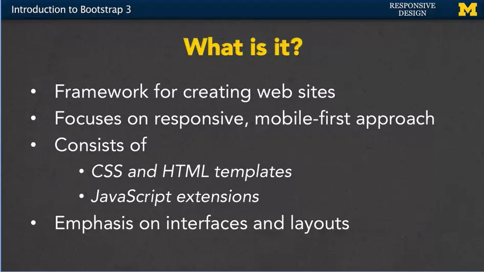
Today we're going to talk about Bootstrap.
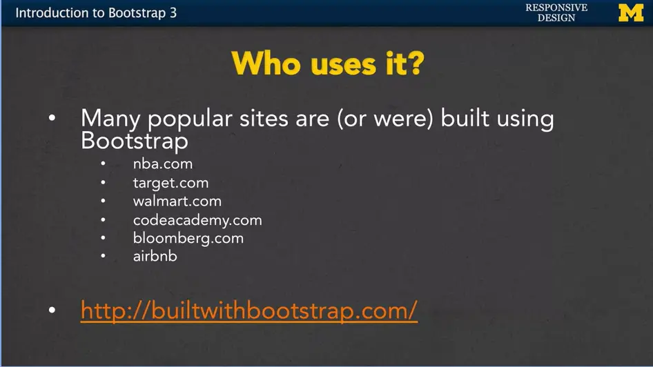
Speaking of that, who uses Bootstrap?
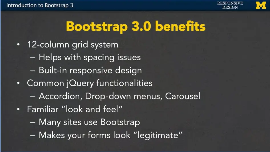
There are a number of benefits of using Bootstrap 3.0.
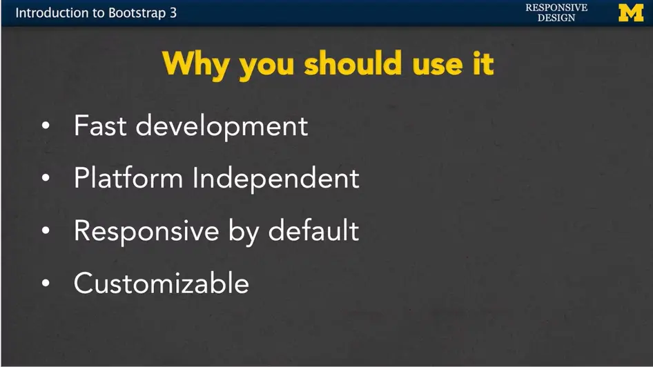
So why should you consider using Bootstrap? Or at least know a little bit about it?
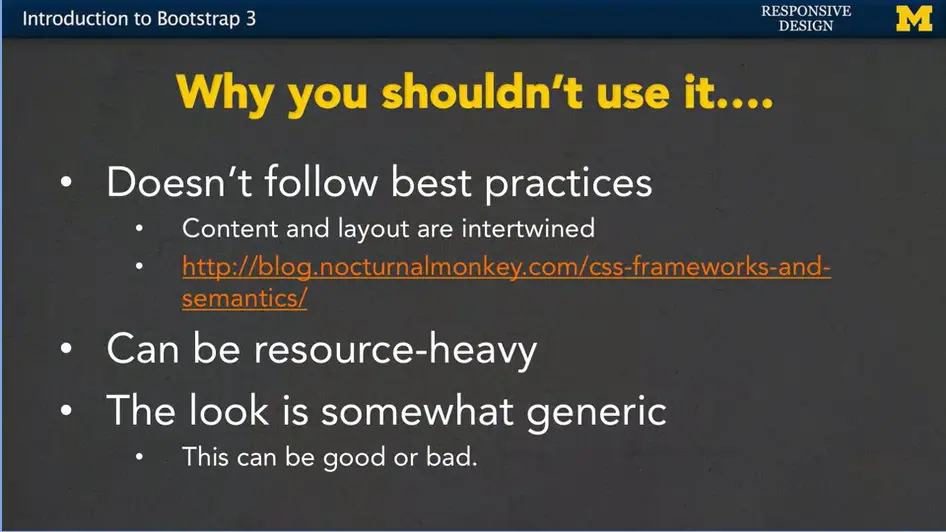
But there are reasons why you might not want to use Bootstrap.
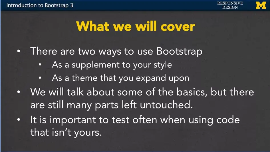
So, it's important to understand that Bootstrap is something that you want to use, not something that you feel confined by.
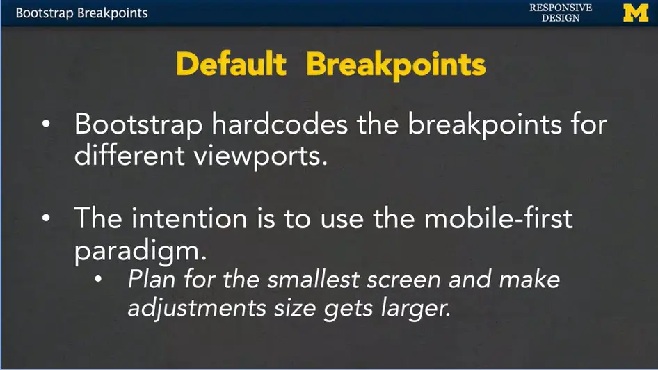
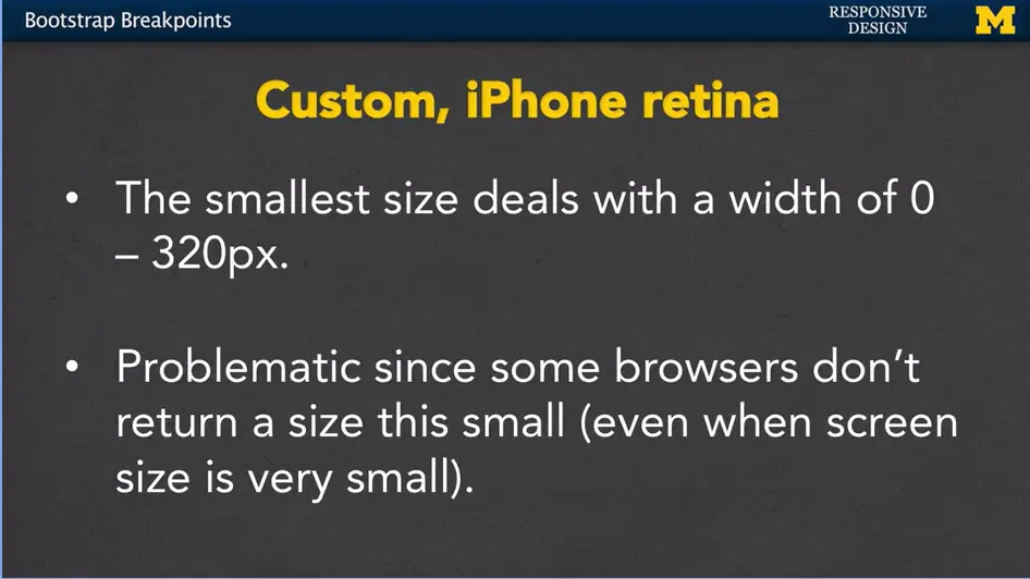
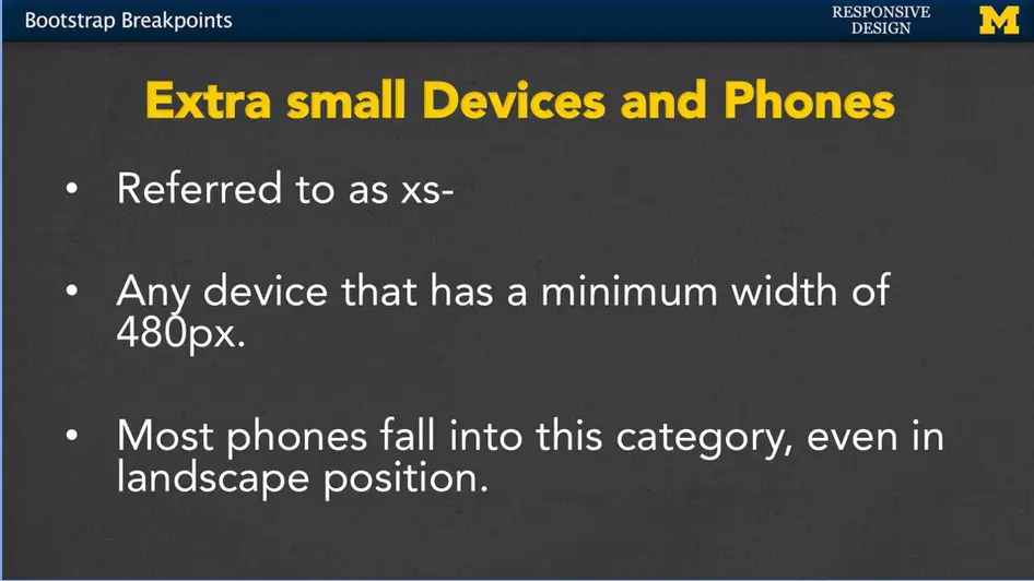
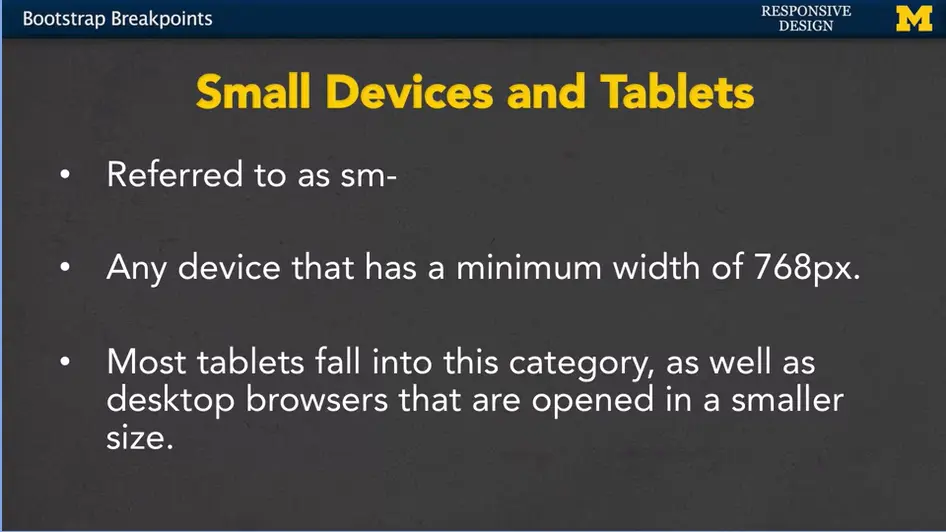
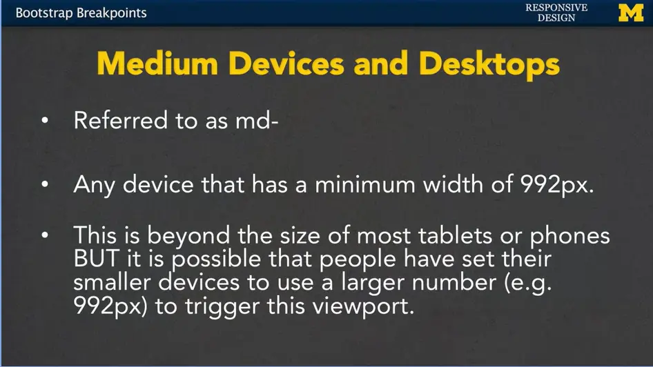
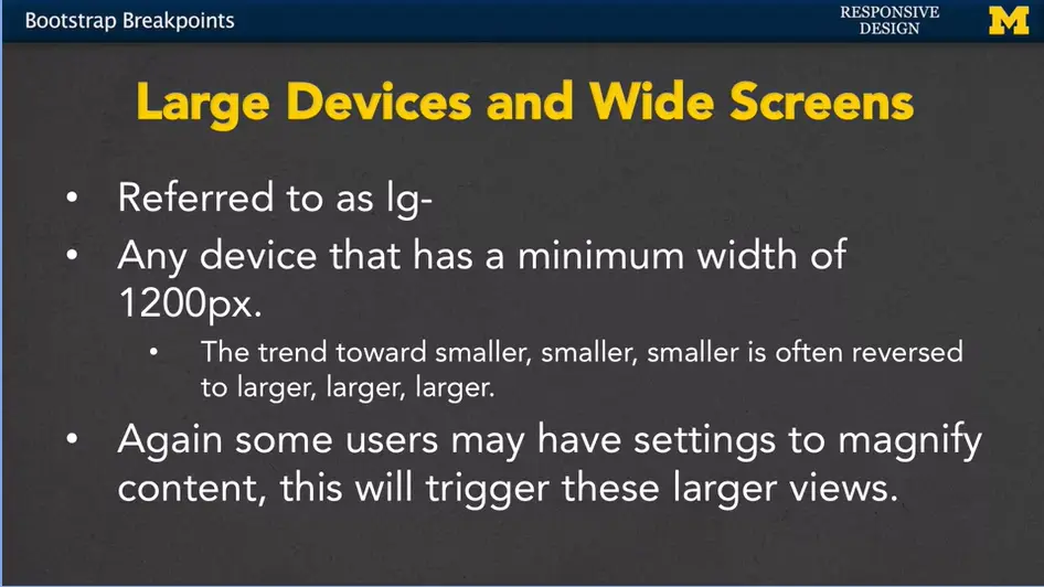
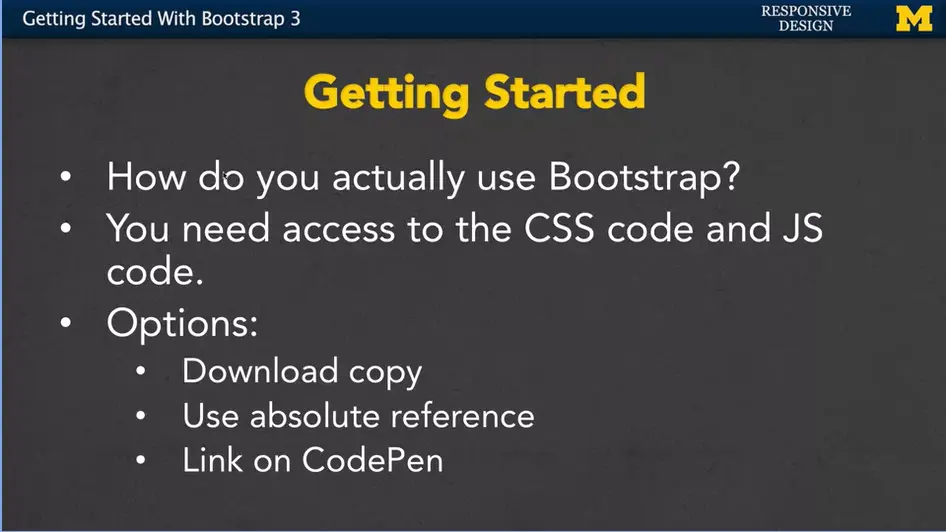
If you want to save your own copy of bootstrap, you can go to the website, getbootstrap.com, and there's a quick an easy get started link for downloading. It is important that you use the official site when you're grabbing your bootstrap code. A number of times, students have gone on, searched the internet, and download older versions of bootstrap and unfortunately, they are completely incompatible. And it takes a really hard time to figure out where they went wrong. So, download from the official site.
When you download, you also have the option of customizing the values before you download. This will save you time, if you know there are certain break points, colors, or other styles that you want to happen, and you don't want to go around and overwrite them later.
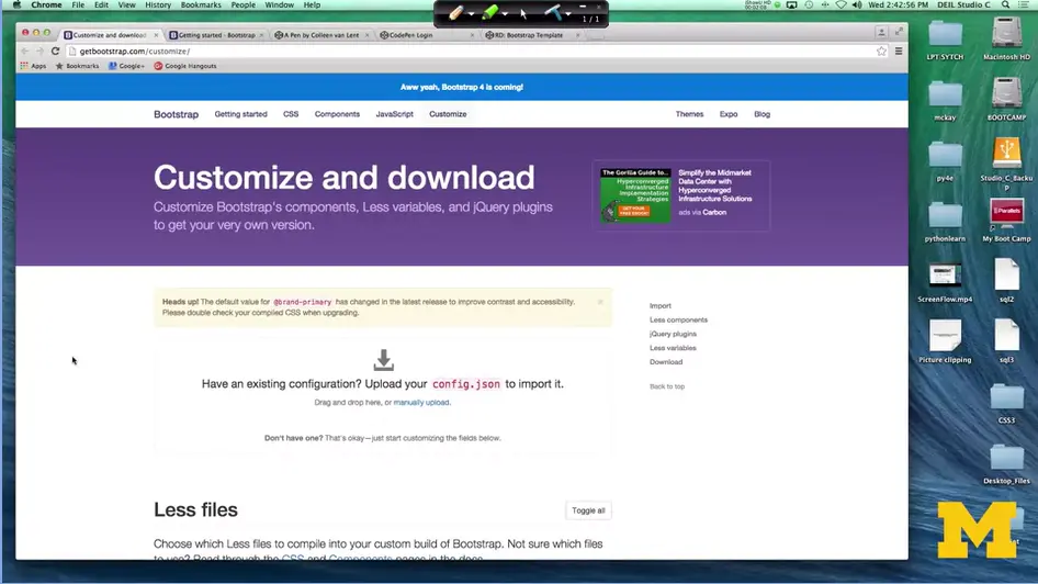
https://codepen.io/ColleenEMc/pen/obwJGp/
https://getbootstrap.com/docs/3.4/customize/
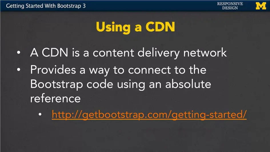
<!doctype html>
<html lang="en">
  <head>
    <meta charset="utf-8">
    <meta name="viewport" content="width=device-width,
      initial-scale=1">
    <title>Bootstrap demo</title>
    <link
      href="https://cdn.jsdelivr.net/npm/[email protected]/dist/css/bootstrap.min.css"
        rel="stylesheet"
        integrity="sha384-4bw+/aepP/YC94hEpVNVgiZdgIC5+VKNBQNGCHeKRQN+PtmoHDEXuppvnDJzQIu9"
        crossorigin="anonymous">
  </head>
<body>
  <h1>Hello, world!</h1>
  <script
    src="https://cdn.jsdelivr.net/npm/[email protected]/dist/js/bootstrap.bundle.min.js"
      integrity="sha384-HwwvtgBNo3bZJJLYd8oVXjrBZt8cqVSpeBNS5n7C8IVInixGAoxmnlMuBnhbgrkm"
      crossorigin="anonymous"></script>
</body>
</html>
https://codepen.io/cristinaconacel/pen/NOpVja
https://codepen.io/cristinaconacel/pen/zmZQKy
Let me show you. When you go to the website, you can see that it lets you customize different options. For instance, you can put in and you can say how I want to use tables, forms, buttons. You can down further and say you know what I don't think I'm really going to use any jQuery, so I'm going to uncheck these boxes, and that's going to let me download smaller amounts of code. You can go in and you can change the different colors to what you want them to be. It's a kind of nice way to get started if you already know exactly what you want to do.
For most of us though we're going to download the basic code. The most important thing is that once you've downloaded that code, make sure you know where you saved your files, this is so important you don't want to spend time later trying to remember exactly where you saved it, change your links, move things around It's very important to be organized.
Another option, though, if you don't want that work of downloading the code, or you want to make sure that you always have the most up to date copy, is to use a CDN, or content delivery network. Basically, CDN provides a way for you to use an absolute reference or a link to get the bootstrap code. Down here, again, we can go to the link getbootstrap.com/getting-started and they will give you the code that you need to include.
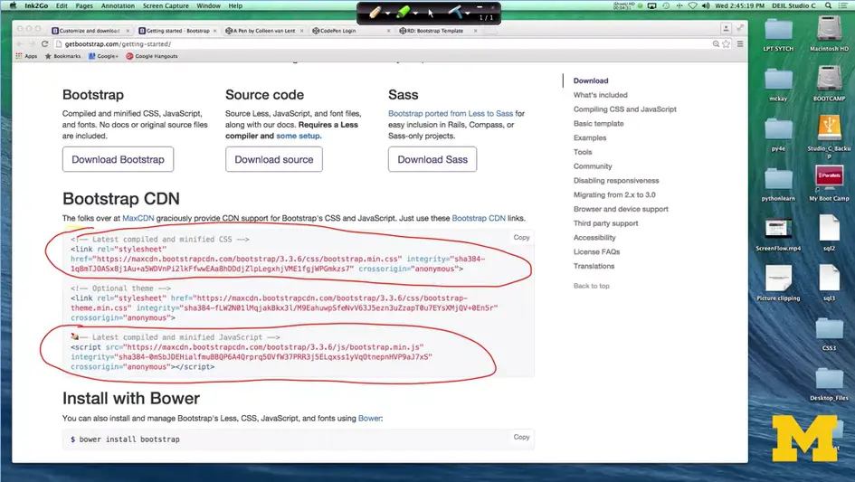
I've got it right here. You will need to copy and paste this code and this code into the header of your document. It's really important to make sure you have the full thing because it allows bootstrap to know that you're connecting through the CDN and you're not just spamming them or trying to download other things. By including these, you no longer have to keep a copy yourself. And that's really handy if you plan on having many different versions of your site. And you don't want to have lots of different copies of the bootstrap code.
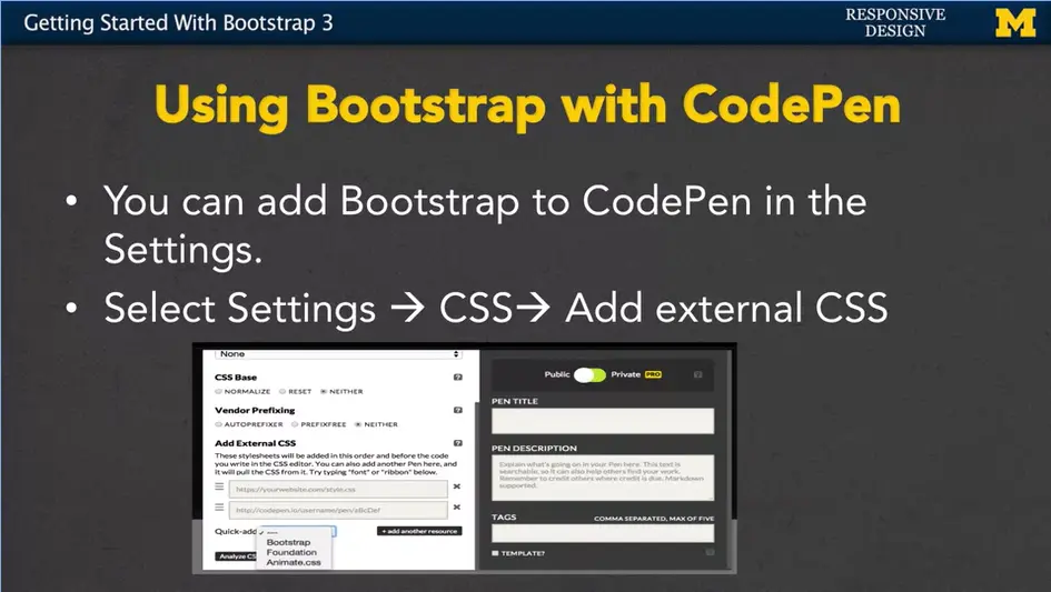
I'm adding a third option to this lecture because so many of us use CodePen. I wanted to show you how you can link the bootstrap from CodePen, if you don't want to remember those extra links. You start off by going to the settings, then the CSS, and add external CSS. You've got an example here for us, where I am starting fresh. I don't want to go in and put in those links, because I really want to keep this code clean. I really want to keep it to just HTML.
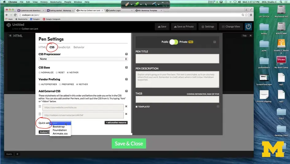
If you follow along, I'm going to go here to settings. I need to click here on the CSS. And, if you go down here to add external add, right underneath here, there's a little something called, quick add. Alright?
And, if you click on quick add. You can see that bootstrap is one of the options. Once you have that put in there. As long as it's in here. It now knows this is how you can add the external CSS. Now you may remember that I said, you're going to connect to the CSS and JavaScript files.
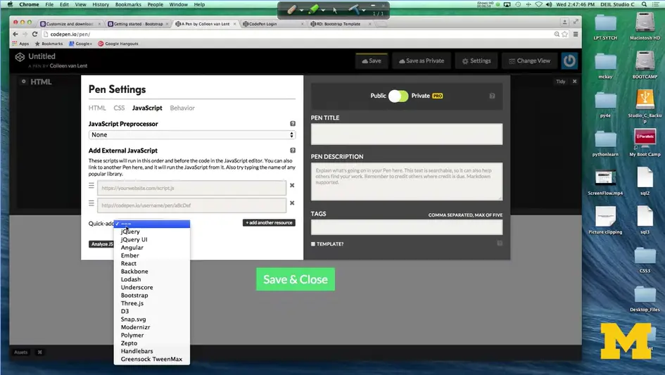
Once you added the CSS you want to click on JavaScript. Right here. Quick add, and add bootstrap as well. Once we've done this, our site is now ready to use any of the bootstrap classes or any of the bootstrap JavaScript that we may need to use.
It's very common when you're first getting started with bootstrap, or even once you're a bit of a pro, to start with a template that's already been created. If you go to bootstrap and you're following along in the examples they have some example code there for you.
On CodePen I've included another example code, that's just modified a little bit from the getbootstrap.com and I've put it in my Code Academy Responsive Design Bootstrap Template. In my template, I did not go in and link to bootstrap using the settings. Instead, I wanted to show you this code both with and without the links because that way if you write it up yourself you can still have it.
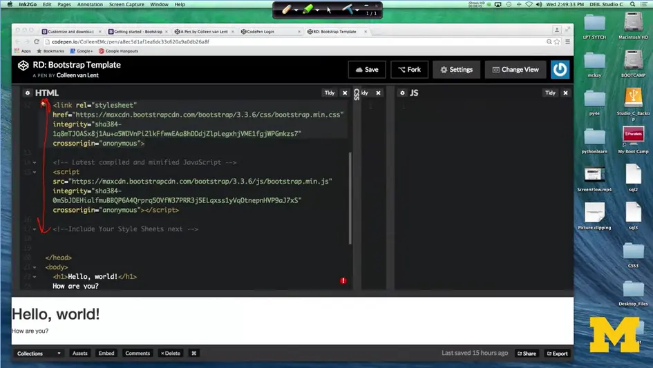
So, here's the link to the bootstrap, CSS, and JavaScript, and down here is my actual code, all right? It doesn't look like there's that much going on, I mean, because there isn't. All I've done is put in a hello world, how are you? However, if you've been coding for long enough, your eye might notice that, the Hello, world and the How are you, look a little bit different from the default values. Instead, it's using that bootstrap font. One way is for me to delete the link to the style sheet. I'll do that right here. And now you can see that the font has changed a little bit.
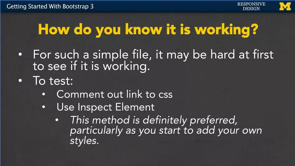
This is actually really important and let's talk about why. So, on a simple file, like I said, one of the things you can do to test to see if bootstrap is actually working or actually doing anything it to comment out that link to the CSS. Right away you should at least see some sort of very faint change in the font.
Another thing you can do, and I really encourage you to do, is to use inspect element. This method is preferred, particularly as you start to add your own styles. Don't forget, bootstrap is just one of the tools for styling your page. The expectation is that you will still write your own style sheet as well.
With inspect element, we can go in, look at the different parts of the page and figure out exactly which styles are being applied and which ones aren't. I'll make sure when we go through our code within the examples that I often stop and use inspect element to show you what I'm talking about.
So, as we finish up, this very quick example, I hope that you go in. I hope you grab that CodePen example and you try writing one of your own. If it's not working, don't forget that you need to include to link that code in some way. You can use inspect element to see If there's any styles being applied.
You need to make sure that you always include the JavaScript at the bottom. In fact, I'm not sure I even put enough emphasis on that, so let me show it to you again, just so you know what I'm talking about. I'm back at our original template code. And I'll put back in the style sheet.
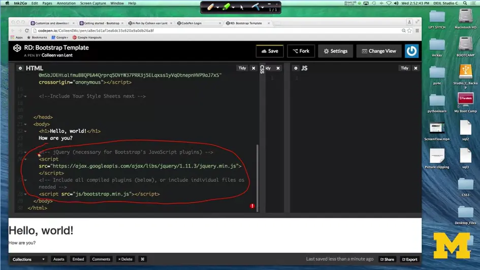
When you scroll down, you can see that after I have hello world, I have the template code that includes a link to some bootstrap code. Even though you may not be using java script. Even though you may not know how java script works for some of you. It's important to know that bootstrap may be using the JavaScript in order to get things to work a certain way.
This down here is a number one problem for getting to link to the JavaScript. So, when you use, start writing your own code I highly recommend that you use my template to get started every single time. It's also important to remember that you can customize those bootstrap defaults. I talk about that a lot right now. I don't think you're going to do it. I don't think you should do it, but it's something that I want you to know is possible once you really get the hang of what's going on.
Finally, you can also always go in and overwrite those bootstrap defaults. Remember how I said the font looks a little bit different than what you may have been expecting? That's okay, you can go in and change it in your own style sheet. That's something I hope that you'll explore over this next week/module as you go in and you write code, and you practice, and you write some code again. Thanks.
<!DOCTYPE html>
<html lang="en">
  <head>
    <meta charset="utf-8">
    <meta http-equiv="X-UA-Compatible" content="IE=edge">
    <meta name="viewport" content="width=device-width,
      initial-scale=1">
    <!-- The above 3 meta tags *must* come first in the head; any
      other head content must come *after* these tags -->
    <title>Bootstrap 101 Template</title>
    <!-- Bootstrap -->
    <!-- Latest compiled and minified CSS -->
    <link rel="stylesheet"
      href="https://maxcdn.bootstrapcdn.com/bootstrap/3.3.6/css/bootstrap.min.css"
        integrity="sha384-1q8mTJOASx8j1Au+a5WDVnPi2lkFfwwEAa8hDDdjZlpLegxhjVME1fgjWPGmkzs7"
        crossorigin="anonymous">
    <!-- Latest compiled and minified JavaScript -->
    <script
      src="https://maxcdn.bootstrapcdn.com/bootstrap/3.3.6/js/bootstrap.min.js"
        integrity="sha384-0mSbJDEHialfmuBBQP6A4Qrprq5OVfW37PRR3j5ELqxss1yVqOtnepnHVP9aJ7xS"
        crossorigin="anonymous"></script>
    <!--Include Your Style Sheets next -->
  </head>
  <body>
    <h1>Hello, world!</h1>
      How are you?
    <!-- jQuery (necessary for Bootstrap's JavaScript plugins)
    -->
    <script
      src="https://ajax.googleapis.com/ajax/libs/jquery/1.11.3/jquery.min.js"></script>
        <!-- Include all compiled plugins (below), or include individual
        files as needed -->
        <script src="js/bootstrap.min.js"></script>
        <!-- If you don't have the files saved locally, make sure to link
        it in CodePen, just like you linked the CSS. -->
  </body>
</html>
Basic grid layouts to get you familiar with building within the Bootstrap grid system.
Get three equal-width columns starting at desktops and scaling to large desktops. On mobile devices, tablets and below, the columns will automatically stack.

Get three columns starting at desktops and scaling to large desktops of various widths. Remember, grid columns should add up to twelve for a single horizontal block. More than that, and columns start stacking no matter the viewport.

Get two columns starting at desktops and scaling to large desktops.

No grid classes are necessary for full-width elements.
Per the documentation, nesting is easy—just put a row of columns within an existing column. This gives you two columns starting at desktops and scaling to large desktops, with another two (equal widths) within the larger column.
At mobile device sizes, tablets and down, these columns and their nested columns will stack.

The Bootstrap 3 grid system has four tiers of classes: xs (phones), sm (tablets), md (desktops), and lg (larger desktops). You can use nearly any combination of these classes to create more dynamic and flexible layouts.
Each tier of classes scales up, meaning if you plan on setting the same widths for xs and sm, you only need to specify xs.


Clear floats at specific breakpoints to prevent awkward wrapping with uneven content.

Reset offsets, pushes, and pulls at specific breakpoints.

Hi everybody. Today, we're going to talk about the grid system for Bootstrap three.
I want to start off by saying, if at the end of this week/module (3-05), you completely understand the Bootstrap layout system, you are awesome. Because for most of us it takes at least two or three times of looking at the material, playing with it and then doing it all over again, to really get a good understanding of how this works.
I'm hoping that you'll follow along with me. We'll do an example in one of the next modules, and then you come back and you read this material again, and see if it's starting to really make sense.
Bootstrap can see every element as something you can break down into 12 columns. So, if you have a page, Bootstrap can take any element, and say, oop, all right. There's a container, let's pretend I drew 12 columns. We can break it up and then you can tell Bootstrap whether you want to place something here, or here, or maybe all three of these. Now it's kind of funny because for the longest time people said never use tables to layout the content of your webpage. That's breaking really, some of those basic rules and tenets of content versus layout. But, that's why everyone says Bootstrap uses a grid. It's not a table.
So, you kind of have to throw that practical reasoning out for a little bit, if you're going to be using Bootstrap.
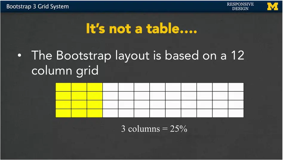
With this table, we can basically say if you want to use three columns, it's the same as saying a width of maybe 25%. Six columns is 50%. Nine columns is 75%.
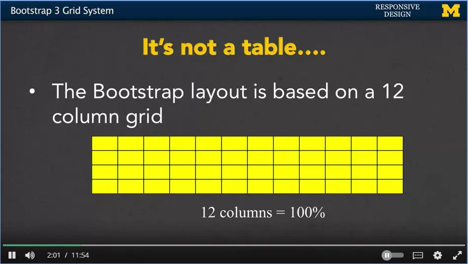
All 12 columns mean you're taking up the full width of the page or that element.
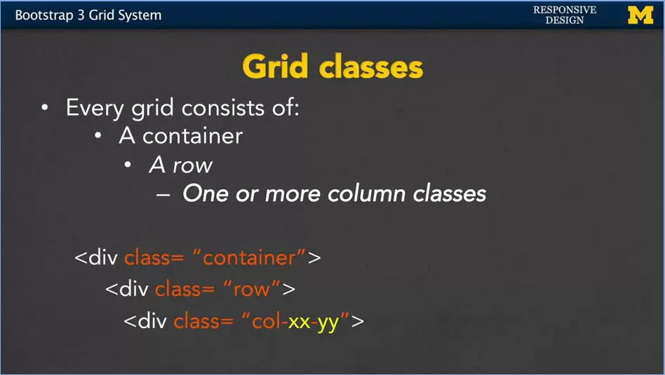
Every grid in Bootstrap consists of a container class, a row class and then one or more column classes. The actual code itself is going to look like this, where xx is going to be the viewport size. And yy is going to be the number of columns that you want to use. Let's take a look.
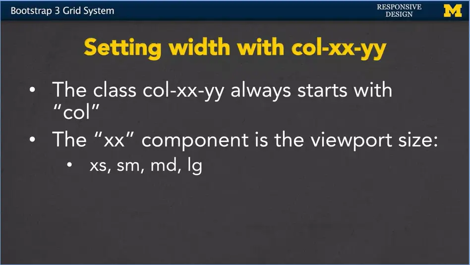
Let's look at our example. The class is always going to start with those three letters, col. The xx component is the viewport size. It's going to be xs for extra small, think your mobile phones. sm for, maybe, those tablets. md for medium. And lg is for large. Again, if you want to kind of think of numbers, you can think of something along the lines about 480, 720, 992, and 1200.
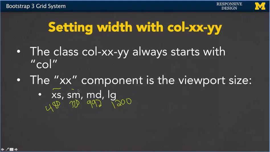
Now, I promised you a while ago, you don't actually have to remember these numbers. I'm pretty sure that I got them wrong myself. So just remember more general concepts than the numbers. But you have to remember xs, sm, md, or large. It has to be one of those four abbreviations.
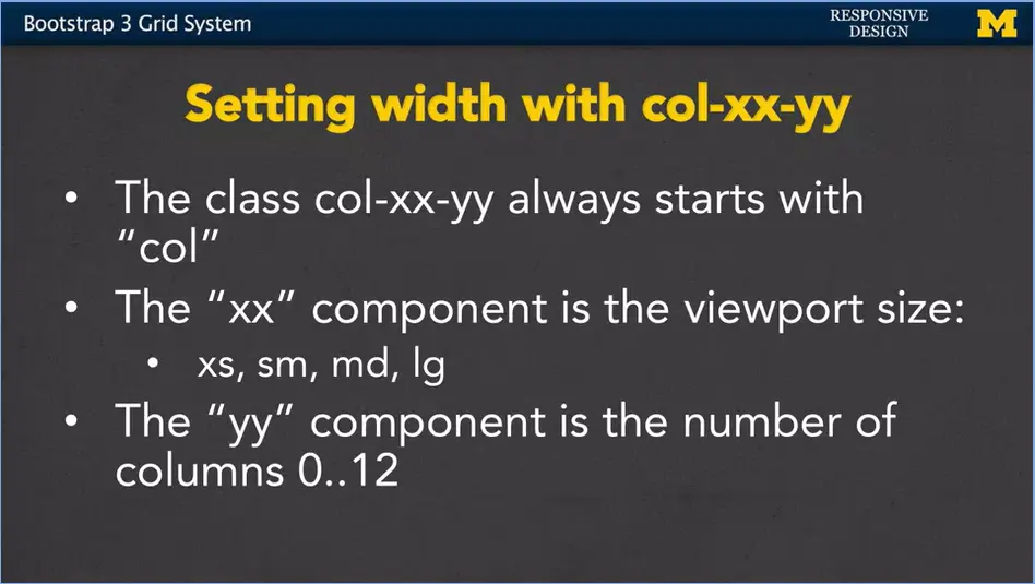
Once you've declared the viewport size, you can now say exactly how many columns you want this element to take up. Anything from zero, which means it shouldn't show up at all to 12 which means take up the maximum width that it possibly can.
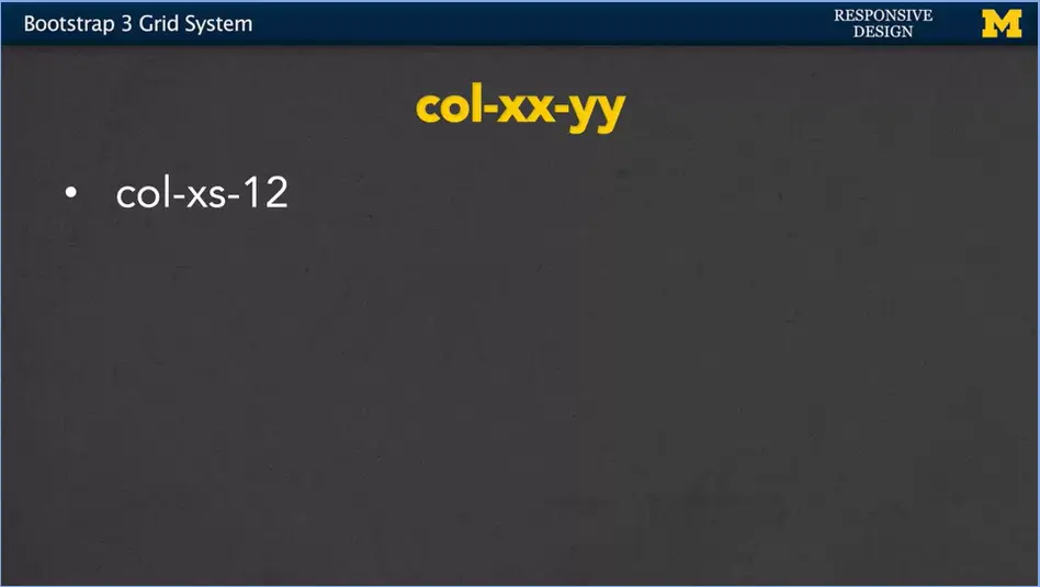
So, if you have an element that has class equals col-xs-12, you're saying, if you're viewing this on a small screen, it should take up the full width.
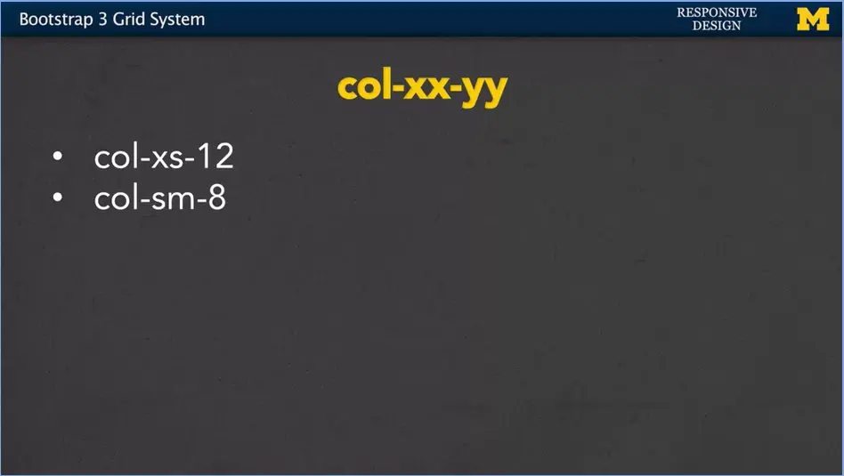
If you're looking at one that has a class of col-sm-8, now you want to take up eight out of those 12 columns, but only on the smallest screen.
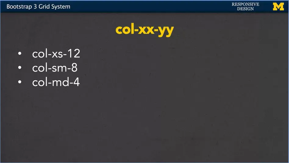
For col-md-4, you're saying, if I'm on a medium screen I want to use up four columns or one third of the entire screen size.
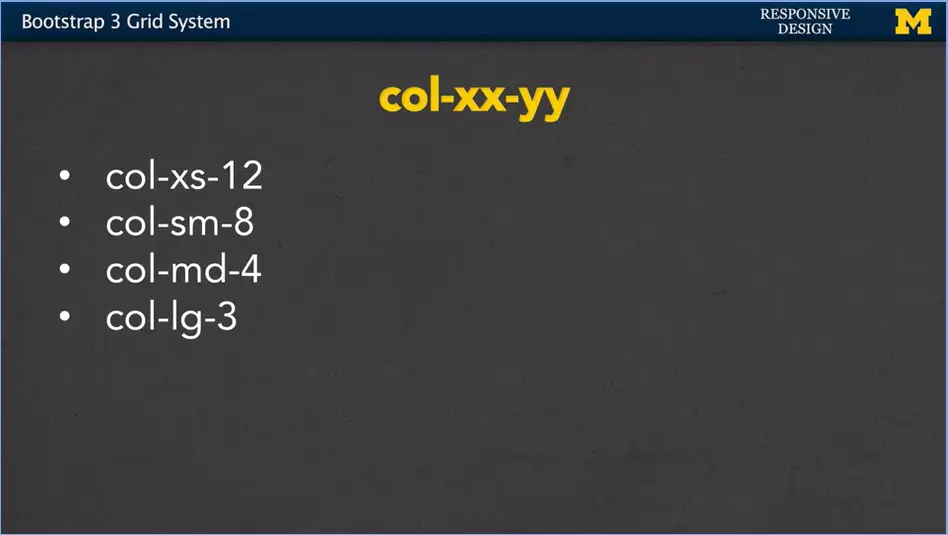
And for col-lg-3, you're saying, well this is a large screen, it doesn't need to be as big as it was on those other screens. Let's just use up a quarter or 25%.
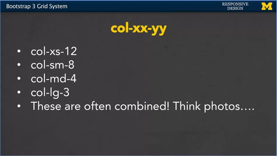
Now, this is the interesting thing. Many times you're going to combine these classes together. Let's think about if you're going to put pictures on your website. It's a very common idea to think, well on the small screen I want one picture, and each picture should take up the whole width of the viewport. But if I'm on a larger screen, well, then maybe there can be three across, and on a different screen maybe four across.
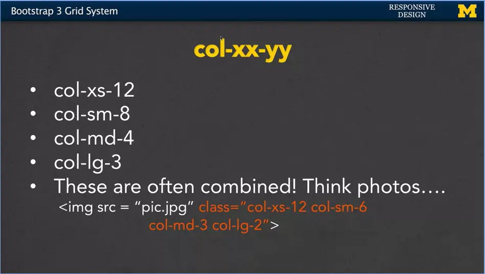
Let's imagine that I have an image, some sort of pic.jpg. And then we have our four screen sizes. I might have my extra small, small, my medium and it's not quite going to look larger but my large. When you look at col-xs-12, that means my image should take up pretty much the whole width. But, if I'm showing this image on a small screen, I only want it to take up about half the size. That way if there's other images, they can fill in next to me instead of under me. In the same way, if I'm going to have a medium screen, I only wanted to take up about a quarter leaving room for three other pictures. And then, on a large screen I'm going to draw it really small just to kind of be the side be like, I only want that to take up one sixth. It's the same picture. It's the same HTML code. The difference is that, on different viewports, the picture is going to look relatively big on a small screen and relatively small on a larger screen.
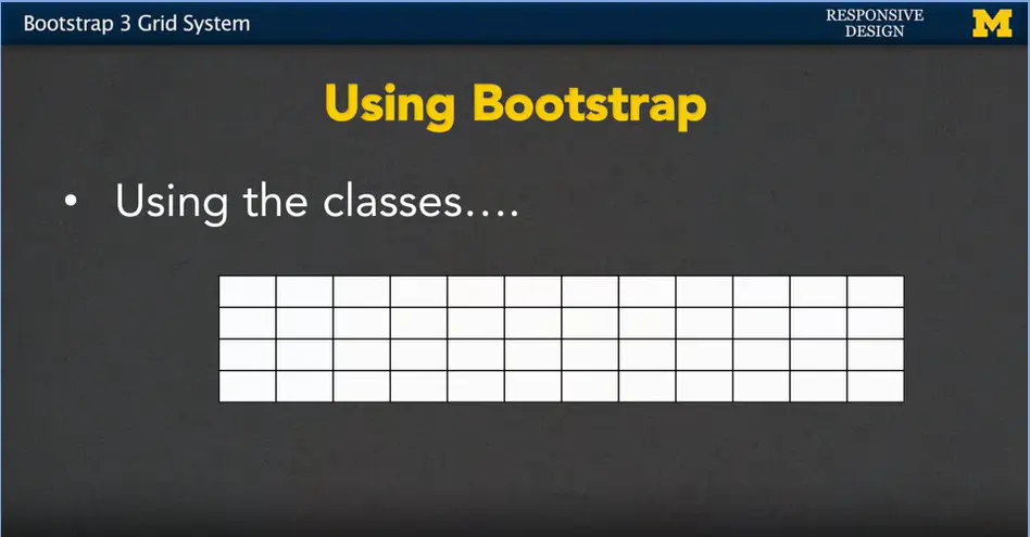
So, let's review that grid picture but using the classes this time. Right here we have nothing on there.
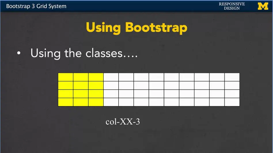
But if I use col-XX-3, we're using three of the 12 or 25%.
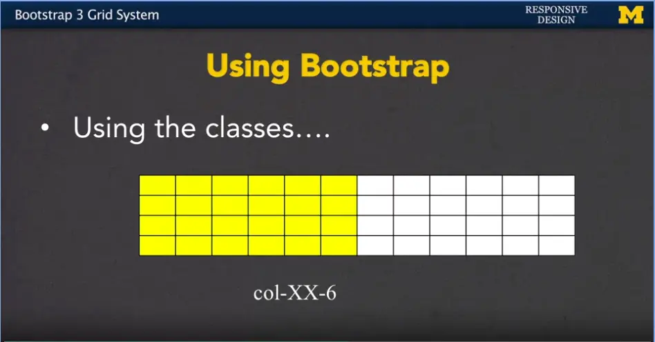
If I say col-XX-6, I'm using 50% now.
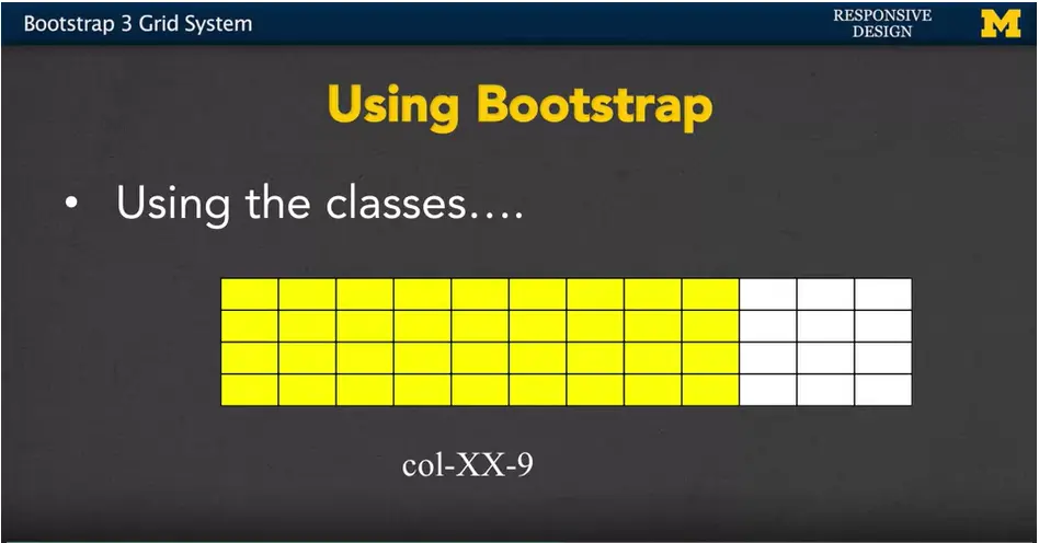
Col-XX-9, 75% and
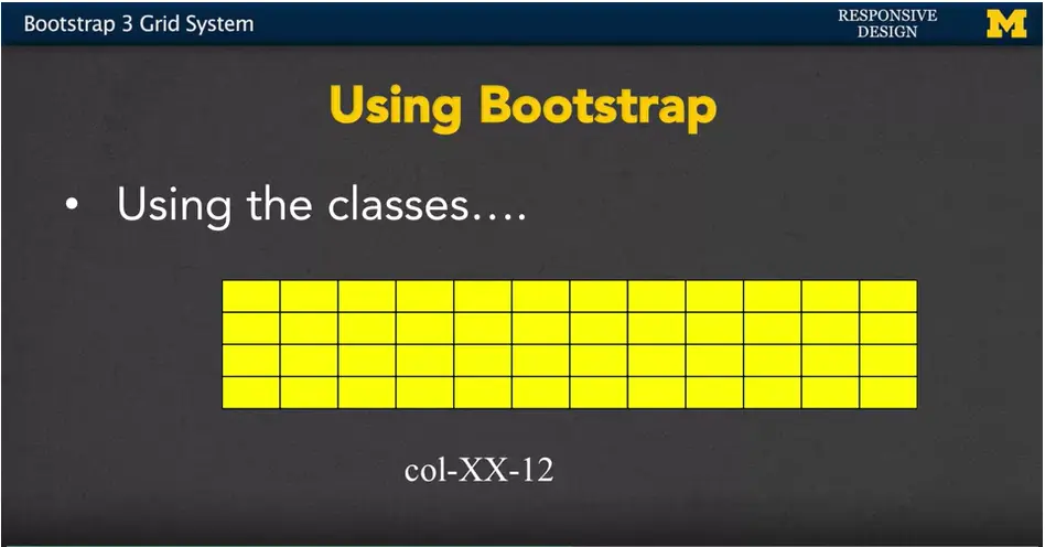
col-XX-12 means used up the full width that's available to you.
But what if you want two elements next to each other? For instance, but only on a larger screen. Separate block, small screen. In line block on a large screen.
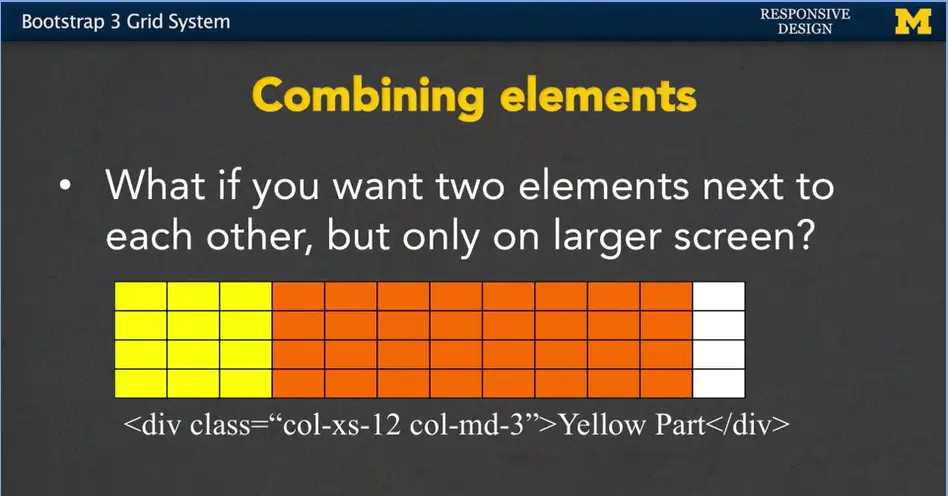
Well, what we could do is we can start off by saying, that yellow part of our page, well, on a small screen, I want it to take up the full width. But, on a medium screen, I want it to take up only three.
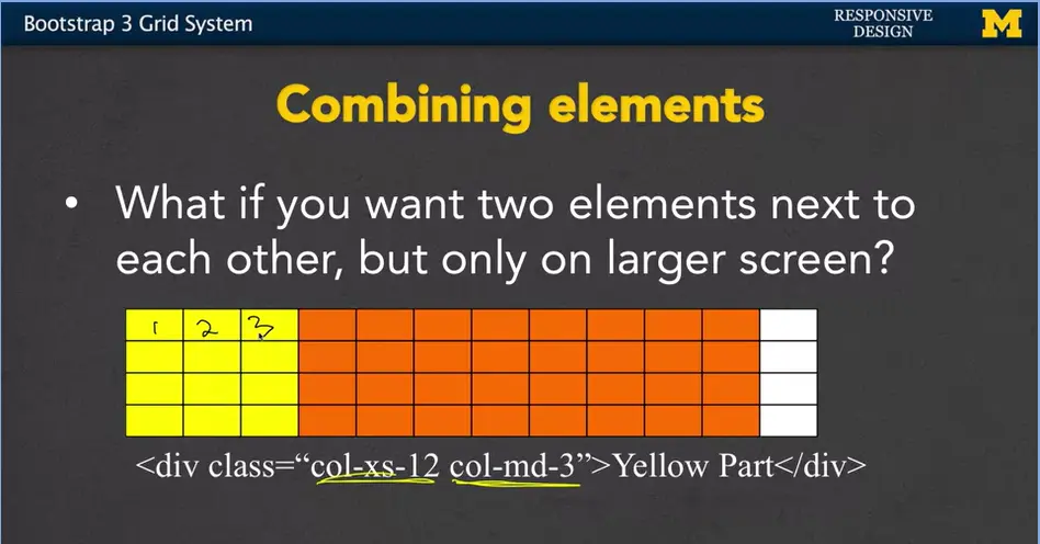
So, on here when I'm looking at a large screen, I'm only taking up one, two, three columns. All right.
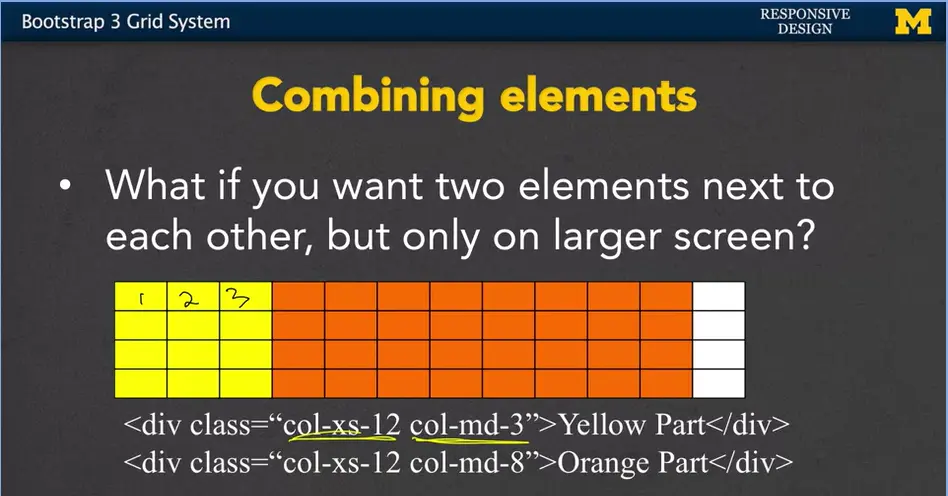
Then if we add another div next to it, that div can say for this orange part, if I'm on a small screen, again, I want to use up the full width. But if I'm on a medium screen or bigger, whoa, well in that case, I want to use eight columns.
Now, if you're following me, hopefully you are. Wake up, wake up, you'd realize that 3 plus 8 only equals 11. I didn't use the whole screen. I did that on purpose because I want to show you that it's absolutely okay to not use up the whole screen. The second thing you might be wondering is what about small and large. I didn't say anything for those. I didn't mention them at all. Everything, since it's a mobile first, propagates up.
So, if I define something for extra small, then by default it's also going to apply to small, medium, large. Unless I specify something for medium. And then that's going to override everything for medium and large. You can really get away with just specifying one or two rules and still hit multiple break points.
It's actually quite possible to write even easier or cleaner code than what I just wrote here.
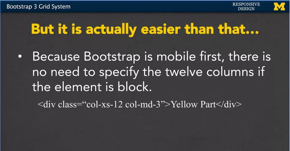
Whenever you want to say something should be the full 12 columns and it is block already by default, it takes up the whole width. You can pretty much skip this whole col-xs-12 part. Bootstrap knows to do that by default. It says I didn't know you were supposed to take up the full width, you don't need to tell me. Instead, you can just specify those rules where it's going to change.
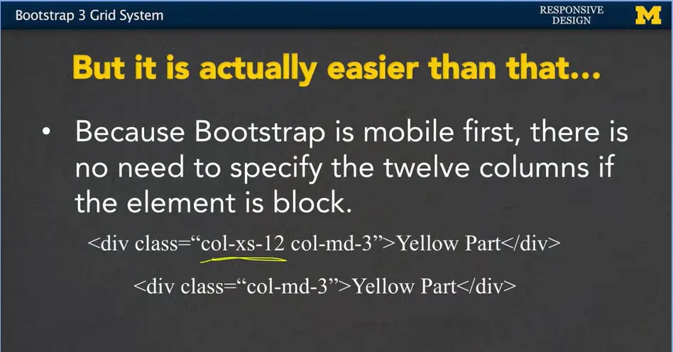
I've dropped the smaller part and this new rule now says basically any time you are on a medium viewport or larger, make it three columns.
By default, Bootstrap is going to put things as far to the left as it possibly can when it's positioning them.
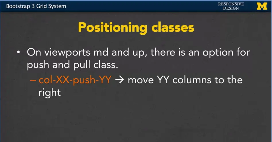
However, it is possible to add a push and a pull class on different elements. If you have col-XX-push-YY. You're basically saying, hey, on any viewport that's X, I want you to go ahead and push this element Y columns to the left.
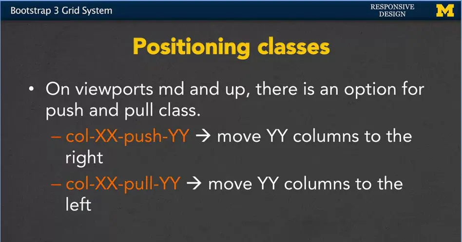
In the same way, there's a pull. In here, you move columns to the right. We're not going to play with this right now, but it was something that I want you to be aware of. In the same way, I want you to know about the responsive utility classes.
Earlier, I mentioned that you can have XX, or something like XX column zero, or really for anything, you can have column zero, hides it from the screen. It's usually a lot easier to use the hidden class instead. Hidden-XX basically says, make this visible on every viewport except for the one we're going to mention right here.
In the same way, visible-XX says, hide something. It shouldn't be visible unless I'm on this certain size screen.
The last one we have is sr-only. And this is a special Bootstrap utility class for screen readers. It hides the content for everyone, unless they're using a screen reader to access the page. If they are, then this element is visible to them, and them only.
So, we mentioned and we talk a lot about Bootstrap is this mobile first idea and that larger screens inherit values from smaller screens. I really think that the grid class is a great example for you to play with it and see how they work. The idea that if you define something from medium screens, it also applies for large screens. If you apply something to extra small screens, it also applies for every screen size that's bigger. There's a great site at Bootstrap, bootstrap.com/examples/grid, where you can go through and you can see some of the examples that they have coded up for you.
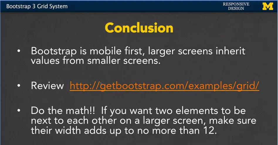
Really important, do the math.
If you've got maybe a third grader or a fourth grader at home, someone who's about eight to nine, have them check. Because one thing you always want to make sure you do is that the columns that you want to be next to each other, shouldn't add up to more than 12. Seems like a simple thing, but it's very important.
In the next week/module (3-06) we're going to code together and do some work with this grid class. I hope you'll join me and you'll get a really good feeling about how this works with Bootstrap.
Hi everybody. Let's go over an example together where we're using the Bootstrap Grid System. I'm going to go into CodePen and use this code so you can start from scratch or mess with the code and play with it with me.
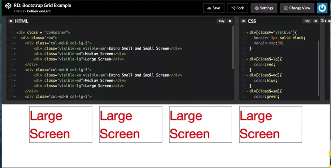
As you may recall, whenever you want to use the grid system for Bootstrap, it's important that you put two kind of wrapper classes around it.
Here, I have my class = container, and my class = row. What I'm saying here is, it's time to look for those col-md-6, col-lg-2 different classes. And I want you to put these elements together based on being in the same row at times. I'm actually going to move this.
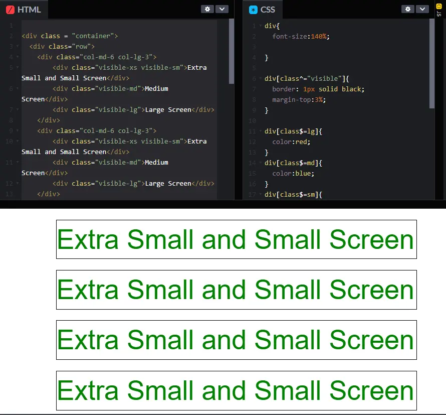
I'm going to a bit of a smaller screen to start with. And when we do this, we're going to go through and look at how the code works together. We don't even need to really look at the CSS for now, so I'll pull that out of the way. I have four divs inside here. Now, in each case, each one of these divs is exactly the same. The code doesn't change at all. You can kind of trust me on that one.
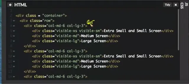
So, we're just going to look at the first one, and look at what that code does. The first thing we need to realize is col-md-6 and col-lg-3. How many viewports do we have right here? How many different distinct looks are we coding for? At first glance, your answer might be two. We're coding for the medium and the large screen, but don't forget, Bootstrap is always thinking, mobile first. So, by default, we have an extra small, maybe small view. This, what we've done right here, is we've now made it so there are three distinct views. One, for the extra small and small screens, one for the medium screens, and one for the large screen.
By default, whenever we're on an extra small screen, and we didn't say anything else, Bootstrap is going to say, you're going to do a div, and you didn't tell me what to do. No problem. Let's make that sucker full screen. We're going to by default use all 12 columns. So, that's why this little div right here says, extra small and small screen. So my question is for you. Why is it not showing medium screen and large screen? Why isn't that information showing up? Well, it's back to those Bootstrap utility classes. Down here, I have visible medium and visible large. This essentially says, you know what, I don't want you to show up unless I'm on a medium size screen, and down here, I don't want you to display unless you’re on a large screen.
As we transition from smaller to bigger, this one's going to go away, and this one will suddenly show up.
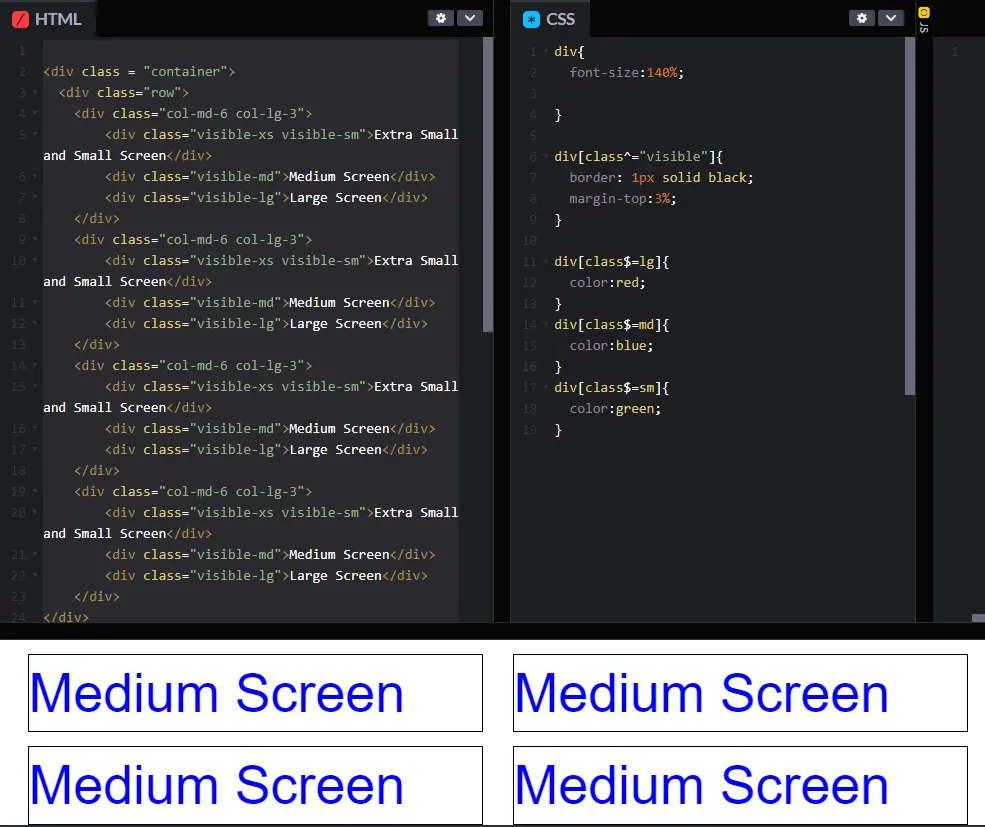
Let's take a look. Right here, I've just hit the medium view port screen size, and a few things have happened. First, the div that said extra small and small screen, it disappeared. It is now no longer visible.
The second thing that happened is that the medium divs now have become visible. We couldn't see them before, and now we can. But the third thing that happened, that you might not notice unless you really are thinking about it, is before each div took up the full width of the screen.
Remember, we had four boxes, boom. One, two, three, four. Now, instead of taking up the full width, we're only taking up six columns. We're not taking up 12. So, we've really changed the look of this. We've changed the content, but we've also changed the layout. So instead of having four on top of each other, we have two pairs of two.
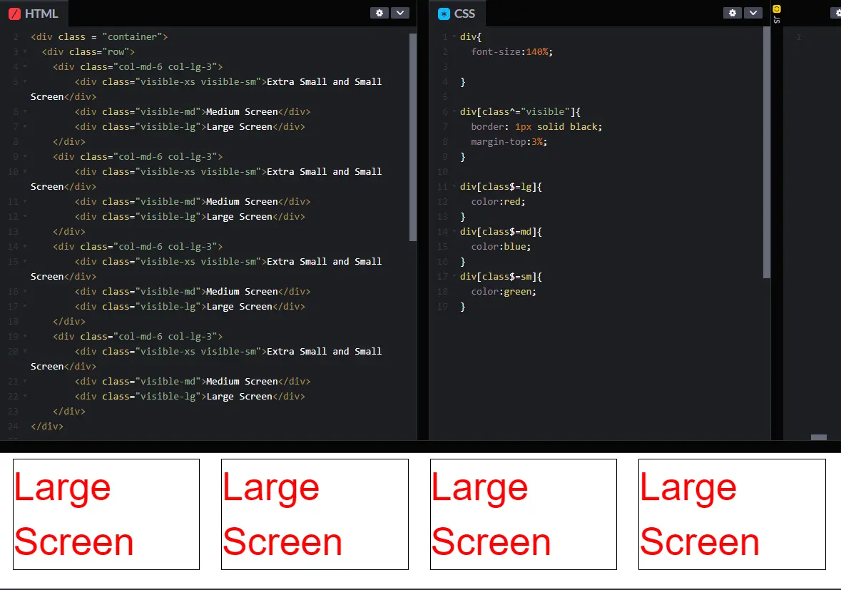
Last thing I'm going to do next, of course, is go to the even larger screen. So, in this next step, as we reach the larger screen, the same type of thing has happened. The extra small and small divs, still hidden, still not there. Can't see this one, can't see that one.
Now, the large screen information is visible and we've triggered this rule right here. We've said, on a large screen, I want each one of these divs to take up 25% of the screen, 3 out of those 12 columns.
And now everything is laid out in one big view. Hopefully, at this point, you have a few questions. Unfortunately, I'm not right there to answer them. So, I'm going to have to guess and maybe try to figure out some things that you might be wondering right now. I know one that I was wondering is this whole idea of what's with the extra space along the sides? Each one of these columns is supposed to be about 25%, but there is a lot of blank spaces around. One of those reasons is that the container class and the row class has padding and margin around it. So, this is kind of dead space, same over here. So we might be using up 25% of the space, but that's really only from here to here, not the full screen that's something that's important to realize.
The next thing that you may or may not be wondering is how I manage to style, maybe the colors of the fonts or those borders around things. Feel free to go in and look at all the code that I have here, not just the HTML (see end of week/module for code). I'm going to pull my CSS back over. And you can see that I have written some style sheets that say, you know what, I want you to add a border but only around those classes that start with the word visible.
And you know what? On any class that ends in large, I want you to have it the red, any that ends in medium, the blue, etc., etc. With this class, we may not do as many lectures as I've done in some of the other classes. There's a reason for that. I want you to spend your time playing with the code. Listening to me is awesome, I know it. But playing with code may be ever better as far as learning things about what you're doing in web design.
Play with this code, change things from visible to hidden. Go ahead and put in different numbers to see what happens. It can be a lot of fun to play with things, and make things, break them, and fix them again. Good luck.
<div class = "container">
  <div class="row">
    <div class="col-md-6 col-lg-3">
    <div class="visible-xs visible-sm">Extra Small and Small
      Screen</div>
    <div class="visible-md">Medium Screen</div>
    <div class="visible-lg">Large Screen</div>
  </div>
  <div class="col-md-6 col-lg-3">
    <div class="visible-xs visible-sm">Extra Small and Small
      Screen</div>
    <div class="visible-md">Medium Screen</div>
    <div class="visible-lg">Large Screen</div>
  </div>
  <div class="col-md-6 col-lg-3">
  <div class="visible-xs visible-sm">Extra Small and Small
    Screen</div>
    <div class="visible-md">Medium Screen</div>
    <div class="visible-lg">Large Screen</div>
  </div>
  <div class="col-md-6 col-lg-3">
    <div class="visible-xs visible-sm">Extra Small and Small
      Screen</div>
    <div class="visible-md">Medium Screen</div>
    <div class="visible-lg">Large Screen</div>
  </div>
</div>
div{
  font-size:135%;
}
div[class^="visible"]{
  border: 1px solid black;
  margin-top:3%;
}
div[class$=lg]{
  color:red;
}
div[class$=md]{
  color:blue;
}
div[class$=sm]{
  color:green;
}
Hi, everybody. Today, we're going to talk about navigation bars.
Navigation is one of those things about Bootstrap, that's very familiar to people when they see sites that use Bootstrap. It always looks about the same. It works about the same. People are comfortable with it. The nav class is typically combined with other classes to create each different style navigation that you're going to see.
When you make a navigation bar, one of the first things you have to decide is what type of links you want. Bootstrap provides nav-tabs and nav-pills.
Let's take a look at what this looks like on the browser. Let's start with nav-tabs. The first thing I hope that you would look at and see is that it doesn't look very good. I've got the code. I've taken it from Bootstrap. I went in and I used the nav class right here. Change that to yellow. I used the nav class right here and I also included the nav-tabs class. This is something new people haven't always seen, that you can use multiple classes within the class. So used it, looks correct, looks great, but I don't see any difference. This is something that's going to happen to you. The problem is I haven't linked to the Bootstrap CSS.
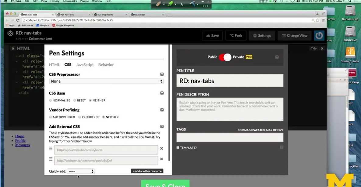
Let's go ahead and do that now. I'm going to go into Settings, I'm going to click on CSS and I'm going to go down here to quick add and add Bootstrap. And as soon as I save that, boom, there you go.
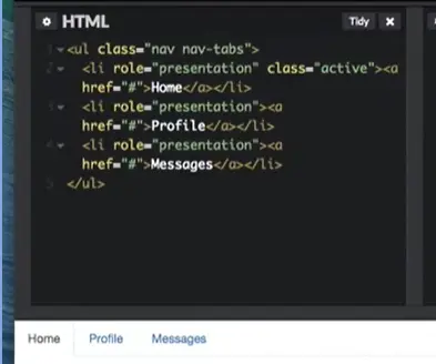
That looks like a much more professionally designed navigation bar. When you use the tabs, it's supposed to simulate that kind of look you see in a file tabbing system where you kind of flip through.
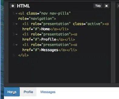
Now, let's look at nav-pills. Here you can see that each one of the links, basically, has a different color. You can go in, this one is blue, the other one's are white. They all have that kind of same square look. The reason that this one is blue and the others aren't is because I've added what's called an active class. This class in the first <li> says, I want to distinguish this link from the other links.
So, let's make it a different color. I can play with that code and I can change it, so that instead of having this link be active Got it? Let's put it here under profile <li> and now I've made the other one active. It's not really a big deal whether you're going to use pills or tabs. It's just a design decision that you want to make a little bit early on.
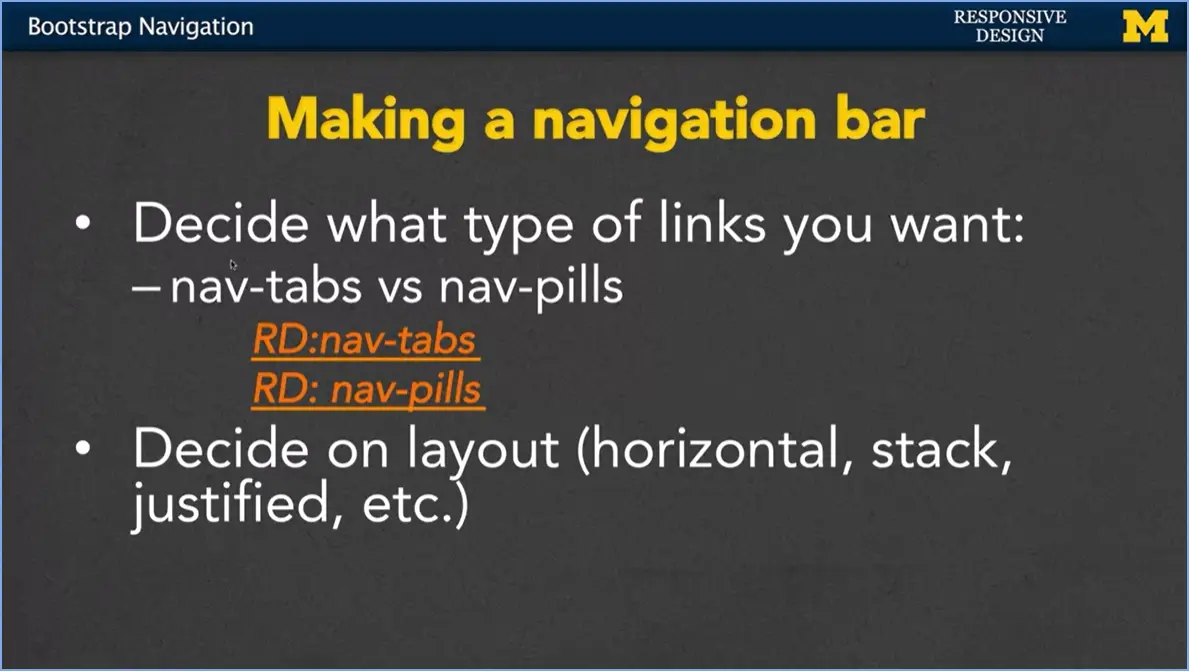
Once you've decided on either tabs or pills, another thing you’re going to consider is the layout. Do you want your navigation bar to be horizontal, vertical, justified? There are few different options and I'm going to show you right now how you can quickly change them. Let's go ahead and just use the nav-pills code. When I go back up to that unordered list element, I have that it should be nav in nav pills.
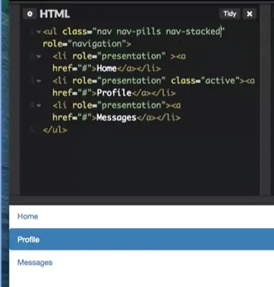
What I want to add now is to say, you know what? Instead of being horizontal, I want to change it, so that it's vertical or stacked. This simple class completely changes the look of our page.
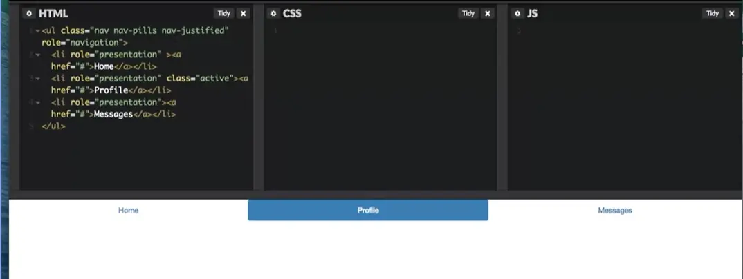
Another option that we can use is nav-justified. When you use nav-justified, by default, it's going to take as many links as you have and spread them out proportionately. So here, because I have three links, each link takes up a third of the page. If I had five each would take up 20% and different things like that. Now the interesting thing about nav-justified is that when you resize the window, it actually changes the look of the page.
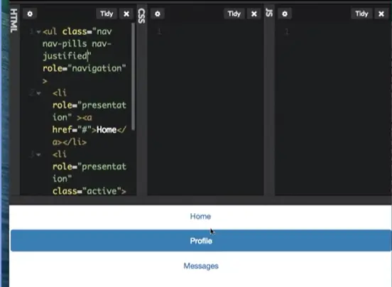
So now as I make it smaller, it changes from justified per stack. This gives a kind of really cool look without you having to do much about it. So, on the small view, you go to stacks. On the larger views, you're horizontal.
Another thing you see a lot of people like to add to their navigation bars are these drop-down menus where you have different options, but some of the options have sub options to them. If you want to use drop-down menus, it's very important for you to remember to link to the Bootstrap JavaScript files and include that link at the bottom of your code to jQuery. So, let’s go ahead and take a look at what we can do.
<ul class="nav nav-tabs">
  <li role="presentation" class="active"><a
    href="#">Home</a></li>
  <li role="presentation"><a
    href="#">Profile</a></li>
  <li role="presentation"><a
    href="#">Messages</a></li>
</ul>
<ul class="nav nav-pills" role="navigation">
  <li role="presentation" class="active"><a
    href="#">Home</a></li>
  <li role="presentation"><a
    href="#">Profile</a></li>
  <li role="presentation"><a
    href="#">Messages</a></li>
</ul>
<ul class="nav nav-pills">
  <li> <a href="#">Regular Link</a></li>
  <li> <a href="#">Regular Link</a></li>
  <li role="presentation" class="dropdown">
    <a class="dropdown-toggle" data-toggle="dropdown" href="#"
      role="button" aria-haspopup="true" aria-expanded="false">
      Dropdown <span class="caret"></span>
    </a>
    <ul class="dropdown-menu">
      <li> <a href ="#">Option One</a>
      <li> <a href ="#">Option Two</a>
    </ul>
  </li>
  <li> <a href="#">Regular Link</a></li>
</ul>
<!-- jQuery (necessary for Bootstrap's JavaScript plugins)
-->
<script
  src="https://ajax.googleapis.com/ajax/libs/jquery/1.11.3/jquery.min.js"></script>
  <!-- Include all compiled plugins (below), or include individual
  files as needed -->
<nav class="navbar navbar-default navbar-fixed-bottom">
<div class="container">
<ul class="nav nav-pills">
<li> <a href="#">Link One</a></li>
<li> <a href="#">Link Two</a></li>
<li> <a href="#">Link Three</a></li>
<li> <a href="#">Link Four</a></li>
</ul>
</div>
</nav>
<div>1 Lots and lots of Content!!!</div>
<div>2 Lots and lots of Content!!!</div>
<div>3 Lots and lots of Content!!!</div>
<div>4 Lots and lots of Content!!!</div>
<div>5 Lots and lots of Content!!!</div>
<div>6Lots and lots of Content!!!</div>
The example on Bootstrap is called pills with drop-downs.
I've made my own example and we're going to look at it now, it's called responsive design drop downs. So, I've taken the code that they've used in Bootstrap and I've made it, so that it just looks a little bit more complete. I added in some regular links next to our drop-down link.
<ul class="nav nav-pills">
  <li> <a href="#">Regular Link</a></li>
  <li> <a href="#">Regular Link</a></li>
  <li role="presentation" class="dropdown">
    <a class="dropdown-toggle" data-toggle="dropdown" href="#"
    role="button" aria-haspopup="true" aria-expanded="false">
    Dropdown <span class="caret"></span>
  </a>
  <ul class="dropdown-menu">
    <li> <a href ="#">Option One</a>
    <li> <a href ="#">Option Two</a>
  </ul>
  </li>
  <li> <a href="#">Regular Link</a></li>
</ul>
<!-- jQuery (necessary for Bootstrap's JavaScript plugins)
-->
<script
src="https://ajax.googleapis.com/ajax/libs/jquery/1.11.3/jquery.min.js"></script>
<!-- Include all compiled plugins (below), or include individual
files as needed -->
Now hopefully, when we go through, you would think that when I click on the drop-down, something should drop-down and it didn't. I do this on purpose, because I really like to make the same mistakes that you guys possibly make.
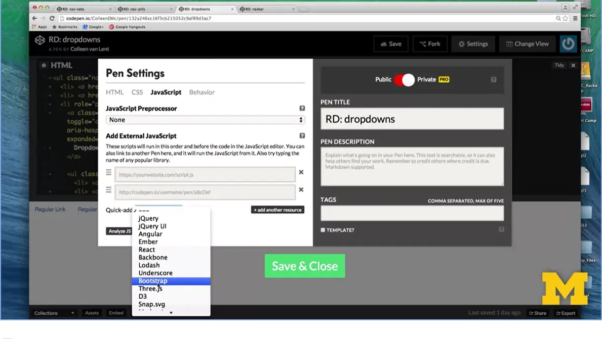
So first, I need to know, did I link to the Bootstrap JavaScript files? I can check up and there's nothing there. I can check my settings and I can see, yep, I forgot to add the Bootstrap files. Save. I've saved it. I go down, it still doesn't work. What could be going on that where I'm linking to it, but my JavaScript or something dynamic isn't happening? This occurs a lot.
So while I haven't actually forgotten it as you may have, I did comment it out.
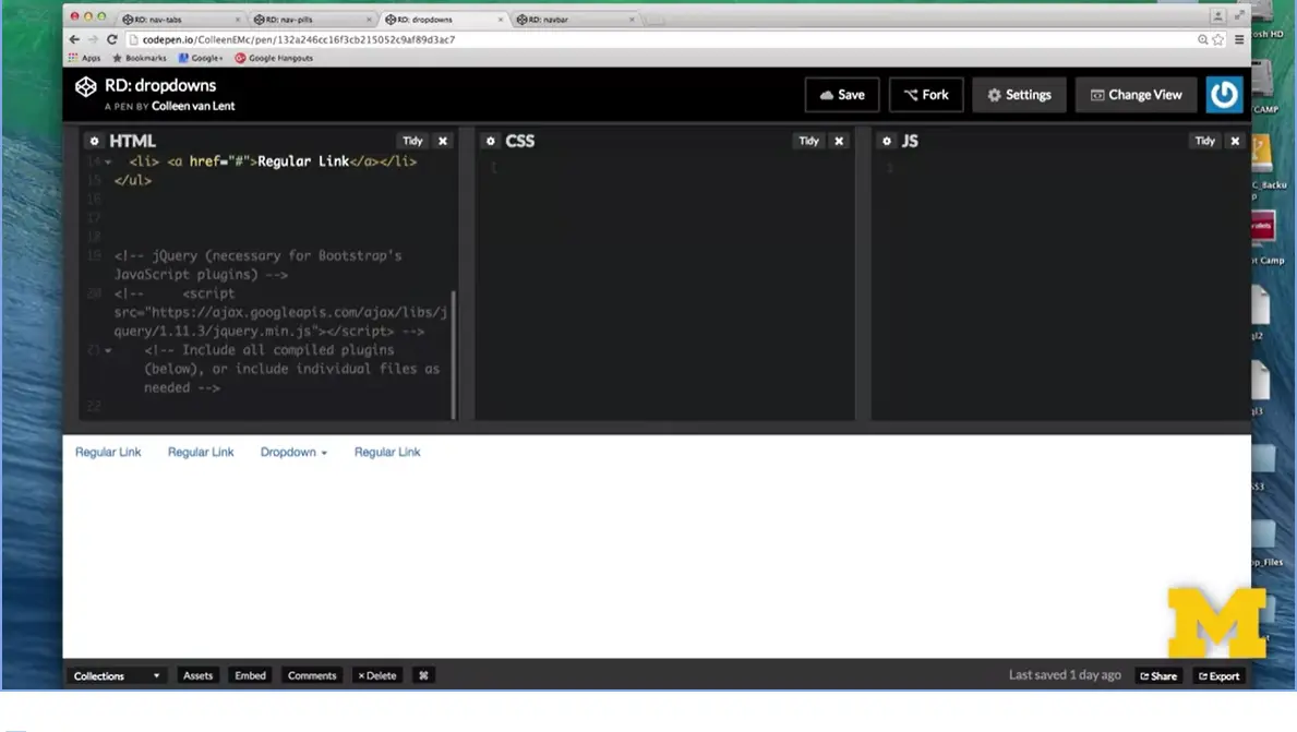
I'm going to go back here and say, oop, I know there's a script I'm supposed to have down at the bottom. The one that links to jQuery, I'm going to save this now and you can see that now the drop-down option works. Using bootstrap is not meant to be difficult, but there are all these little tripping points. That's why I encourage people to add code slowly and incrementally and keep testing every few minutes to make sure that you're on the right path.
<nav class="navbar navbar-default navbar-fixed-bottom">
<div class="container">
<ul class="nav nav-pills">
<li> <a href="#">Link One</a></li>
<li> <a href="#">Link Two</a></li>
<li> <a href="#">Link Three</a></li>
<li> <a href="#">Link Four</a></li>
</ul>
</div>
</nav>
<div>1 Lots and lots of Content!!!</div>
<div>2 Lots and lots of Content!!!</div>
<div>3 Lots and lots of Content!!!</div>
<div>4 Lots and lots of Content!!!</div>
<div>5 Lots and lots of Content!!!</div>
<div>6Lots and lots of Content!!!</div>
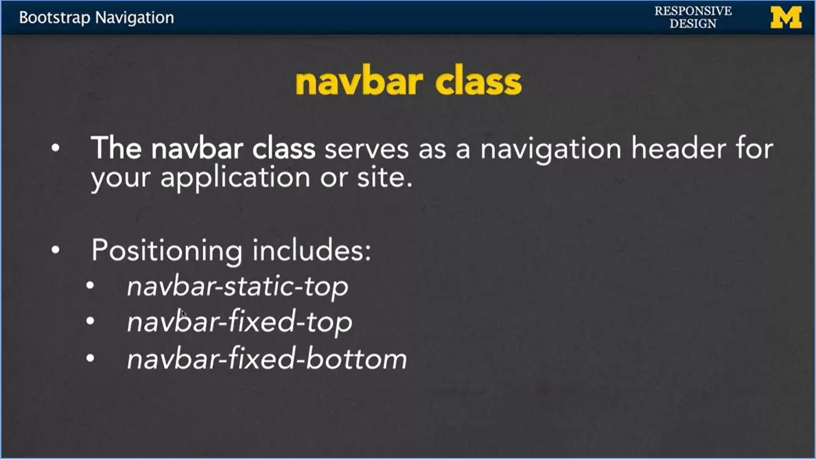
The last class I'm going to talk to you about, with respect to navigation right now, is the navbar class.
What it does is it kind of serves as a navigation header for either just that one part or your entire site. When you use navbar, the positioning is very important. You can have navbarstatic at the top. Navbar-fixed to the top or navbar-fixed to the bottom and this is going to affect where your different, where your navbar is going to show up and how it interacts with the other elements.
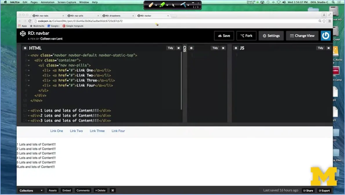
Let's take a quick look. What I have here is that I've wrapped up my typical nav with nav-pills and I've put it inside of a navbar class. I said, you know what? I want to use navbar, let's use the default values and I want it to be navbar- static-top.
This means put it at the top of the page and as people scroll down, you can see pretty much nothing's going on as I scroll back and forth. That's how I want it to be, it's just always at the top. However, instead of being static, I can go in and I can change this to fixed before I can even hit Save. I hope you notice that my content actually moved. I have changed the positioning of my navbar from static to fixed and fixed is what I call the annoying pop ad version of positioning. It means it's on top, it's not going to move.
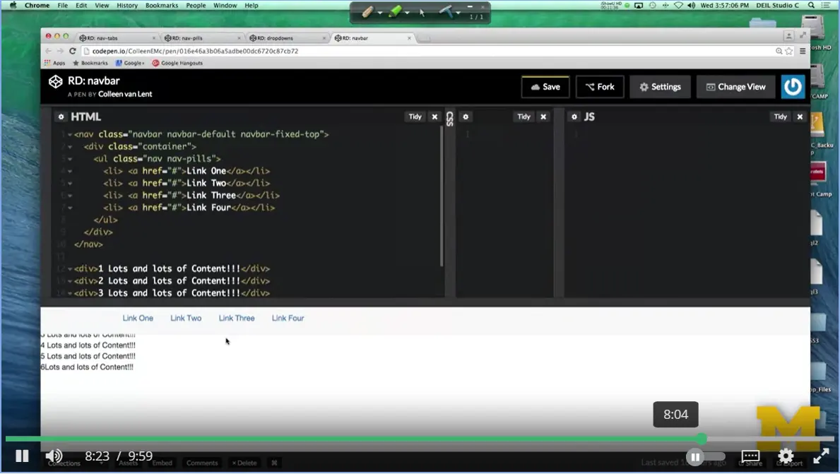
So, if I go back down to my screen now, you can see that it actually hides some of the other stuff that's there. I'm going to make my screen smaller. You can see I can scroll up and down here, but it's impossible to see the things that are underneath the navbar.
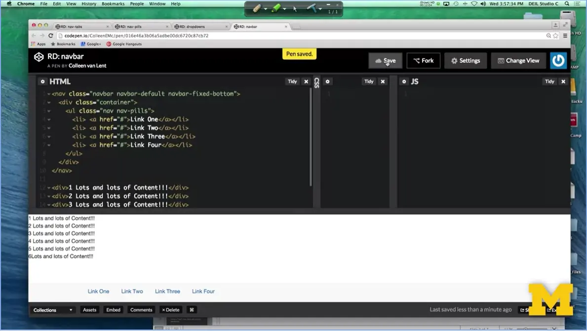
When you use fixed just be careful, the last option was to use bottom. And here what I've done is I've simply moved my navbar from the top to the bottom. But many times, with fixed content, this works out much better, because it doesn't cover up other things and at least take away the ability to scroll up and down and at least see them.
Back when you were learning about HTML, hopefully, you learned about semantic tags. Some tags are very generic div, P, different things like that. Other tags have meaning. Nav tag is one of those, it helps convey the semantics that this is a navigation section of your page.
Using a nav tag and a nav class are not the same. A nav class does not convey any semantics. So whenever possible, augment your bootstrap by using that nav tag. You can really just put it right before, close it right underneath what you are doing with navigation.
Another option is to use what is called an "ARIA" attribute where you can put role = "navigation" and it provides the same type of accessibility information that that nav tag will provide.
Let's go back, look at that code that I've provided, add some tags, play with the code. See how you can get your own navigation bar to show up on the screen.
<ul class="nav nav-tabs">
  <li role="presentation" class="active"><a
    href="#">Home</a></li>
  <li role="presentation"><a
    href="#">Profile</a></li>
  <li role="presentation"><a
    href="#">Messages</a></li>
</ul>
<ul class="nav nav-pills" role="navigation">
  <li role="presentation" class="active"><a
    href="#">Home</a></li>
  <li role="presentation"><a
    href="#">Profile</a></li>
  <li role="presentation"><a
    href="#">Messages</a></li>
</ul>
<ul class="nav nav-pills">
  <li> <a href="#">Regular Link</a></li>
  <li> <a href="#">Regular Link</a></li>
  <li role="presentation" class="dropdown">
  <a class="dropdown-toggle" data-toggle="dropdown" href="#"
    role="button" aria-haspopup="true" aria-expanded="false">
    Dropdown <span class="caret"></span>
  </a>
  <ul class="dropdown-menu">
    <li> <a href ="#">Option One</a>
    <li> <a href ="#">Option Two</a>
  </ul>
  </li>
  <li> <a href="#">Regular Link</a></li>
</ul>
<!-- jQuery (necessary for Bootstrap's JavaScript plugins)
-->
<script
src="https://ajax.googleapis.com/ajax/libs/jquery/1.11.3/jquery.min.js"></script>
<!-- Include all compiled plugins (below), or include individual
files as needed -->
<nav class="navbar navbar-default navbar-fixed-bottom">
<div class="container">
<ul class="nav nav-pills">
<li> <a href="#">Link One</a></li>
<li> <a href="#">Link Two</a></li>
<li> <a href="#">Link Three</a></li>
<li> <a href="#">Link Four</a></li>
</ul>
</div>
</nav>
<div>1 Lots and lots of Content!!!</div>
<div>2 Lots and lots of Content!!!</div>
<div>3 Lots and lots of Content!!!</div>
<div>4 Lots and lots of Content!!!</div>
<div>5 Lots and lots of Content!!!</div>
<div>6Lots and lots of Content!!!</div>
I am about to go into some of the more advanced classes in Bootstrap. Before we begin, are you looking for another reference on Bootstrap? Ifound that this article did a nice job of showing Bootstrap classes along with the CSS that goes with them. http://www.sitepoint.com/responsive-web-design-tips-bootstrap-css/
Read the following article:
http://blog.nocturnalmonkey.com/css-frameworks-and-semantics/
Do you prefer using standard CSS or CSS frameworks? Do you think it is more important to learn current (job-earning) trends (such as Bootstrap) or to stick to the basics? Share your thoughts.
I for one think that standards are very important, but so is knowing current trends. You can't live in a bubble.
Hi everybody. Let's talk about images. I think we've all been to places, where you've been on a website and particularly if it's not a professionally done website, some of the pictures are way too big or way too small or sometimes you'll see that even just when people send you an email. My mom does this all the time.
Hey, look at these pictures, and I'm trying to look at them and I've got to go scroll, scroll, scroll, scroll because the image is just so big. Since so many web pages now are made up of images, it's really important for us to think about how we can make them responsive. And we're going to talk about two different approaches.
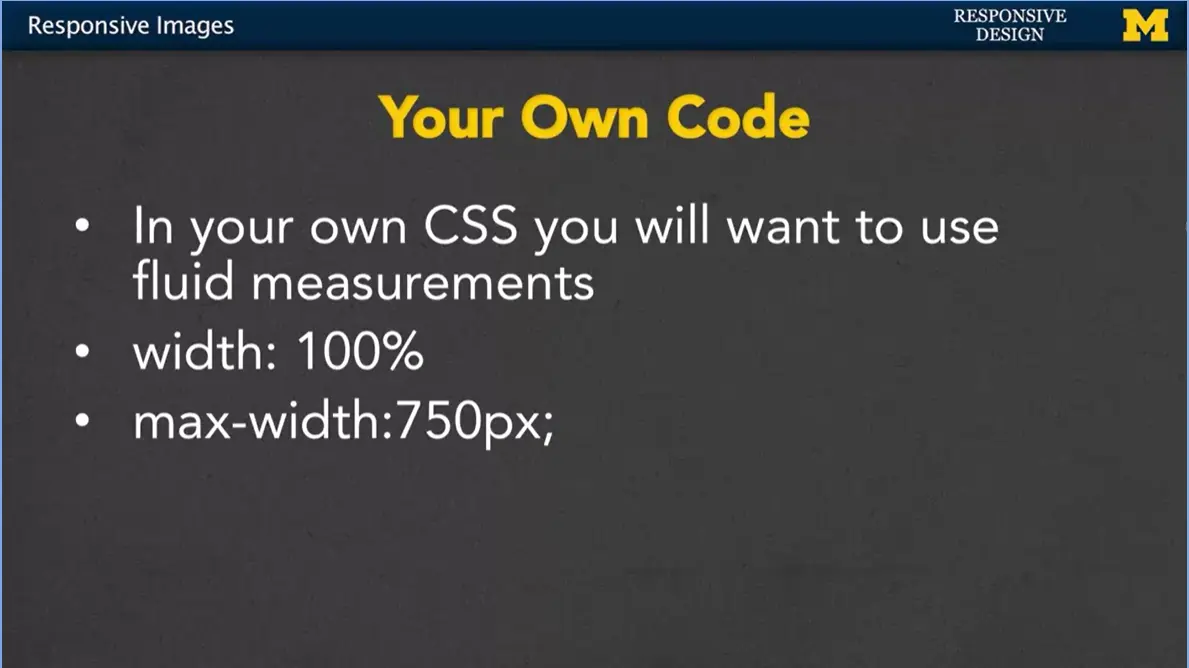
One is to write your own code to do this, and the second is to use Bootstrap and some of the built-in Bootstrap classes. In your own code, it's not that hard to make your images responsive.
You just want to use fluid measurements. If you set that width to a 100% that means it's going to naturally change as people resize the window. You can also add a little bit of an element to that, however.
If you think someone’s going to be looking at your page on an extra large screen. It's perfectly okay to add in an extra element called max width. This will say, you know what? I want this picture to grow with the screen size, or show up full width of the screen size. Unless, we're in certain situations, in which case, you still want it to be responsive. But you really want it to top off at 750 pixels, maybe because you think the quality of the image will degrade, or you just don't want it to have so much emphasis.
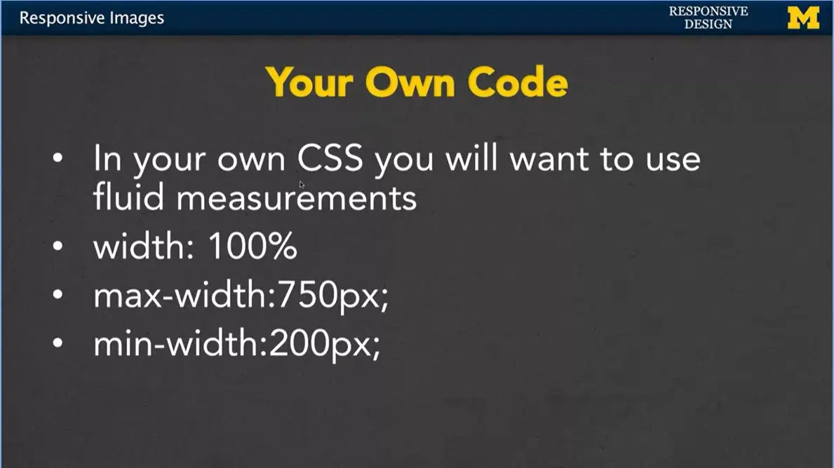
In the same way, you can also set a min-width, where if the screen is very small, you don't necessarily be proportional to the screen any more. You really want it to be at least 200 pixels. When you go in and you start setting the width on images, you might be wondering if you should be setting the height as well. In general, you do not, because what's going to happen is it's going to skew.
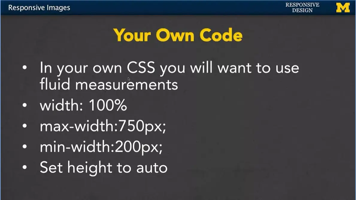
You can't get it exactly right. So usually, you just set the height to auto or leave it alone.
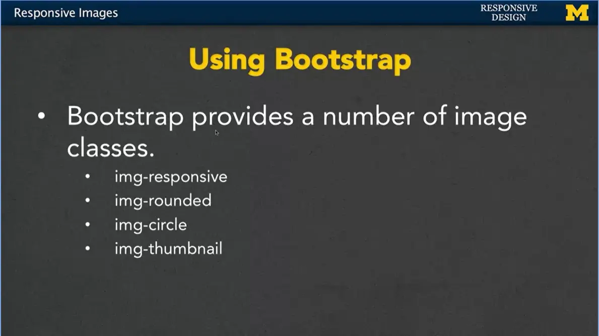
Many people really like to use the Bootstrap classes with their images, and that's because they provide a number of image classes, some of them beyond the responsiveness that we normally talk about. So, they do have an image responsive class. There's an image rounded, where it goes in and adds a little bit of border radius to give that image a slight curved look. You can also do image circle, where it will take whatever image you want and only show the circular part. It completely cuts off those corners. And then another one, you'll see quite a bit is img-thumbnail. What this one will do, is give your image the kind of look that is often associated with thumbnails. A little bit of a border, a small size, we'll take a look at those in just a second.
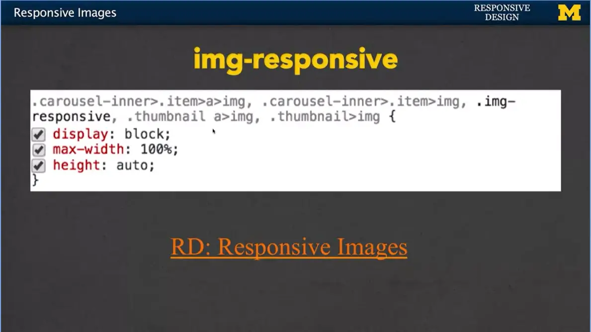
But first, let’s take a closer look at that img-responsive class. What I've done here is I've taken a quick screenshot of what the inspect element says happened, when the image responsive kicks in. And as you can see, we have display: block, which simply means you can only have one at a time, the max-width: 100%, and the height: auto. This is very similar to the code we were talking about, if you wanted to put it in yourself. Let's look at those other classes as well.
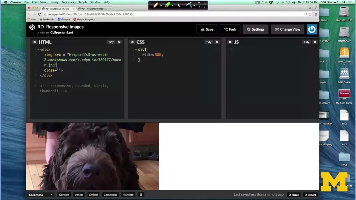
So, what I have right here is a single image in code pen. There are no classes applied. I went ahead and I put it inside a div. And I'm going to re-size the screen a bit.
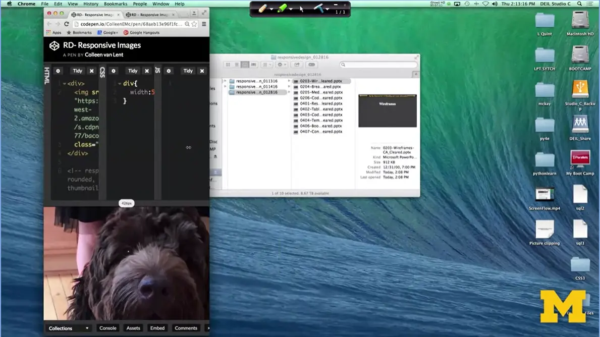
That you can see my dog stays there, he doesn't shrink, he doesn't do anything like that.
Div {
  Width: 50%;
}
Img {
  Width: 75%;
}
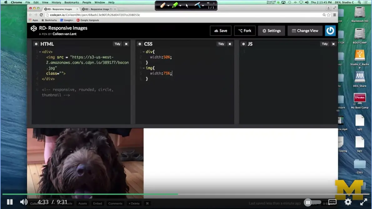
It would be possible for me to go in and do something along the lines of image with 75%. And what that means, is it's going to take its width based on the width of its parent, that div. So, if I re-size again. You can see that the picture of Bacon is actually changing. This is great, this is exactly the kind of responsive behavior that we want to see.
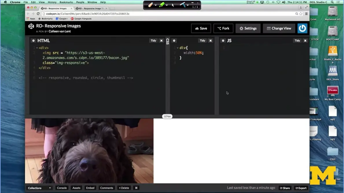
Let's see how it works, if we use Bootstrap instead. I'm going to go in and get rid of that. Now, one of the things I've done when I created this file, is that I linked it to the Bootstrap CSS, so I've already done that step. So, if you're writing this by hand, don't forget to link it in. Now, I can ignore the CSS part and just change the HTML to add different classes. We'll start with image responsive. When I do this one, you can see that now when I re-size it, again, great responsive behavior.
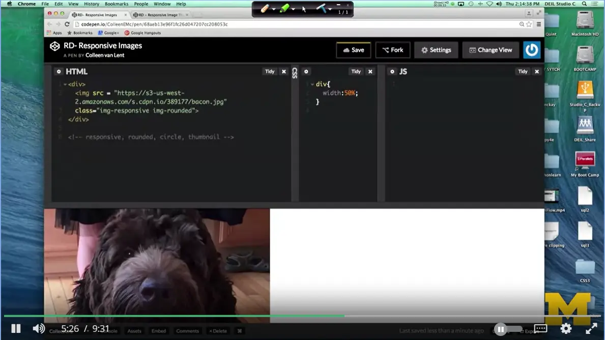
Let's see what those other kinds of visual ones do for us. We can have image rounded. And, it's probably barely perceptible to you, but you can have this little tiny curving, right here, curved just a little bit.
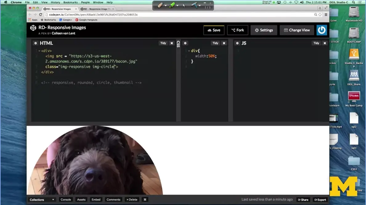
Let's go for image circle, so you can really see when something happens. And as you can see, it really just cuts off part of the pictures, so you can have that circle look.
The last one I'm going to do, which we can actually add at the same time actually just do it here, image thumbnail, hit save. It probably is hard to tell on this screen, but a slight border came out along here around this picture, you can't see it, and there is a little bit of padding and as we re-size the screen, you can see it is still responsive. Especially with that little red mark there, you can tell really well.
Each one of these Bootstrap classes is really simple to implement. And the reason they're there is because it's something people do all the time, so why go to the hassle of writing your own code, if somebody else has already done it. Well, we can see that there are reasons for doing that.
Personally, I would have liked a much thicker border, so you all could have seen it. But in many cases, you're really happy with the defaults. Let's look at one more example.
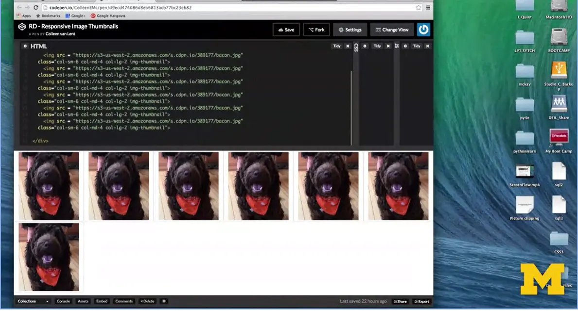
So, let's go ahead and look at this example, where I put together the Thumbnail class, along with some of our Grid classes to give you an idea how this would work. Up here, I have seven pictures of my dog. I just spent some time berating myself, because I couldn't add the seven pictures. I combine these with the thumbnail class to really have a kind of cool gallery effect.
So let me start by showing you the code. It's really simple. Kind of quick. Every single line says this same exact thing. It simply, I give the name of the file, and then I have class column small 6, that means when I'm on a small screen, each picture should take up 6 columns. Column medium four, each one should take up four columns and column large two, which means each one should take up two columns. So, if you do the math, that means on a small screen you should see two side by side. On a medium screen, you should see three side by side. And on a large screen, you should see six on each row. That's what was kind of messing me up. I was trying to figure out why this extra picture was off to the side. Well, I actually put it there because I wanted to show that there were one, two, three, four, five, six. All right.
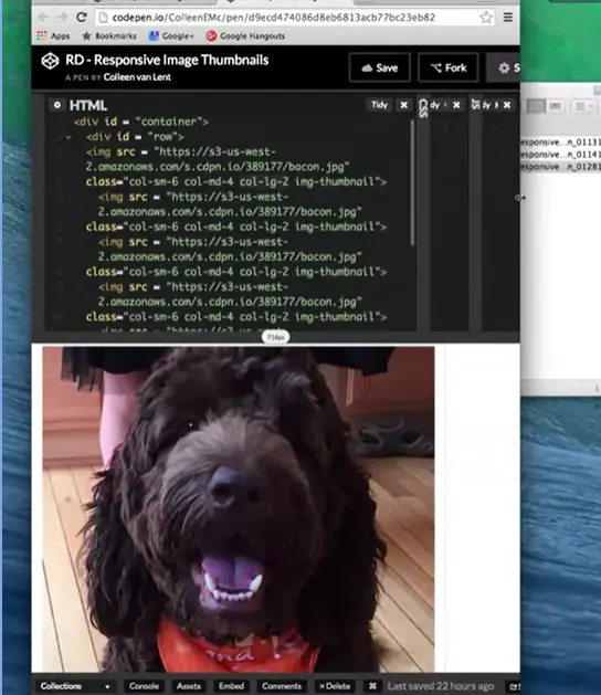
So, let's look at the small screen. Well, now this is interesting because I'm looking at it and nowhere do I say that something should take up all 12 columns. I said it should be six, four, or two so I should always have at least two pictures next to each other, and the question is why on the extra small screen is there only one picture of bacon staring at us.
Well, the reason is Bootstrap is always mobile first. So, it's always thinking about that extra small screen, even if you're not thinking about it. And by default, if you don't declare a rule for extra small, it's going to default for 12. So that's why on the extra small screen, you get one dog.
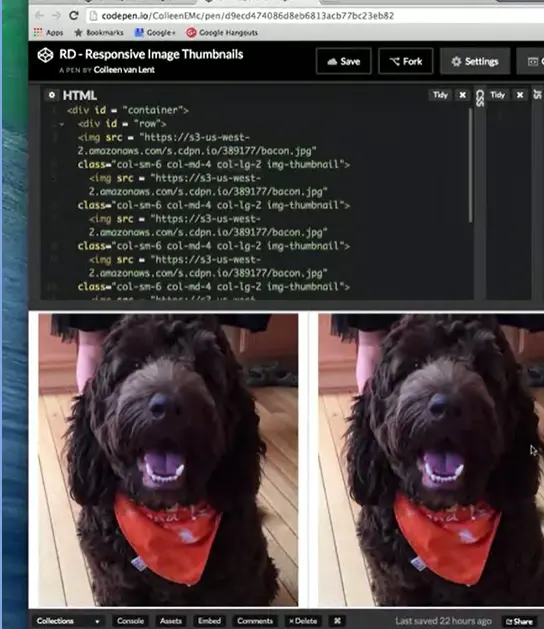
The small screen you get two in each row.
Then you go to three on the media screen image size.
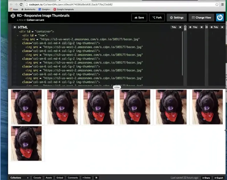
And then, you pop over to six. That's the way things are going on here. Have some fun with images. Images are always fun. People like to see your pictures. And it's always nice when you can have that extra little bit of style to them.
I hope you'll put your own pictures in and you'll play with your own circle classes, rounded classes, and responsive classes. The important part is to get as much experience and practice as possible.
<div>
<img src =
"https://s3-us-west-2.amazonaws.com/s.cdpn.io/389177/bacon.jpg"
class="img-responsive img-thumbnail">
</div>
<!-- responsive, rounded, circle, thumbnail -->
RD-Responsive Image Thumbnails:
<div class = "container">
<div class = "row">
<img src =
"https://s3-us-west-2.amazonaws.com/s.cdpn.io/389177/bacon.jpg"
class="col-sm-6 col-md-4 col-lg-2 img-thumbnail">
<img src =
"https://s3-us-west-2.amazonaws.com/s.cdpn.io/389177/bacon.jpg"
class="col-sm-6 col-md-4 col-lg-2 img-thumbnail">
<img src =
"https://s3-us-west-2.amazonaws.com/s.cdpn.io/389177/bacon.jpg"
class="col-sm-6 col-md-4 col-lg-2 img-thumbnail">
<img src =
"https://s3-us-west-2.amazonaws.com/s.cdpn.io/389177/bacon.jpg"
class="col-sm-6 col-md-4 col-lg-2 img-thumbnail">
<img src =
"https://s3-us-west-2.amazonaws.com/s.cdpn.io/389177/bacon.jpg"
class="col-sm-6 col-md-4 col-lg-2 img-thumbnail">
<img src =
"https://s3-us-west-2.amazonaws.com/s.cdpn.io/389177/bacon.jpg"
class="col-sm-6 col-md-4 col-lg-2 img-thumbnail">
<img src =
"https://s3-us-west-2.amazonaws.com/s.cdpn.io/389177/bacon.jpg"
class="col-sm-6 col-md-4 col-lg-2 img-thumbnail">
</div>
Hi everybody. Today, we're going to talk about tables. Many people use Bootstrap for styling their tables. I find that Bootstrap is very popular for both tables and navigation menus. Because it's really easy to go from something that's ugly, to something that looks really professional. And it doesn't take much effort. However, using Bootstrap to make tables, is an example of where you may apply many classes, to a single element.
When we write our own code, we tend to make classes that stand alone. I'm going to make this special class and it's going to style everything beautifully. In Bootstrap, instead you need to layer multiple classes on top of each other to get a really specific look.
The table class, the class just class equals table, it's the foundation. You need to have that class every time you style tables.
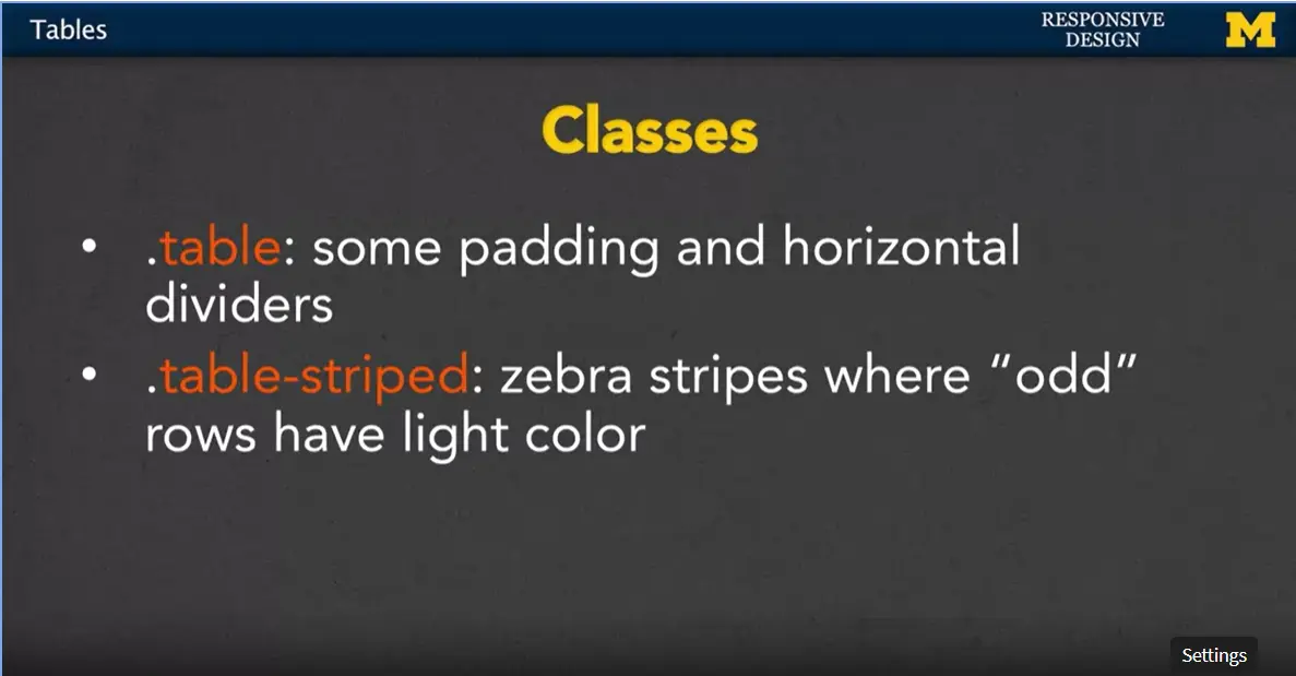
Let's talk about that one. The simple table class it just adds some padding and horizontal dividers. It doesn't sound like much but I'm going to show you in a few minutes and it's kind of impressive how quickly it transforms it.
You can also us the class, table-striped, in addition to the table class. This stripes your table with a kind of odd and even look. Every odd row has a little bit of color, every even row is just background transparent.
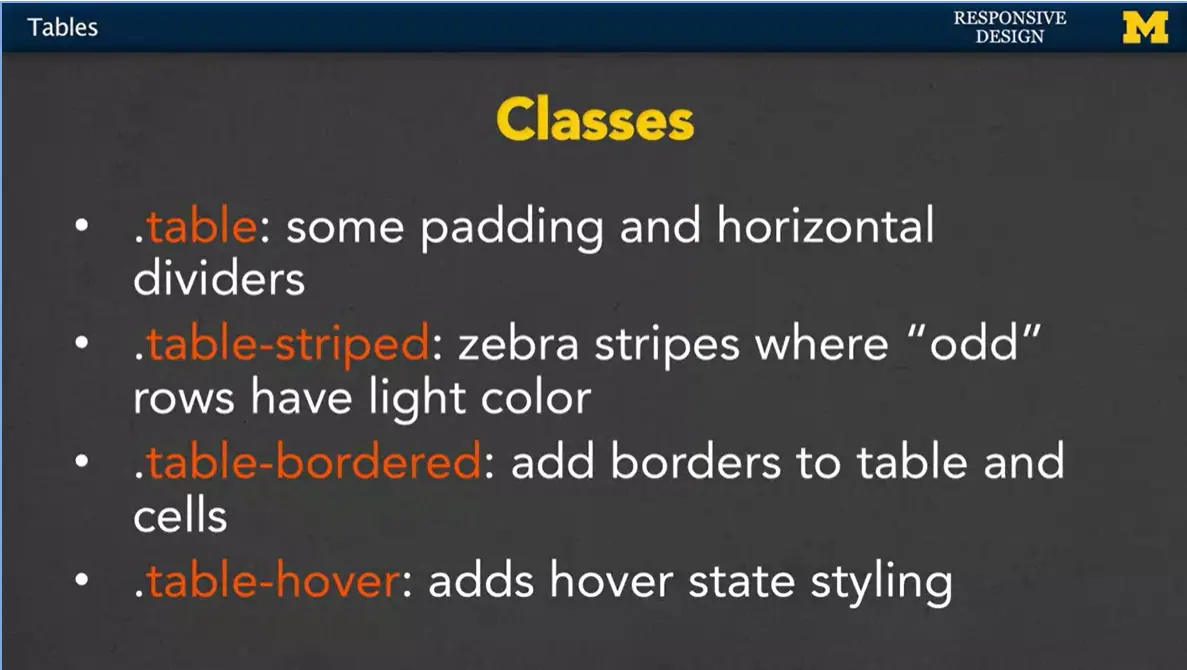
You can also add borders to your table where it will add a border to the tables and the cells inside the table.
We can also add a hover. This adds a hovering state so as you move your mouse or whenever you access the different rows it can change the look. It's also possible to have responsive tables. It actually sounds I think a little cooler than it is.
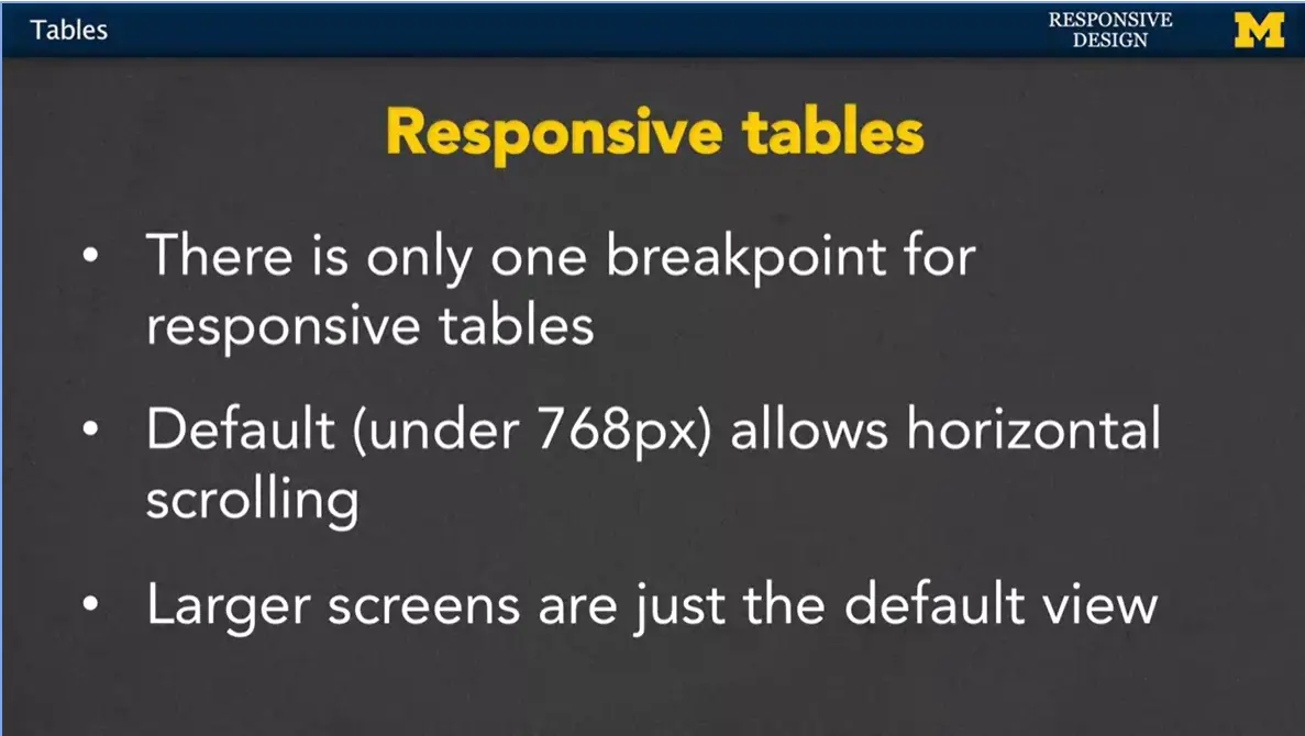
How it works is that Bootstrap sets one breakpoint for responsive tables.
By default, any table that's under 768 pixels, you can scroll back and forth. It doesn't try to squish the entire table into one little screen. You just kind of scroll.
But anything over 768 pixels. Well, then you're just going to get that default view. There's no default scrolling at the bottom.
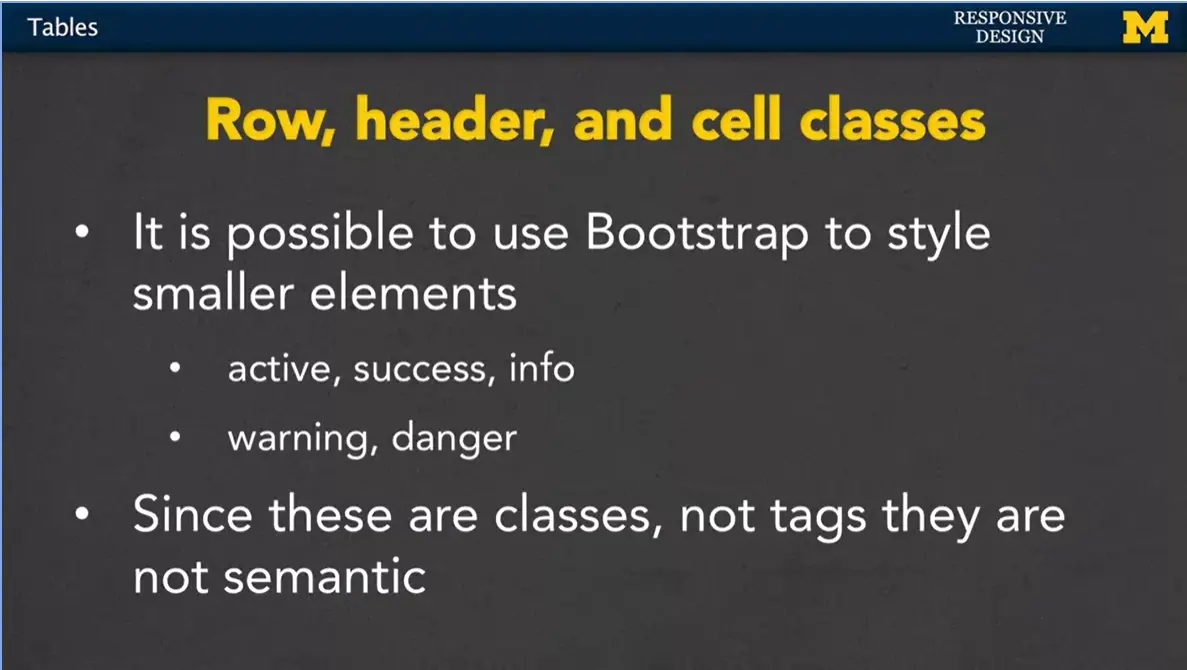
It's also possible to style some of the individual elements. Instead of the entire table, you can style a single cell, part of a row, or part of a header.
Some of those classes include active, success, and info. You also have warning and danger.
Since these are classes, I want to remind you that they do not have any semantics in it. A screen reader or anything like that, even someone searching for tags, isn't going to realize that you're trying to put a warning in there, it's just a class like any other class.
Let's go ahead and look at an example (see end of week/module for code). I really encourage you in this particular case to go onto CodePen and check out this Bootstrap tables code from the responsive design section. So, what I've done here is I've made a very simple table. I already went in and included the link to Bootstrap style in CodePen.
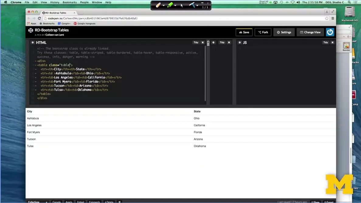
So now, I'm just going to add some classes so you can see how it looks. When I add table class equals table, right away you can see wow, that looks so much better, all right? You didn't have to add any of your own styling at all. And now it went from just a bunch of text to something that really does look like a table.
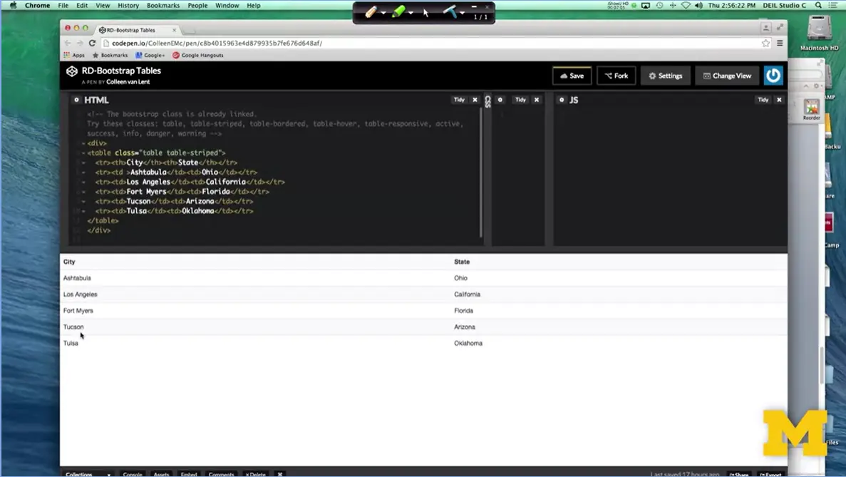
I can add in table-striped, and before I hit that D, I want you to look at the picture, and then look again. You're going to want to look at the Ashtabula, the Fort Myers, the Tulsa. It's going to be very nuanced, but you'll be able to see that it does look a little bit different. It was actually Los Angeles and Tucson. They have a little slight bit of color to them, while before there weren't.
How Bootstrap does this is it actually uses pseudo classes, and it does an odd even type approach to figure out which one should have color, and which one's don't. I'm going to add the table bordered. And actually, it's just table, yeah. I always forget. I'm going to be honest. I always forget whether it's table border, or bordered. Apparently, it's bordered. And once we add that you can see that it's added the lines in between.
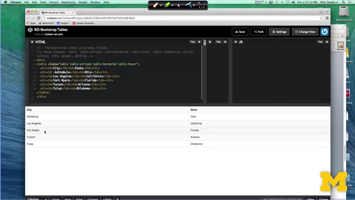
The last one I'm going to add right here is the table hover. When I save that one, again, it's a very gentle look. It's not something you see right away, but as I scroll between the different rows, there's a little bit of a hover styling effect. The next thing I want to talk to you about is the table responsive. It actually took me quite a bit of time to get this one to work, and I couldn't figure out what was going on.
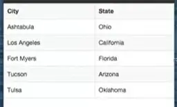
First, let's look at this table when I make the screen really small. Here we go, as I make it smaller and smaller it's just going to shrink everything down. I mean, there's not really much I can do for it.
I'm going to make it a little bit better and just to make things a little bit more interesting, let's add a little bit more content. That way we can see, well, maybe it didn't need to be responsive. There we go. Now I have a much bigger page. So, I'm going to save it, and I'm going to resize again. Now as you can see, it's just kind of squishing everything in smaller and smaller. Eventually, my browser gets a scrollbar at the bottom. But it's the entire browser, not just the table.
So, let's go back and make this bigger. If you add table responsive right here, if you do what I did and you save it and you make it smaller, still nothing happened. That's because if you want to use table responsive, you need to put this class on the parent container, all right. I'm going to go here, so I'm going to add the class equals responsive, oops, table responsive, to the div class.
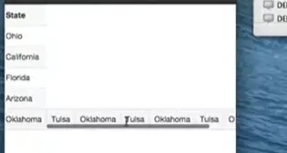
I'm going to save it, and now when I resize it, at first, it doesn't look very much different, but now, if I actually go to the table, you can see it now has its very own little scroll bar that I can use to go back and forth. So, it won't try to squish the elements too much. It'll still make them pretty small, but you can see that if there's other information underneath, it won't be spread out as much, so I can get that scroll right up to I think I said about 768. So even here, it takes up all the space, I don't need it. But that response is just basically going to let people scroll.
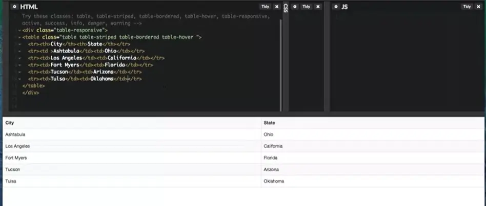
I'm going to get rid of some of this extra ugliness for just a second. Get it back to our old one, and then the last thing I was going to show you were some of those special classes that you can use on the elements themselves.
So, if I go in to this row, I can add class equals success. It basically just turned it green. Nothing too important there. If I do class equals active it's going to set it to, did I do that right? Yeah, you can't even see it. It's barely even colored but it's there. You can also do danger. That's your pink. And warning. Oops that will not work. And in this one again you can see that it turns in a kind of yellowish color.
I'm not a super big fan of some of these classes just because they're so nuanced and hard to even tell. Visually, I think it'd probably be best if you just wrote your own classes. But those first couple where you have the table, you have the table striped, it's really great.
If you want to have more impact with your style, it's perfectly fine if you write your own rules. Or better yet, get into the habit of learning some of the Bootstrap classes. And then overwriting certain elements of them with your own style. It's a great way to get practice with both responsive design, CSS and just good coding skills.
<!-- The bootstrap class is already linked.
Try these classes: table, table-striped, table-bordered, table-hover,
table-responsive, active, success, info, danger, warning -->
<div class="table-responsive">
<table class="table table-striped table-bordered table-hover
">
<tr><th>City</th><th>State</th></tr>
<tr class = "warning"><td
>Ashtabula</td><td>Ohio</td></tr>
<tr><td>Los
Angeles</td><td>California</td></tr>
<tr><td>Fort
Myers</td><td>Florida</td></tr>
<tr><td>Tucson</td><td>Arizona</td></tr>
<tr><td>Tulsa</td><td>Oklahoma</td></tr>
</table>
</div>
Hi everybody, welcome back to another Code with Me. What I want to do today is take some code that you're really likely to find online. And that's the code for using Bootstrap to make a collapsible navigation menu (see end of week/module for source).
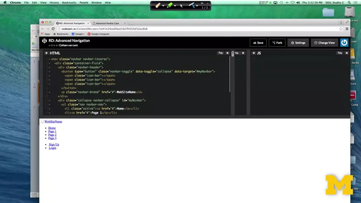
Let's take a look at what happens when we put it into CodePen. So, what I have here is the HTML that's needed to make a really kind of cool, collapsible navigation bar. It's the kind where it's regular when it's large screen, but when you make it small, you get this little like hamburger icon. Well, as you can see, this is not a good-looking page yet. And it's not up to me to add the CSS, because I'm trying to use Bootstrap classes. So, I want to walk through with you the things that you would need to do in order to get this to work.
Now, if you were using an editor such as Sublime or Atom, you would want to go in and actually edit the head of your document because you need to remember to link to the style sheets. When we use CodePen, we can just do this.
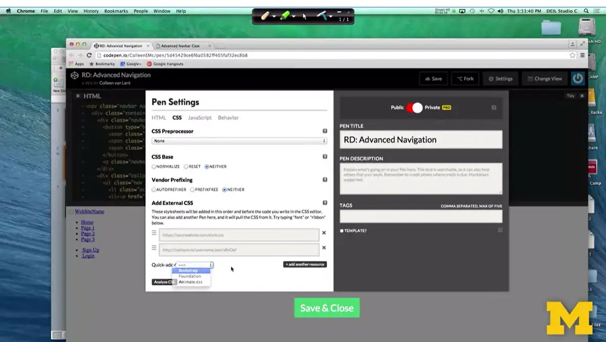
Settings > CSS, you know what? I want to add Bootstrap, and I've got it. As soon as I do that, you can see like, hey, this is a really much better-looking navigation bar. I've got all the different components.
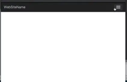
And if you watch, as I re-size it and make it smaller, we get this kind of collapsible menu. People tend to call this the hamburger, because you have the three lines.
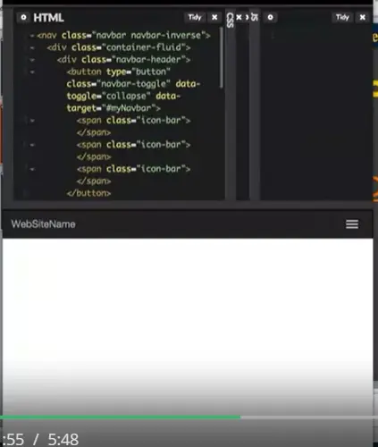
Where do these different parts come from? Well, if you look right here, you can see that I've got three classes called icon-bar, icon-bar, icon-bar. That's where this little part is coming from. So now, everything looks really great. The problem is if I actually go to open it, nothing's happening. I'm clicking and clicking, and nothing's going on. This is just another example of why code snippets can get you into trouble. What we want to do is we need to remember that most of the interactivity on a page is due to JavaScript.
Let's go in and add that JavaScript code. All right, so I added the link to the JavaScript and I'm going to make it smaller, and again, the icon appears, but when I click on it, it's still just not working.
Sometimes when you use CodePen, it's hard to know what kind of links are working and which ones aren't. What I'm going to do right now is I'm going to take this same code I was using on CodePen, but I'm going ahead and I just changed it to use in editor instead.
So, let's take a look at that code. Right here, I wrote the code on my own, and when I minimize it, it's the exact same code. You can see that the menu bar opens and closes naturally. What I really like about writing my own code sometimes instead of CodePen is that it's also much easier for me to use inspect element to look at what's really going on, so let's do that for a second. So, I've resized it to full screen. I'm going to go ahead and show you the page source for just a second there.I know you can't see it, I'll post it online. The important thing to know is it's exactly the same code.
And I remembered to include the links to Bootstrap, to jQuery, and the Bootstrap JavaScript as well. So, I have those three files. What I'm really interested in and what you should be really interested in is what's going on with these individual lines of code?
What do they mean because if you're going to use Bootstrap, and you want the coolest things, you find that it can be a little overwhelming at times, so let's take a look.
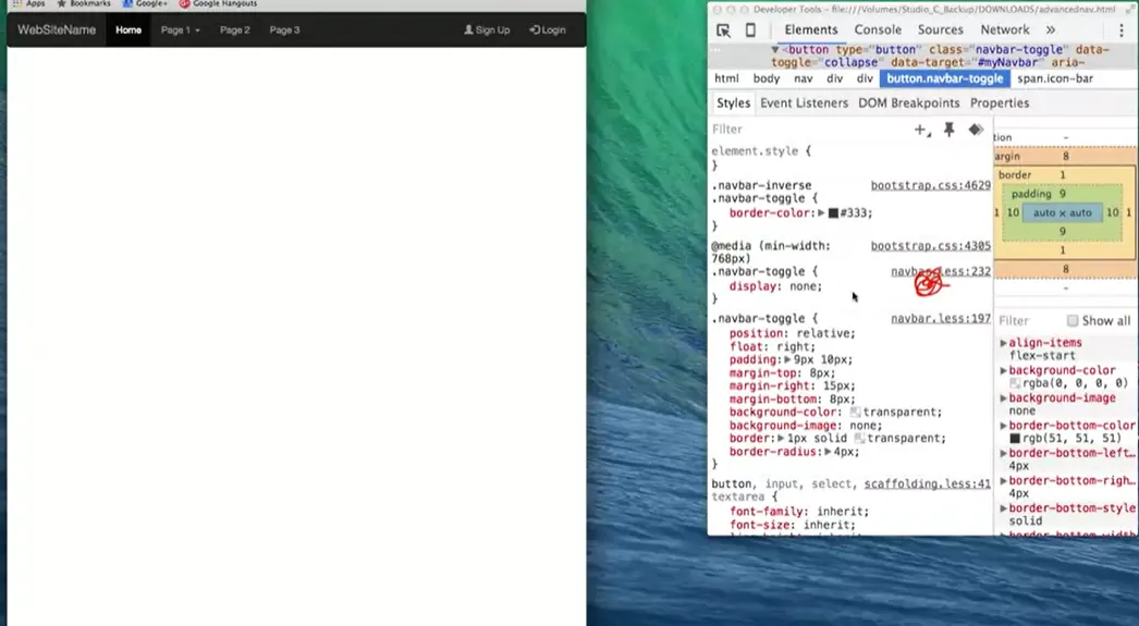
I'm going to start with the mobile view because I'm really curious how this showed up. Why is this here when it wasn't here before, so if I right-click and do inspect, I'm going to get my second window over here. And it's really helpful because I can go in and I can say like there's this button. This button that I want to look at, and right away, you can see all the details. You can see the border color, the position, all the things that you're really kind of interested in. But what I'm more interested in is how does it change when the screen gets bigger? So, I'll go back over here, make the screen a little bit bigger. And look, right in that same general area, you can see that now it's displaying none, where before, it used to have different parts to it.
So, this is my recommendation for you as you try to do advanced navigation bars using Bootstrap.
One, avoid using CodePen and try to use your own editor to kind of start from scratch. That gives you the power to quickly see if you're linking to all the style sheets and the JavaScript and the jQuery.
Second, it's a lot easier to use inspect element to see which parts are working and which ones aren't. Go in and play with the code a little bit and figure out if you can change it so your icon is four lines instead of three or two lines. It's playing with these little things that's going to help give you the practice you need to use Bootstrap or write your own code effectively.
<nav class="navbar navbar-inverse">
<div class="container-fluid">
<div class="navbar-header">
<button type="button" class="navbar-toggle" data-toggle="collapse"
data-target="#myNavbar">
<span class="icon-bar"></span>
<span class="icon-bar"></span>
<span class="icon-bar"></span>
</button>
<a class="navbar-brand" href="#">WebSiteName</a>
</div>
<div class="collapse navbar-collapse" id="myNavbar">
<ul class="nav navbar-nav">
<li class="active"><a href="#">Home</a></li>
<li><a href="#">Page 1</a></li>
<li><a href="#">Page 2</a></li>
<li><a href="#">Page 3</a></li>
</ul>
<ul class="nav navbar-nav navbar-right">
<li><a href="#"><span class="glyphicon glyphicon-user"></span> Sign Up</a></li>
<li><a href="#"><span class="glyphicon glyphicon-log-in"></span> Login</a></li>
</ul>
</div>
</div>
</nav>
Hi everybody. Many times, if you're talking to people who do web design, you've got the people who think, I hate Bootstrap, and other people are like, I love Bootstrap. Why is bootstrap so popular, and to be honest, so hated at the same time? I think one of the key reasons is because there are so many free templates out there for us to use. So, if someone hands you a bunch of code, you're going to say thank you, and probably use it. But that also tends to infuriate some people who really believe that every website should be unique and original. Let's go ahead and talk about some of those free templates that I'm talking about because, if it sounds really good to you, I want to get you in the right direction.
This first link comes from getbootstrap.com. These are just the ones that provide you when you first get started. These other two, bootstrapzero.com and startbootstrap.com, these are just ones I found either through word of mouth or through a search engine.
Let's take a look. So here I am at the getbootstrap.com kind of default page where you can find out where to download, and where to get the different links, and things like that.
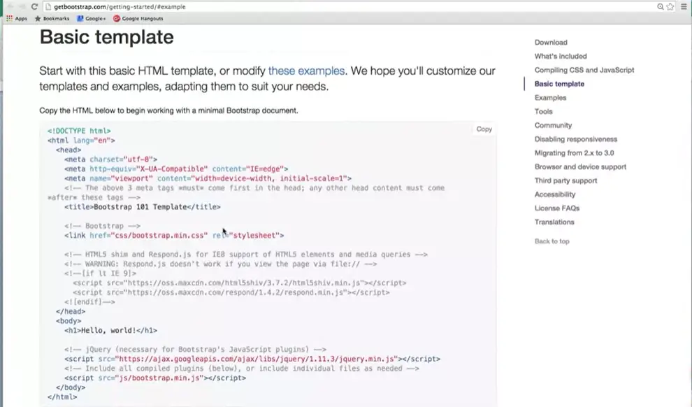
What I'm going to show you is that if I quickly scroll down.
Not only will they give you a basic template for where you can start your pages with a simple, hello world. They also include a lot of different examples of other templates. So, you could click in and say, you know what? I want this template right here. I want my site to look like this one right here.
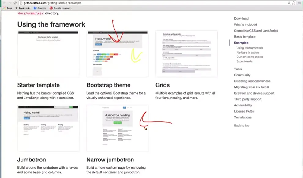
Or I really like the look of this one. And you can use it to build very basic templates. Again, nothing too fancy, because the assumption is that you're here to learn, more than to use as your professional site.
If you want to go a couple steps up, let's go ahead and take a look at this next option. So here I am at bootstrapzero.com, and you can see that, again, they're listing a bunch of free Bootstrap themes. They tend to go in these general ideas of, do you want it to be a landing zone, do you want it to have kind of a dashboard look, you can pick.
So, if I clicked on this landing zone theme, I'm going to go right here, Then, what you get is a much more detailed description of what kind of things you can have. It mentions that it's built for laptop and mobile view, as well as well as different views. It can talk about different things that you use. Different keywords, we use Bootstrap and the grid, and we use a form, and we have a video background.
But what you probably really care about at this point is, what does it look like? So let's hit this preview button right down here. And quickly you can see what the page would look like on the different platforms.
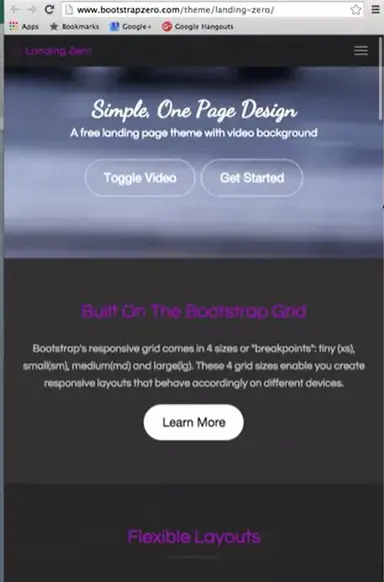
I'm going to resize the screen, and you go a little bit further down. And they have that kind of drop-down menu here. Still have the video, they talk about their reflexive layout. So, this is great and all, but what do you with it if you really like it? What you do is they always offer this download option right here. And you can download the code and then start playing with it yourself.
The same is true if you go to Start Bootstrap where you can get other themes and templates. Again, it's open source which means it's absolutely free and you can use it. You don't need to pay them. You don't need to do anything special. People like to help others and not only that, they like the idea of people using their code. If you can kind of mention it in your comments, give them a thumbs up, it's going to help them become better programmers.
So again, they break it down in different ideas.
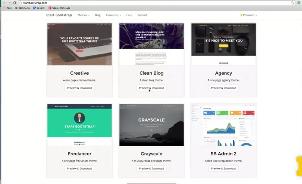
Do you want a blog page? Hey, let's go ahead and preview and download that one. Each one of these elements are going to have things that you really like about them, but they might have some things that you don't like about them as well. So how do we use them? I mentioned that one of the things you can do is you can just download the code.
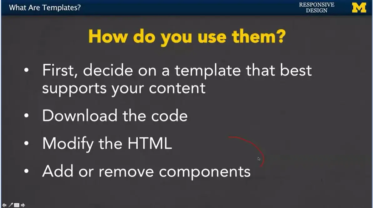
But before you go across and you go, that one's awesome, I really like the look at that page, you need to decide if the template is really going to support your content. Go back, say hm, what are the important parts of my page? What is it that I want to emphasize? You don't necessarily want a streaming, cool video in the background if it doesn't fit your content.
That's when you download the code. Find that template that's going to work really well for you, download that code.
And then, you will need to modify the HTML. You'll go in, every place they have the stuff about themselves, you're going to replace it with the content you want to display.
This is why it's so important to understand at least some HTML and some CSS even though there's free software out there. If you don't have that basic understanding, you're really left at the mercy of other people. When you know a little bit, it can really help you make huge changes in the templates.
The last thing you're going to with the modify HTML is add or remove components.
If they have, like I said, a video, and you have no use for videos, that's okay. Just take it out of the HTML. You can also take it out of the CSS if you really want to kind of improve performance. If they use a kind of layout where it's three columns, and you only want two, that's okay. You can go in and just remove the parts that you don't want. If you're feeling really powerful, you can also go in and add parts that you do want.
So, using Bootstrap is really that easy. Even if you don't understand HTML or CSS, or you understand JavaScript but you hate it so much, it's still possible for you to create a really great looking site using Bootstrap or really any other template at all. The thing is, I think if you can use them but make changes because you know a little bit about these things, your site not only is going to look so much better, but you can be really proud of knowing that you had a hand in creating something so great.
Hi, everybody. This morning I was actually ready to tape and my interviewer didn't show up, but luckily, I ran into one of my old students, Mike Wojan, in the hallway and he's agreed to talk with me this morning about some of the things that he learned in my class, as well as some of the things that he wished he had learned. So good morning, Mike, and thanks for joining us.
>> Yeah, thanks for having me, I literally work across the hallway. It was funny running into you this morning. I'm happy to come chat with you.
>> Great, so I want to just catch up a little bit. I know you've had a few jobs since you graduated. I was really curious about that first job, that kind of first job when you leave school and you have some knowledge, but not a lot of experience. So what did you do when you first graduated?
>> Sure, so when I graduated, I found a job as a User Experience Analyst for the Information Technology Services for U of M. And over there I was working on websites and mobile apps, trying to make them easier to use for their main user base on campus.
>> Okay, that sounds great, pretty much what you were studying for, so that's unusual and wonderful. I was curious, and I want you to be honest here. Your teachers can't teach you everything, so I mention in web design in my lectures that you can follow along, but you don't really learn anything until you get your hands dirty. So I was curious if there were things I didn't talk about, because I know you took the class three or four years ago and things have changed since then. But when you got out there in the real world, what are things that you had to learn on your own?
>> Sure, so I think what we learned in your class was how to write HTML and CSS and kind of design really well, but sort of in a vacuum, and so learning how to apply those same skills in the real world was kind of a challenge. So starting out for ITS, I realized I had to work on some systems that were pretty foreign to me, like content management systems. Since they work on these websites that impact so many users, they need something on the backend to help manage the code. So learning that was tricky, but at the end of the day I realized that the stuff going on inside that system, like the HTML and CSS that I was writing, were the same things that I learned in your class. So it wasn't too bad of a transition. Other things like accessibility are very important, especially for the University of Michigan and its users. So learning about accessibility and how to take this HTML that I was writing, the semantic code, and take it to the next level that makes it accessible by all of my users was a very interesting experience.
>> Yeah, I think you took my class back before I was teaching HTML 5. And so we didn't have a lot of those semantic tags. I didn't know if now you're using header and footer and nav and just some of the other tags that we didn't have back then. So that makes me feel better that we're incorporating those now. Do you still have a personal portfolio? Absolutely, yep, so my website as it exists today is actually just an iteration of what I've built for your class for that final project. So that was really cool to have a foundation to work on and kind of turn my website into more of a portfolio showcase of the types of things I do in the industry now. And that came in especially handy when I applied for this new job because I was able to share some of my work with them before meeting them in person.
>> That's good, so do you code much? Is that what you're doing, are you still coding or are you doing other things with people? You let other people do the code and you're managerial and kind of, I'm really curious what-
>> Yeah.
>> What you do when you leave, so.
>> Yeah, so I'm still coding a little bit. I still think it's a lot of fun and it's really important to be able to have that background in programming so I can speak the same language as the developers that I worked with every day. Mainly when I'm doing development work, it's just for kind of rapid prototyping things. I do have full-time developers that I work with that do the heavy lifting when it comes to the coding behind the scenes. But I'm out on campus, primarily, sitting down with my users and figuring out what they need from these systems that we're providing them. And then being able to come back to the office, take that feedback that I got from those users, and translate it into things that the developers can work on, that's kind of that heavy middle ground.
>> Okay. Okay, so you have a new job though, right? because like I mentioned, I just ran into you in the hallway, I hadn't seen you around. What are you doing now?
>> Yeah, so my first job out of school I was a User Experience Analyst. Now I'm a User Experience Designer. And the main difference there is working for this new department, the Digital Innovation Greenhouse. I'm working on tools that are much more flexible and agile and we're working on them iteratively. So, I'm able to go out to campus, get this feedback and write cards for my developers to work on and we can implement things quickly, gather feedback on it and iterate on those changes. So, I'm doing much more design work now, so I'm kind of picking up a lot of the visual design, the graphic design, trying to figure out which color palettes and typography and iconography works for the systems that we provide. And I think that's a new, interesting challenge for me.
>> That's great. It kind of brings up something that I hear a lot when we hear about, why are so many developers’ men, which they are, and one of the reasons people give is I don't want to do tech because I want to be out helping people. I want to be doing things with people. But we had talked, because you originally were a political science major, correct? And you moved away. Do you feel that you get to interact with people? And are you just doing tech or do you feel you're doing more?
>> Absolutely, I still do the tech stuff. I still consider myself a very technical person, but my main passion is working with people. And I think the reason I transitioned into the informatics major from the CS was because I still wanted to work with the human element and I'm most passionate about helping people solve problems with technology. And so, I felt that when I was just programming full time, I really wasn't able to interact with the users like I knew that I should, and so there is some middle ground between those two fields. And I think that it's really important to be able to know what's going on behind the scenes with the code when I'm sitting across from users. Because when they give me feedback, I might know what's actually capable, kind of in the back of my head, or what we're capable of doing, what's possible, because I understand our code base. But I don't necessarily need to be heads down programming all the time, because we've got people that do that full time.
>> Because who wants to be heads down programming all the time. There are times in life but not forever for me. Well, that's great. This is what I was kind of hoping for is, I'm this face on this screen that have been lecturing to everybody, and it's different when you go to there in the real world. And I don't know if you were nervous about that first job. I found that I'd done well in school but that didn't necessarily mean I knew everything. And I like to encourage people to know that when they're in tech, they're never going to know everything. But it's these basic building blocks you talked about.
>> Of course, yep. It was definitely a learning curve starting that first job after school. But I just had to go in confident that I had that background that I got from classes like yours and I had the skill set. And really after a couple of months of settling into that new job, I felt like I'd really found a place for myself and proved myself, and you just gotta take what you learned in school, and start applying it. And figure out how you need to tweak those skill sets to fit in to different types of working environments and it's really not as bad as it sounds.
>> All right, well, thank you very much. I do want to thank Mike for this kind of last-minute interview. I hope you found it useful and I hope it's going to inspire you to realize that whether you want to get deeply into tech or just really at a surface level, it can help you accomplish any type of job that you're going to go into. So thank you
Good morning, everybody. Apparently, I am starting a new series called high jacking my students in the hallway because I've just run into another student, Heidi Wong. And what I did is I noticed that she was working on some wire frames. So, this is a great opportunity to again talk about some of the real-world applications of the things that you're learning in this class. So good morning, Heidi.
>> Good morning.
>> Thank you for doing this, I really appreciate it. So, you were in my class last semester, correct?
>> Yes.
>> And one of the things I did as an assignment was ask everybody to sketch out their website before we started designing. What did you think was the importance of that assignment when you actually did it and how much do you think your sketch really reflected what your final project looked like?
>> Well I thought sketching was actually really helpful in imagining the experience I wanted viewers to have on my website. Because at that point, it was very early in the semester so I didn't really know how to do very much as far as coding went. But I could sketch it's pretty simple to think through how the front page would look, and how the elements would be organized? So, it was helpful to lay that down on paper, and then ask the questions, and talk to people about how you would actually implement it in code.
>> I have to say, I'm very impressed because when you say I can sketch, not a problem. Ask me to sketch something and I feel-
>> [LAUGH]
>> Like I want to vomit. For me I'm a coder, I can create things but that initial idea of drawing things out is paralyzing to me. So, it's great to hear, I love to hear that that's what some people's strengths are. And I love that the people whose strengths compliment mine are out there doing the things that I'm not that great at. So, one of the things, I just wanted to mention is I saw that you had these wire frames in front of you. And just how often do you use them in this job?
>> Pretty frequently actually. So, this is a new project I just got put on. It's called policy maker, and it's basically this new tool. They're designing for professor at the school of public policy, and it's supposed to allow her to facilitate. So, every year the word school does is list in class in simulation exercise. And currently they use these tools to facilitate everything. And it's not really cut out for that kind of thing, it's a three-day simulation where there's a lot of communication and collaboration happening. And so, they want to design this new tool that allow her to facilitate that process. And also want the students to more easily communicate and collaborate with one another. And I think when they introduced me to this project, I was having a really hard time imaging everything that was happening. because I have not participated in this process before, and so they listed all of these tasks, they want it to accomplish. And I just not really getting it. So, this is a sort of a way for me, to draw out the different task that will need to get accomplished. For me this is more putting myself in their shoes and imagining the different tasks they'd want to accomplish within the simulation exercise. And just thinking through their journey, through that experience. So, then I had something on paper. And I was able to show it to my boss and does this look like the right sort of experience that you'd want this tool to accomplish? And then they can show it to the professor and then we can start the conversation.
>> So, you have a page there per project, do you have any certain feeling of like how many sketches do you end up with?
>> Not really, I wouldn't say that I'm especially seasoned either so this was one of the first projects where I've actually started with the wire frames as a sort of thinking process.
>> Okay.
>> So I wouldn't have the sort of definitive answer to that. But I guess from me, I really like working through a very iterative process where I'm constantly drawing, and drawing and showing it to people, and if it's like not right then I can just drop it and go to the next one. because that's one thing I sort of learned when I started learning about how to prototype and wire frame, is that you don't want to have anything too precious.
>> That's a great idea, and I assume by that you mean, I talk about it's so much better to draw it out by hand because you're willing to accept those changes well.
>> Right.
>> You want to be flexible.
>> Right, and they're very abstract too. I draw a couple of boxes and they're all meant to be like this is exactly how it looks. It's sort of here's the overall idea. Does this look right? If it does then I can sort of move forward and we're find that further.
>> So I'm curious just because it seems you're really into the graphical, the drawing part, the sketching out. Are any of the HTML tags kind of in your brain as you're doing it or are you really just looking at it as separate parts? Be honest, it's okay.
>> That's a good question.
>> [LAUGH]
>> I think it was helpful, it's helpful to definitely know how HTML works. So, I feel like it's always sort of constantly in the back of my head now, but I wouldn't say it necessarily informed how I think about the experience.
>> Which is really great actually-
>> Yeah.
>> Because if you're thinking about users, you should be thinking about users, not about code. Well then one last question for you just because I'm curious. Actually, it's not even a question, it's a statement change to that. When you did your sketch for class-
>> Yeah.
>> Were you thinking about interaction or were you thinking about layout?
>> I think I was thinking about layout actually. Because I think for me, at that point I wasn't sure sort of scopes of interaction that were even like doable. I think I have a much better grasp of it now. But at that point, I hadn't even seen enough to know what was possible. I didn't know if something was a jQuery thing or a JavaScript thing or whatever.
So, I think I was just thinking hopefully out at that point.
>> I think that's a really important idea, because when you're first beginning-
>> Yeah.
>> When you don't know much yet.
>> You do what you can and think layout is what we focus on and I'm just really glad to hear that you've experienced this idea that why are your friends are not just about layout, it's also really about that experience.
>> Right.
>> Thank you again, for stopping and talking to us and sharing some of your work. Again, I just like to remind everyone that I'd really enjoy the fact when I see students and I am fine if they are not doing anything at all that I taught them. Because what I'm really proud of the fact that they're following what they enjoy and they're using tech in their own ways to interact with people. So good luck, I hope you enjoyed this interview.
Hi everybody. Welcome back.
Today, we're going to talk responsive design with Heather Newman form the University of Michigan. Good morning, Heather.
>> Good morning.
>> How are you doing?
>> I'm doing very well. How about yourself?
>> I'm good thanks. Let's go ahead and jump right to it. What is your role at the University of Michigan?
>> I'm Director of Marketing and Communications for the School of Information, which is one of the 19 schools and colleges at the University. So, I oversee all of the school's public relations. I oversee all of its marketing. I oversee all of its communications. Mostly for external audiences, folks outside the University. Excuse me. And I oversee all of the websites and design.
>> Okay, well, I'm tired just listening to everything you do.
>>
>> And I'm also a little bit in awe, because that sounds like it's a really big mix of both technical, non-technical, working with people.
>> I assume a lot of independent work as well. Have you always been part of the tech field?
>> I started in technology as a kid, right? Like many of our students, I had a personal computer at home from age ten, I was online from age 12.
>> Mm-hm.
>> But actually, much of my career has been focused on text. So, before I was in marketing and communications, I was a journalist. So, I spent 20 years covering, and still do for some outlets, cover technology and video games. And so that's been a large focus for me throughout my working career.
>> Okay, but let's talk specifically about the web page and the different things you do. When did responsive design or responsiveness in all these different platforms hit your radar, as something that you needed to make sure that the Site was on top of?
>> Really from day one. When I first started at the School of Information and the websites became sort of part of my purview, it was pretty obvious that the site we had at the time had not been designed to be friendly with mobile devices. And yet, our students, who are fairly advanced, much like the students for this course, I suspect, were already at that point carrying around smart phones. They were already using tablets, which are classified as mobile devices frequently for websites, certainly were at that point in time.
So, the experience that they were getting if they tried to look at our site at that point, or any of our sites really, was not optimal. They were seeing sort of the big websites shrunk down to a little, tiny, screen and the outcome was that folks had a very difficult time using the site and they would frequently abandon it as mobile visitors.
>> Really? What was your approach? I've talked in the class about some of the different ways people can try to design from scratch, or use different sites for mobile versus a single site with different style sheets. How did you go about approaching your response?
>> Back in 2011, we initially approached setting up an entirely separate mobile site
>> It would still draw from some of the information and some of the articles we have posted on the main site, but it would be structured entirely differently. sort of one of those m dot addresses, right? So that people who came in on what we identified as a mobile platform, would see that separate site that was tailored specifically for users of that platform.
>> And the reason why we chose to do it at that point in time, was that Google would give preferential search results to people who had specific mobile websites. Or mobile versions of their websites. So, if you had somebody who was searching for you on Google, and you had an M dot style website, that would pull up higher up in the search results than if you had a normal website, that had a more responsive design. Google's gotten a lot more sophisticated since then, so that's no longer an issue. And what we discovered was that it was incredibly difficult to try and feed a good amount of information into a mobile website. Without confusing or frustrating people who knew that information was available on the desktop site. But either couldn't get to it in the same way, or they couldn't see everything that they could on the desktop site. And there was no good way for us to sign post, to say this is the point where you really need to go to the desktop to see what you're going to see. So, we actually abandoned those plans even before fully implementing the site. Okay, that must have been painful.
>> Yes. [LAUGH]
>> As a programmer, I like the students to know that sometimes you just have to chuck out everything you've done so fa,r and it can be really painful for people to do that. And it's great to hear that's not a failure, that's just one of design. That's just what technology is, you know, going back and doing it again. So, you know, now you use you know a more sophisticated approach. But still you know after you rolled out, you know the latest sight are their things that ever surprise you now or surprised you? When you had these sites up.
>> Well, and we have a series of sites, right, we have the main site for the school, but we also have sub-sites that address some of our specific programs, especially those which are shared with other colleges and schools on campus. So, we've had the opportunity to kind of redesign with mobile in mind in a number of places, and it continually surprises me what people want to do, so
>> As a school, at the university, for example, you can start your application for the university via our website. It stuns me every year to discover how many students want to begin their application to grad school using their phones.
>> Knowing that I'm probably not going to write my essay on my phone, right, but I want to be able to start my application in a way that is easy for me to begin.
So at least I can get a sense of, these are the things that are going to be required to apply
>> These are the things that I can start to ruminate about. Do I need to include this in my position statement or my essay? And so, we needed to support that as part of our mobile approach. And at this point, all of our websites, I believe, are mobile first. In the sense that our students, large percentages of our students and prospective students come in using mobile platforms. Whether they're smaller form factor tablets or whether they're just smartphones. But in either case that's the form factor that we design for now, and the desktop is I guess an additional version that expands on that. Okay, great. So, these are exactly the kind of things that I love to hear about, because it's so different when you're out there in the real world, and you're developing these things, and you're dealing with failure. One of the things I always hear from prospective employees, is teach the students how to fail. And I was like, I can't, there are teacher evaluations.
>>
>> So, I guess my question for you, probably my final question right now, is
I know that you hire a lot of developers, and not just developers, but other people who you expect to have some level of technology knowledge, or you know, understanding of HTML. For people who are not computer science majors. For people who are not necessarily coming in with a degree that's, you know, in design or technology specifically, what kind of things do you look for? Just across the board for when you're hiring people to work as part of your group. Really new people. Kind of that first entry level job.
>> I think that a lot of, especially for that kind of entry level position. What you're looking for is folks who have taken an initiative to learn things on their own, right. Because they're not necessarily going to have the 20 years of job experience to build up progressively responsible positions that relate to technology. Or to you know the websites, but if they can demonstrate that they've had an interest for a while, in a particular area. That they're reading, articles, journal articles, you know news stories that relate to developments in the field, that they're doing things like this class, right? To kind of advance their own knowledge. It's an indication that they have an active interest and that they have the willingness to kind of consume information in that field. To be honest, web design changes on a daily basis, right? Every day there is something new that comes in.
So having somebody who has a full suite of technical skills up front is great. But if that person can't adapt and can't change those skills as they move on. Then ten years from now you're going to end up with somebody who is a whiz at ColdFusion programming and can put together the best site based on frames you've ever seen, but they're not going to be somebody that can adapt and roll with the new tech.
So, a lot of folks, when responsive design became such an important priority for website design. A lot of people were used to designing for the desktop. They wanted everything to be pixel perfect. They wanted everything to look, exactly the same on every screen, and to be like infinitely customizable, right and controllable. That, and some of those people had difficulty adapting.
The more you can prove to me that you have the ability to roll with those punches as they come, and the more you can prove that you're excited about the idea of learning new things and applying them, the more likely I am to consider your application.
>> All right great. Thank you so much Heather, I appreciate all your input today, and I hope that you've also gained something from this. Whether it's understanding that yes, it's okay and expected to fail, or really that any little thing you can do to get yourself more engaged in tech is going to help you in all these different fields.
So, thank you very much.

Hi, everybody. Let's talk about Bootstrap 4, 5 and 6. In this class I've been talking about Bootstrap 3 exclusively. Those are the materials I covered in the slides, and that's where the classes came from. But now that Bootstrap 4 & 5 are available does it matter? How will it affect you? Well, just so you know, when Bootstrap 3 came out it completely killed Bootstrap 2.0. There were way too many incompatible changes. So, if you wrote your site using Bootstrap 2, and you tried to convert or add Bootstrap 3 elements to it, it just didn't work it died. Luckily for us with Bootstrap 4 they worked much harder to make the two compatible.
They're still developing it, but I can tell you that Bootstrap 5 will be one hell of a lot faster and better than both 3 and 4. They've switched from a kind of language called Less to one called Sass that's just going to be faster creating the things that you need. They're going to include a new grid tier, so we had our extra small, small, medium, and large. There's going to be something in addition, so it won't kill the other ones. There are going to be new customization options. If you remember when you downloaded Bootstrap 3 there were all these options that you could add for things that you wanted to change. You can expect even more in Bootstrap 4. One other thing I just wanted to mention because I know that we've talked about it a little bit is that it's starting to use more fluid elements or fluid measurements. It can use rem and em units where before it didn't use them. And hopefully if you've been paying attention through this whole class. If you get involved in a conversation you can nod and say, yeah, rem, em, good stuff, and actually kind of know what you're talking about. And that always feels good when you're hanging out with techie people.
If you're interested in learning more about Bootstrap 4 or 5 you can download the new code at this URL. v4- alpha.getbootstrap.com. Whenever they're referring to software in alpha version that means it hasn't been completely tested yet. It's safe for you to download, but there's probably going to be bugs. The other thing you can do is you can follow the blog as they talk about the different things they're adding or deleting from bootstrap.
If you're considering jumping into Bootstrap 4, I think this is a great idea if you really want to be a serious developer. It always helps to be on that cutting edge in web development and really anything techie. I hope what I helped you understand was that learning bootstrap 3 is really useful and you're going to be able to use it for long time. Bootstrap 4 can only make things better, so if it's something you're interested in, go ahead. I myself am excited to see where it goes.
Congratulations everybody. I'm really glad that we had this chance to learn about responsive design.
Responsive design is really a key component to any type of web development you're going to do today. It touches on user experience, graphical design, coding, every single element. And that's hy I really like to keep it towards the end so people can get the most out of it. One other extra thing, that I also mention that people are even more excited about, is that responsive design can also affect search engine optimization.
If you do it right, people are going to be led to your page more and more. Also, I'm really glad we had the chance to learn how to use frameworks, such as Bootstrap. Learning how to do frameworks may seem like a cop-out sometimes, because you're not writing your own code, but it couldn't be further from the truth. You're getting great experience understanding concepts. You get to use other people's classes, experience linking to other files. Believe me, debugging your code when you try to use other people's code is not a cop-out, it's a really great learning experience.
So, what next? What should you do once you finish this class? Well, you should continue to practice your skills.
You now know HTML, CSS, hopefully you know some JavaScript, and you also know about responsive
design. So, you can go out there and use your code from others, or from yourself, to create different
looks for pages that already exist. You can also go out and begin your own portfolio. You really have
all the knowledge you need.
Thank you for coming along with us, and I hope you enjoyed the class.
This is an interesting article on the evolution of the Airbnb website.
CSS Frameworks and the Evolution of AirBnB.
I think one of the reasons I find it interesting is that the CodeAcademy CSS tutorial actually uses a similar platform to teach about Bootstrap.
This material is not required for the course.
I tend to use Chrome as my browser, and Inspect Element to debug my site. However, here is a tutorial for another very popular development tool - Firebug. This video by Vicki Watson will walk you through how it works. Bootstrap Firebug.
If anyone wants to improve testing and debugging skills using Chrome. Codeschool has free courses about DevTools:

Want to keep learning? Explore hundreds of learning experiences from the University of Michigan faculty and instructional teams on Michigan Online.
Be the first to know about new learning experiences from the University of Michigan! Subscribe to the Michigan Online email list!
..the end of 'Advanced Styling with Responsive Design' by the University of Michigan.